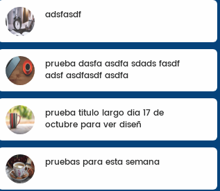
What I need to do is to leave the text centered with respect to the image, that is, if the text has 2 lines as shown in the image, it fits perfectly but if it has only 1 it is strange and I would like it to go down to focus . Is there any way to do this by css dynamically?
I have tried two solutions:
HTML element:
<div class="taskRecipient" data-id="<?php echo $value->taskId; ?>">
    <div class="miniTaskImageRecipient">
        <img class="miniTaskImage" src="<?php echo $value->image; ?>">
    </div>
    <div class="miniTaskTitle"><?php echo $value->title; ?></div>
</div>
Current CSS:
.taskRecipient{
    position: relative;
    padding: 3%;
    border-top-right-radius: 6px;
    border-top-left-radius: 6px;
    border-bottom-right-radius: 6px;
    border-bottom-left-radius: 6px;
    margin-bottom: 10px;
    -webkit-transition: all 0s ease-out;
    transition: all 0s ease-out;
    z-index: 1000;
    position: relative;
    overflow: hidden;
    cursor: pointer;
    background-color: #fff;
}

.miniTaskImageRecipient {
    width: 20%;
    display: inline-block;
    float: left;
}

.miniTaskImage {
    width: 42px;
    height: 42px;
    border-radius: 100px;
    margin-left: 3%;
    margin-right: 3%;
}

.miniTaskTitle {
    color: #252525;
    width: 70%;
    overflow: hidden;
    font-family: 'Poppins-Medium';
    padding-top: 1%;
}
CSS test1:
.miniTaskTitle {
    color: #252525;
    width: 70%;
    overflow: hidden;
    font-family: 'Poppins-Medium';
    padding-top: 1%;
    position: absolute;
    top: 30%;
    right: 10%;
}
This focuses the container to the center with what unbags the titles with 2 lines.
CSS test2:
.miniTaskTitle {
    color: #252525;
    width: 70%;
    overflow: hidden;
    font-family: 'Poppins-Medium';
    padding-top: 1%;
    trasnform:translateY(50%)
}
I also focus the container to the center unbalancing the titles of two lines.
Any ideas on how to do it?