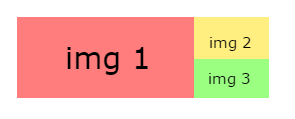
I need to align 3 images in the following way:
How could you do it using bootstrap and CSS?
I need to align 3 images in the following way:
How could you do it using bootstrap and CSS?
This will be worth it!
CSS
.container {
    width: 400px;
    height: 150px;
    background: #000;
}

.right {
    float: right;
    display: inline-block;
    background: red;
    height: 100%;
    width: 30%;
}

.left {
    float: left;
    display: inline-block;
    background: blue;
    height: 100%;
    width: 70%;
    overflow: hidden;
}

.img2, .img3 {
    height: 50%;
    overflow: hidden; /* Con esto evito que se salgan del <div> */
}


/* Con esto haces que las imagenes estén centradas en su posición y en su fondo */
.c_img {
    position: relative;
    top: 50%;
    left: 50%;
    transform: translate(-50%, -50%);
}
Body
<div class="container">
    <div class="left">
        <img class="c_img" src="http://www.todopaisajes.com/Imagenes/paisaje-rural-del-campo.jpg"> <!-- Imagen 1 -->
    </div>

    <div class="right">
        <div class="img2">
            <img class="c_img" src="http://www.poesi.as/cuadros/mar.jpg"> <!-- Imagen 2 -->
        </div>
        <div class="img3">
            <img class="c_img" src="http://www.royaltyfreelandscapesimages.com/imagenes/desierto/desierto_g/Atardecer-en-el-Desierto.jpg"> <!-- Imagen 3 -->
        </div>
    </div>
</div>
Result:

Example in jsfiddle
You can do it in several ways: in the traditional way using inline-block and the new one using Flexbox .
*. *:before, *:after {
  box-sizing: border-box;
  margin: 0;
  padding: 0;
}

.image-grid {
  box-shadow: 0 4px 25px 2px rgba(0,0,0,.2);
  height: 300px;
  margin: 20px auto;
  max-width: 600px;
  width: 100%;
}

.image-grid .left {
  background-color: gold;
  display: inline-block;
  height: 100%;
  margin: 0 -4px 0 0;
  width: 60%;
}

.image-grid figure, .image-grid figure img {
  height: 100%;
  margin: 0;
  width: 100%;
}

.image-grid .right {
  background-color: black;
  display: inline-block;
  height: 100%;
  margin: 0 -4px 0 0;
  width: 40%;
}

.image-grid .right .top {
  background-color: turquoise;
  height: 50%;
}

.image-grid .right .bottom {
  background-color: coral;
  height: 50%;
}
<section class="image-grid">
<section class="left">
<figure>
<img src="http://www.tobyscs.com/files/csgo-viewmodel-script2.jpg">
</figure>
</section>
<section class="right">
<div class="top">
<figure>
<img src="https://images.g2a.com/m/1024x768/1x1x0/thumbnail/c/s/48bcc6b9ead7_cs_go_2__1.jpg">
</figure>
</div>
<div class="bottom">
<figure>
<img src="https://images.g2a.com/m/1024x768/1x1x0/thumbnail/c/o/d8483d53ff9d_counter-strike_global_offensive_8_.jpg">
</figure>
</div>
</section>
</section> An interesting aspect is that, when we have horizontal boxes that are inline-block we need to give a negative right margin ( -4px ) to align them correctly because by default, this type of boxes generate a space to the right. This can be confusing but you get used to it. In this post you can find more information about it.
Flexbox
*. *:before, *:after {
  box-sizing: border-box;
  margin: 0;
  padding: 0;
}

.image-grid {
  box-shadow: 0 4px 25px 2px rgba(0,0,0,.2);
  display: flex;
  height: 300px;
  margin: 20px auto;
  max-width: 600px;
  width: 100%;
}

.image-grid .left {
  flex: 1;
}

.image-grid figure, .image-grid figure img {
  height: 100%;
  margin: 0;
  width: 100%;
}

.image-grid .right {
  display: flex;
  flex-direction: column;
  flex: 0 0 40%;
}

.image-grid .right .top {
  height: 50%;
}

.image-grid .right .bottom {
  height: 50%;
}
<section class="image-grid">
<section class="left">
<figure>
<img src="http://www.tobyscs.com/files/csgo-viewmodel-script2.jpg">
</figure>
</section>
<section class="right">
<div class="top">
<figure>
<img src="https://images.g2a.com/m/1024x768/1x1x0/thumbnail/c/s/48bcc6b9ead7_cs_go_2__1.jpg">
</figure>
</div>
<div class="bottom">
<figure>
<img src="https://images.g2a.com/m/1024x768/1x1x0/thumbnail/c/o/d8483d53ff9d_counter-strike_global_offensive_8_.jpg">
</figure>
</div>
</section>
</section>
.panel {
    width: 100%;
    height: 100px;
}

.der {
    float: right;
    height: 100%;
    width: 25%;
}

 .izq {
    float: left;
    background: red;
    height: 100%;
    width: 75%;
}

.uno{
    height: 50%;
    background:yellow;
}
.dos{
    height: 50%;
    background:green;
}
<div class="panel">
<div class="izq"> </div>
<div class="der">
<div class="uno">
</div>
<div class="dos">
</div>
</div>
</div>