Surely there are enough methods to solve this problem. Here I leave a couple of possible alternatives depending on whether you want all the elements to have the same or different width.
1) All elements with the same size
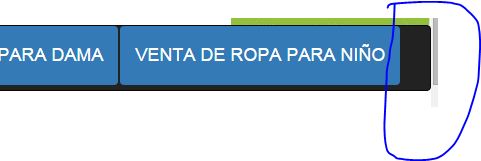
You could use nav-justified which makes all the elements of the nav occupy the same width in the father (and in windows / screens of less than 768 pixels he shows them vertically on top of each other).
Note: as indicated in the link above, nav-justified is not supported at all and has bugs in Safari.
I took the opportunity to clean up the unnecessary classes a little. With those changes, the code would be like this:
<link href="https://maxcdn.bootstrapcdn.com/bootstrap/3.3.6/css/bootstrap.min.css" rel="stylesheet">

<nav class="navbar navbar-default navbar-inverse " >
  <div class="navbar-header " id="navigation">
    <ul class="nav nav-pills nav-justified">
       <li role="presentation" class="active"><a href="index.html"><h4> INICIO</h4></a></li>
       <li role="presentation" class="active"><a href="pacas.html"><h4> VENTA DE ROPA EN PACAS</h4></a></li>
       <li role="presentation" class="active"><a href="varon.html"><h4> VENTA DE ROPA PARA VARON</h4></a></li>
       <li role="presentation" class="active"><a href="dama.html"><h4> VENTA DE ROPA PARA DAMA</h4></a></li>
       <li role="presentation" class="active"><a href="nino.html"><h4>VENTA DE ROPA PARA NIÑO</h4></a></li>
   </ul>
 </div>
</nav>
2) Elements with different sizes
In this case what we would do is make the ul have a display:table , and the li a display:table-cell . This will behave as if they were the cells of a table and the browser will distribute them as it can to adjust to the width of the screen.
The code would look like this:
ul.nav { display:table; width:100%; }
ul.nav > li { display:table-cell; float:none; }
<link href="https://maxcdn.bootstrapcdn.com/bootstrap/3.3.6/css/bootstrap.min.css" rel="stylesheet">

<nav class="navbar navbar-default navbar-inverse " >
  <div id="navigation">
    <ul class="nav nav-pills">
       <li role="presentation" class="active"><a href="index.html"><h4> INICIO</h4></a></li>
       <li role="presentation" class="active"><a href="pacas.html"><h4> VENTA DE ROPA EN PACAS</h4></a></li>
       <li role="presentation" class="active"><a href="varon.html"><h4> VENTA DE ROPA PARA VARON</h4></a></li>
       <li role="presentation" class="active"><a href="dama.html"><h4> VENTA DE ROPA PARA DAMA</h4></a></li>
       <li role="presentation" class="active"><a href="nino.html"><h4>VENTA DE ROPA PARA NIÑO</h4></a></li>
   </ul>
 </div>
</nav>