You do not get the desired effect because the class .mdl-textfield causes the div to have a display:inline-block and then the method does not work because it is not a block (with display:block ).
The solution is simple: modify the style you already have in .input-placa so that it is also considered a block (it would also work with the value inherit ):
.input-placa {
    margin-right: auto;
    margin-left: auto;
    display:block;
}
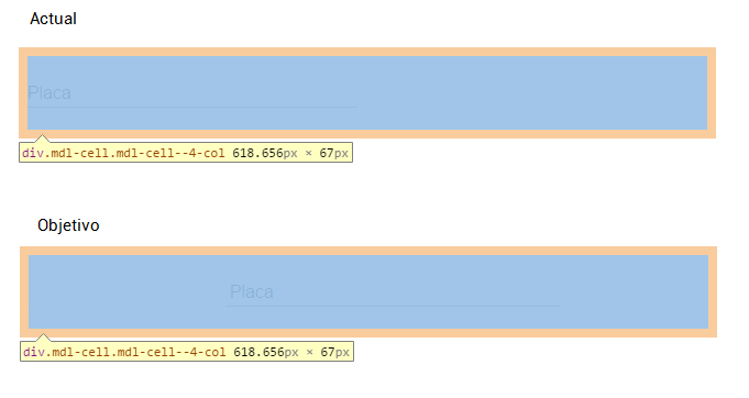
If you notice now, it does center the field full screen on a computer, but it fails when the size is tablet or phone (as in the case of the window below):
<!doctype html>
<html>
  <head>
    <link rel="stylesheet" href="https://fonts.googleapis.com/icon?family=Material+Icons">
    <link rel="stylesheet" href="https://code.getmdl.io/1.1.1/material.indigo-pink.min.css">
    <style media="screen">
      .input-placa {
        margin-right: auto;
        margin-left: auto;
        display:block;
      }
    </style>
  </head>
  <body>
    <div class="mdl-grid">
      <div class="mdl-cell mdl-cell--4-col"></div>
      <div class="mdl-cell mdl-cell--4-col">
        <div class="mdl-textfield mdl-js-textfield input-placa">
          <input class="mdl-textfield__input">
          <label class="mdl-textfield__label" for="placa">Placa</label>
        </div>
      </div>
      <div class="mdl-cell mdl-cell--4-col"></div>
    </div>
    <script defer src="https://code.getmdl.io/1.1.1/material.min.js"></script>
  </body>
</html>
This happens because in grid the columns are defined for large screen ( mdl-cell--N-col ), but they have no definition for smaller screens ( mdl-cell--N-col-tablet and mdl-cell--N-col-phone ).
So it's not just about centering the element in the cell, but you also have to make the cells fit into a row (and since it's centered in the middle cell, it will stay centered).
Note: As indicated in the documentation , the value maximum values per row for large screen is 12, for tablet is 8 and for phone is 4.
<!doctype html>
<html>
  <head>
    <link rel="stylesheet" href="https://fonts.googleapis.com/icon?family=Material+Icons">
    <link rel="stylesheet" href="https://code.getmdl.io/1.1.1/material.indigo-pink.min.css">
    <style media="screen">
      .input-placa {
        margin-right: auto;
        margin-left: auto;
        display:block;
      }
    </style>
  </head>
  <body>
    <div class="mdl-grid">
      <div class="mdl-cell mdl-cell--4-col mdl-cell--1-col-tablet mdl-cell--1-col-phone"></div>
      <div class="mdl-cell mdl-cell--4-col mdl-cell--6-col-tablet mdl-cell--2-col-phone">
        <div class="mdl-textfield mdl-js-textfield input-placa">
          <input class="mdl-textfield__input">
          <label class="mdl-textfield__label" for="placa">Placa</label>
        </div>
      </div>
      <div class="mdl-cell mdl-cell--4-col mdl-cell--1-col-tablet mdl-cell--1-col-phone"></div>
    </div>
    <script defer src="https://code.getmdl.io/1.1.1/material.min.js"></script>
  </body>
</html>