Center group of divs in CSS

1

I would like to know how it would be possible to align a group of divs (4 divs) in the following way:

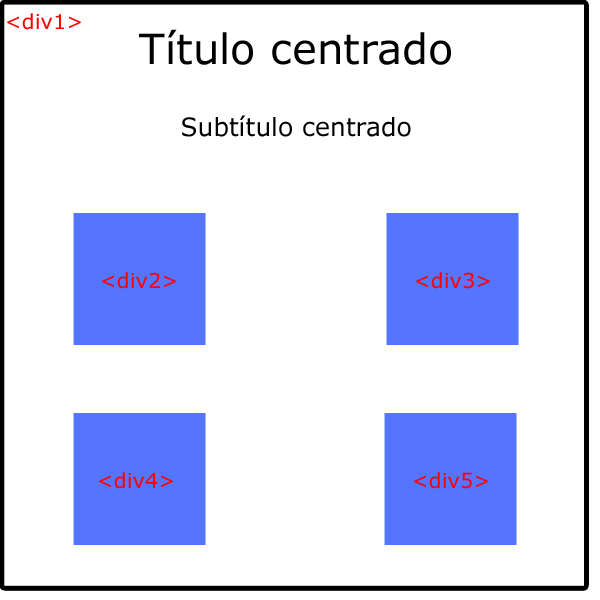
I have tried to do it with float: left, but if I do it, it will go out of the main div. Also, as you can see in the image, I want there to be a margin between them. The thing is that I can not find a way to arrange them that way, I can not think of anything else but to position them individually, but I am convinced that it can be done more easily.

    
asked by Pablo 02.09.2016 в 09:51
source

3 answers

2

If the width and height of the four boxes is known and fixed, using flexbox and calc (IE10 +) can be achieved in this way.

I want to clarify: flexbox is ideal for one-dimensional layouts, so in this case it may not be the best solution. In the future we will have native grids with CSS that will solve this problem in a much simpler way.

.contenedor {
  border: solid 1px black;
  margin: 10px;
}

h1,
h2 {
  text-align: center;  
}

.cajas {
  border: solid 1px blue;
  margin: 10px;
  display: flex;
  flex-wrap: wrap;
}

.caja {
  background-color: red;
  margin: calc(25% - 50px);
  height: 100px;
  width: 100px;
}
<div class="contenedor">
  <h1>Título centrado</h1>
  <h2>Subtítulo centrado</h2>

  <div class="cajas">
    <div class="caja">
    </div>
    <div class="caja">
    </div>
    <div class="caja">
    </div>
    <div class="caja">
    </div>
  </div>
</div>
    
answered by 02.09.2016 / 13:59
source
0

I would add 2 more divs. One for each column and another for the subobjects of the bottom of the title that only covers the two columns.

    
answered by 02.09.2016 в 10:06
0

A quick approach may be the following:

HTML

<div class="container">
  <h1>Título centrado</h1>
  <h2>Subtítulo centrado</h2>

  <div class="box-container">
    <div class="box">
      <div class="box-inner"></div>
    </div>
    <div class="box">
      <div class="box-inner"></div>
    </div>
    <div class="box">
      <div class="box-inner"></div>
    </div>
    <div class="box">
      <div class="box-inner"></div>
    </div>
  </div>
</div>

CSS

.container {
  width: 100vw;
  height: 100vh;
  text-align: center;
}

.box-container {
  width: 80%;
  margin: 0 auto;
}

.box-container::after {
  content: "";
  display: block;
  clear: both;
}

.box {
  float: left;
  position: relative;
  padding-bottom: 50%;
  width: 50%;
  background-color: transparent;
}


.box-inner {
  position: absolute;
  top: 10em;
  bottom: 10em;
  left: 10em;
  right: 10em;
  border: 1px solid #333;
  background-color: purple;
}

You could also get it using the flexible boxes or flexbox .

Here the example working.

    
answered by 02.09.2016 в 10:15