Make objects in a DJango view do not leave the screen

1

You see, I have the following html code (I have removed part of the code so you do not get lost):

{% load staticfiles %}
<html>
<body>
<h1>Lista de animales</h1>
<table>
{% for alfa in animales %}
<td>
<img src="{% static alfa.foto %}" />
<a href='http://127.0.0.1:8000/datos_animal/{{alfa.id}}'>{{alfa.id}}. {{alfa.ncomun}}:<br>{{alfa.ncientifico}}</a>
</td>
{% endfor %}
</table>
</body>
</html>

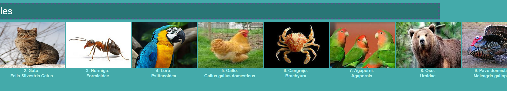
What looks like this:

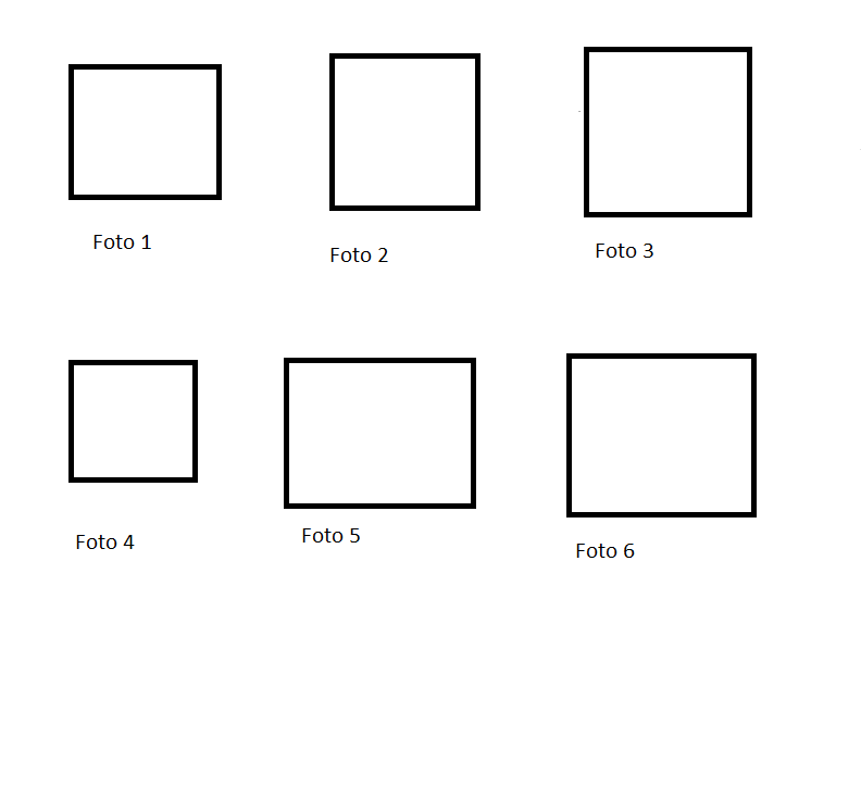
And I would like that, better than that, that when I reached the "edge" of the screen I would continue below. Something like in this sketch:

I update: I have provisionally solved the problem. HTML code:

<table>
{% for alfa in animales %}
<td>
<img src="{% static alfa.foto %}" />
<br>
<a href='http://127.0.0.1:8000/datos_animal/{{alfa.id}}'>{{alfa.id}}. {{alfa.ncomun}}:<br>{{alfa.ncientifico}}</a>
</td>
{% if forloop.counter|divisibleby:8 %}
<tr/>
{% endif %}
{% endfor %}
</table>

But there is a problem: The screen of my PC is large, so I can make it look good on the images, but on a smaller screen there may be photos that pass to the other side of the screen. The solution is that the divisibleby instead of receiving a fixed value, for example, the width of the background between 250. What variable in html gets the size of the screen?

    
asked by Miguel Alparez 09.05.2017 в 22:45
source

1 answer

1

I think there are three options. If you want, say 3 images per line, you can do a minimum test on your template using foorloop :

{% for alfa in animales %}
   {% if forloop.counter0|divisibleby:4 %}
     <tr><td>
       <div class="clear"></div>
     </td></tr>
   {% endif %}
{% endfor %}

(I have not tried the code, but that's the idea)

Another possibility is to let it settle itself ... Look how it looks, if we use max-width:300px

.imagenes {
  max-width: 300px;
}
<table>
  <tr>
    <td>
      <div class="imagenes">
        <img src="http://lorempixel.com/100/100/" class="imagen">
        <img src="http://lorempixel.com/100/100/" class="imagen">
        <img src="http://lorempixel.com/100/100/" class="imagen">
        <img src="http://lorempixel.com/100/100/" class="imagen">
        <img src="http://lorempixel.com/100/100/" class="imagen">
        <img src="http://lorempixel.com/100/100/" class="imagen">
        <img src="http://lorempixel.com/100/100/" class="imagen">
        <img src="http://lorempixel.com/100/100/" class="imagen">
      </div>
    </td>
  </tr>
</table>


and how it looks if we use max-width: 900px ...

.imagenes {
  max-width: 900px;
}
<table>
  <tr>
    <td>
      <div class="imagenes">
        <img src="http://lorempixel.com/100/100/" class="imagen">
        <img src="http://lorempixel.com/100/100/" class="imagen">
        <img src="http://lorempixel.com/100/100/" class="imagen">
        <img src="http://lorempixel.com/100/100/" class="imagen">
        <img src="http://lorempixel.com/100/100/" class="imagen">
        <img src="http://lorempixel.com/100/100/" class="imagen">
        <img src="http://lorempixel.com/100/100/" class="imagen">
        <img src="http://lorempixel.com/100/100/" class="imagen">
      </div>
    </td>
  </tr>
</table>


The third option is to use a framwork such as Bootstrap or Foundation to make your site adaptable.

    
answered by 09.05.2017 в 23:09