Align HTML content to the center with CSS

1

I have the following styles:

    /*Estilos para movil*/

[class*="col-"] {
    width: 100%;
}

@media only screen and (min-width: 600px) {
    /* Para tabletas: */
    .col-m-1 {
        width: 8.33%;
    }
    .col-m-2 {
        width: 16.66%;
    }
    .col-m-3 {
        width: 25%;
    }
    .col-m-4 {
        width: 33.33%;
    }
    .col-m-5 {
        width: 41.66%;
    }
    .col-m-6 {
        width: 50%;
    }
    .col-m-7 {
        width: 58.33%;
    }
    .col-m-8 {
        width: 66.66%;
    }
    .col-m-9 {
        width: 75%;
    }
    .col-m-10 {
        width: 83.33%;
    }
    .col-m-11 {
        width: 91.66%;
    }
    .col-m-12 {
        width: 100%;
    }
}


/*Se recomienda hacer el diseño pensando principalmente en moviles, el codigo quedaria así*/

@media only screen and (min-width: 768px) {
    /*Estilos para desktop*/
    .col-1 {
        width: 8.33%;
    }
    .col-2 {
        width: 16.66%;
    }
    .col-3 {
        width: 25%;
    }
    .col-4 {
        width: 33.33%;
    }
    .col-5 {
        width: 41.66%;
    }
    .col-6 {
        width: 50%;
    }
    .col-7 {
        width: 58.33%;
    }
    .col-8 {
        width: 66.66%;
    }
    .col-9 {
        width: 75%;
    }
    .col-10 {
        width: 83.33%;
    }
    .col-11 {
        width: 91.66%;
    }
    .col-12 {
        width: 100%;
    }
}

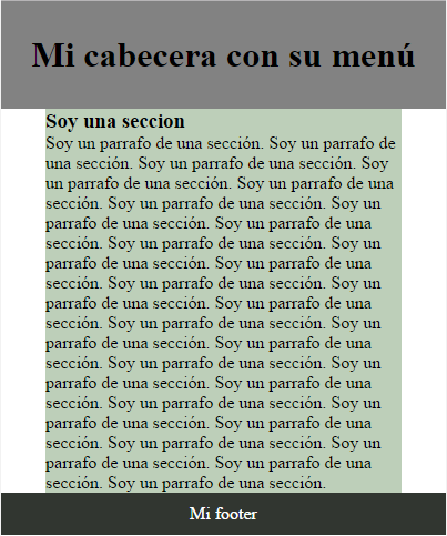
I would like to occupy three grids that in this case would be col-3 and col-m3 but that these grids were exactly the center ones. Could you help me? Adding more details, I have the following page:

But I would like to generate some lateral spaces as shown below in the following image:

    
asked by Guillermo Ricardo Spindola Bri 22.03.2017 в 00:26
source

2 answers

1

You have a header and a normal, long-lived footer , and what you want is to center the content of main , since you have than having an html5 structure such that:

<!DOCTYPE html>
<html lang="es">
<head>
    <meta charset="UTF-8">
    <title>Inicio | Fernando Pacheco</title>
    <link rel="stylesheet" type="text/css" href="estilo.css"/>
</head>
<body>
    <header class="cabecera">
        <h1>Mi cabecera con su menú</h1>
    </header>
    <main class="parteCentral">
                    <h3>Soy una seccion</h3>
        <p>Soy un parrafo de una sección. Soy un parrafo de una sección. Soy un parrafo de una sección. Soy un parrafo de una sección. Soy un parrafo de una sección. Soy un parrafo de una sección. Soy un parrafo de una sección. Soy un parrafo de una sección. Soy un parrafo de una sección. Soy un parrafo de una sección. Soy un parrafo de una sección. Soy un parrafo de una sección. Soy un parrafo de una sección. Soy un parrafo de una sección. Soy un parrafo de una sección. Soy un parrafo de una sección. Soy un parrafo de una sección. Soy un parrafo de una sección. Soy un parrafo de una sección. Soy un parrafo de una sección. Soy un parrafo de una sección. Soy un parrafo de una sección. Soy un parrafo de una sección. Soy un parrafo de una sección.  Soy un parrafo de una sección. Soy un parrafo de una sección. Soy un parrafo de una sección.</p>
    </section>
    </main>
    <footer class="pie">
        <p>Mi footer</p>
    </footer>
</body>
</html>

And the style in CSS3, something simple so you can see the result:

 *{
    border: 0;
    margin: 0;
    padding: 0;
}

.cabecera{
    background: #828282;
    padding: 30px 20px;
    text-align: center;
}

.parteCentral{
    background: #BDCFB9;
    max-width: 80%;
    margin: auto;
}

.pie{
    background: #313630;
    color: #FFFFFF;
    padding: 10px 5px;
    text-align: center;
}

The result you get is:

The funny thing is that you have to put the content in a cotenedor as you say in the comments and then give it a max < 100%, for example max-width: 80%; and with margin: auto; and you already have it.

    
answered by 22.03.2017 в 08:22
0

What you are looking for is what is normally named container . This is nothing more than an HTML element, commonly a div with a class container .

Ex. <div class="container"></div>

This class helps us keep the content in the flow we want and keep it constant on our page.

The simplest option to create this container is to use the following properties:

.container {
    width: 85%;
    margin: 0 auto;
}

Applying it to your markup, with the header inside the container, it would look something like this:

body {
  margin: 0;
}

main {
  display: flex;
  flex-direction: column;
  height: 100vh;
}

.container {
  width: 85%;
  margin: 0 auto;
  /*Solo por motivos de presentación*/
  flex: 3;
  display: flex;
  flex-direction: column;
  /*--------------------------------*/
}

header {
  background-color: mediumseagreen;
  flex: 1;
}

.slider {
  background-color: turquoise;
  flex: 3;
}

section {
  background-color: dodgerblue;
  flex: 5;
}

footer {
  background-color: violet;
  flex: 1;
}
<main>
  <div class="container">
    <header>
      Header
    </header>
    <div class="slider">
      Slider
    </div>
    <section>
      Contenido
    </section>
  </div>
  <footer>
    Footer
  </footer>
</main>
    
answered by 23.03.2017 в 18:31