This topic has been talked about a lot but I can not find the desired result. I'll explain it with bootstrap images.
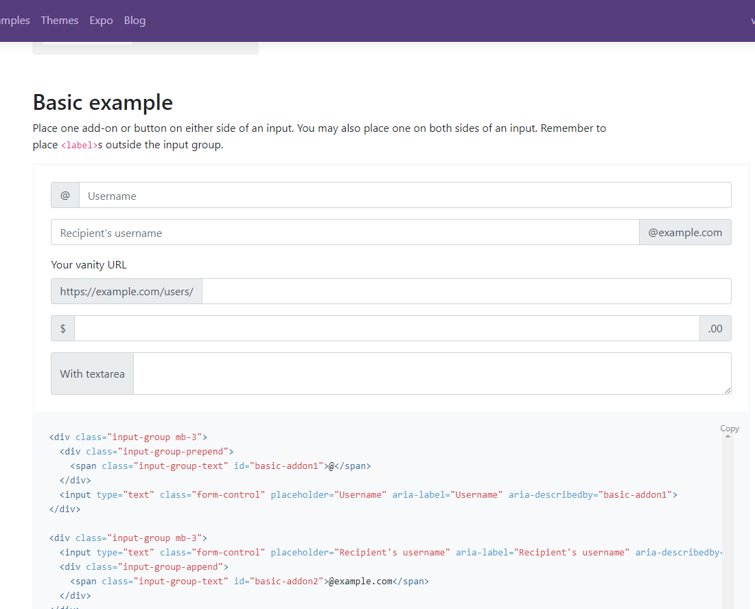
This image shows the elements of the DOM perfectly at a width of 1680 and the zoom of 100%, is the normal view of my screen
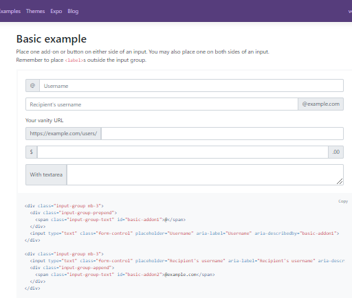
I change the resolution to 800x600 which is as minimal as possible on a PC, I leave the zoom at 100% and this is the result.
Bootstrap does its job well by placing the columns of the grid one below the other, it's fine for the mobiles but the results I'm looking for just for PC.
Now, I leave the width of the screen at 800 and manually adjust the zoom to 50%
Note that the elements look the same as in normal view at 1680 and zoom 100% but smaller, this is exactly what I want but automatically, I've tried with Css, with viewport, etc.
the line of code would be ...
Si el ancho de la pantalla es = 800 entonces ponga el zoom del navegador en 50%
Well, thank you in advance for your comments ...