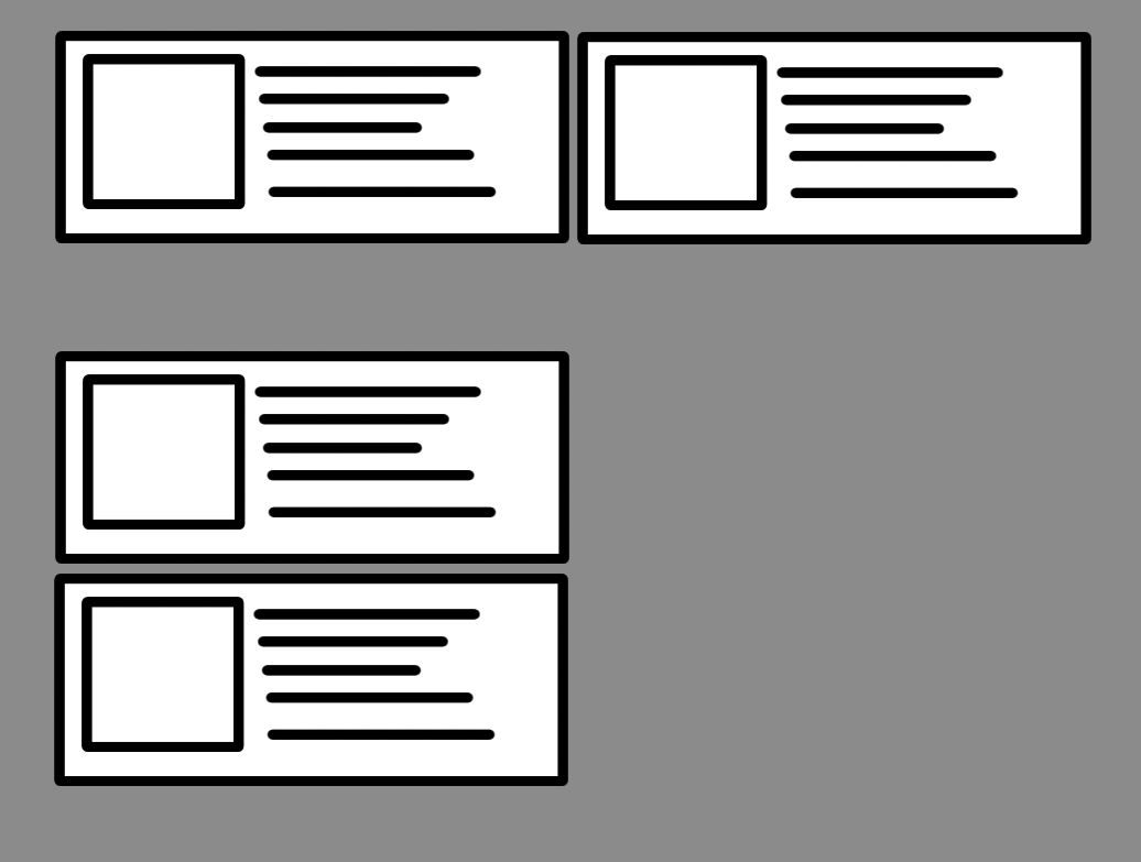
Eh been trying to put two divs that are always the same size one winged another by row but when it is smaller the screen that is placed one below another. There must be a better way but I can not do it effectively
I'm imagining something like this:
This is the CSS code that I have:
 .modal_scroll {
    max-height: 500px;
    overflow-y: auto;
}

.modal_wrap{
    margin-top: 10px;
    display: inline-block;
}

.modal_square{
    padding-right: 5px;
    padding-left: 5px;
    height: 100%;
    width: 50%;
    float: left;
    overflow: hidden;
}

.modal_img{
    margin-right: 5px;
    display: block;
    float: left;
}

.modal_description{
    display:block;
}

@media screen and (max-width: 600px) {
    .modal_square {
     border-top: 2px solid #cacaca;
     float: none;
     margin-right:0;
     width:auto;
   }
 }

 @media screen and (max-height: 500px) {
    .modal_scroll {
        max-height: 300px;
        overflow-y: scroll;
    }
 }
And this is my structure in HTML:
    <div class="modal_scroll">
    <div class="cartTableHeader" colspan="4" style="background-color: #EBEDEF">
        <h4 class="margin-top-10" >Agregar Productos</h4>
    </div>
    <div class="modal_wrap">
        {% for publication_product in publication_products_to_add %}
        <div class="modal_square">
            <div class="modal_img">
                <a href="{% url "get_store_publication" publication_product.publication.id publication_product.publication.slug %}" target="_blank">
                <img src="{{ publication_product.images.0.url_115x115 }}" alt="{{ publication_product.name }}">
                </a>
            </div>
            <div class="CartDescription col-xs-7 info_set">
                <h4>
                    <a href="{% url "get_store_publication" publication_product.publication.id publication_product.publication.slug %}" target="_blank">
                    {{ publication_product.name }}
                    </a>
                </h4>
                <span class="size">
                <span class="text_content_ss">Subtitle</span>
                <br>
                <span class="text_content_ss">Description</span>
                <br>
                <span class="text_content_ss">$00.00</span>
                <br>
                <span style="color:red;" class="text_content_ss">Alert: You need to add this</span>
                <br>
                </span>
            </div>
        </div>
    {% endfor %}