Add 2 inputs side by side in the same column

7

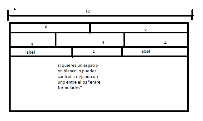
I'm putting together a form in Bootstrap, and I want 2 inputs in the same row and column, side by side.

I tried the class input-group , with which I could add buttons and labels to the inputs, but when I put 2 inputs within a input-group the second input goes down the first one, and I want it to be next to the first and pasted, as it happens with the input-group-addon .

How can that be achieved? As much as possible using the own classes of Bootstrap.

This is what I have so far

<div class="col-xs-12 col-md-3">
    <div class="form-group">
        <label for="">Nro. remito</label>
        <div class="input-group">
            <input name="remitosucursal" id="remitosucursal" type="text" required class="form-control">
            <input name="remitonumero" id="remitonumero" type="text" required class="form-control">
        </div>
    </div>
</div>
    
asked by EliseoDB 18.02.2016 в 15:10
source

6 answers

8

One option would be to add a input-group-addon between the fields and let Bootstrap take care of the styles.

<script src="https://ajax.googleapis.com/ajax/libs/jquery/2.1.0/jquery.min.js"></script>
<script src="https://maxcdn.bootstrapcdn.com/bootstrap/3.2.0/js/bootstrap.min.js"></script>
<link rel="stylesheet" href="https://maxcdn.bootstrapcdn.com/bootstrap/3.2.0/css/bootstrap.min.css">

<div class="container">
  <div class="row">
    <div class="col-xs-12 col-md-3">
      <div class="form-group">
        <label for="">Nro. remito</label>
        <div class="input-group">
          <input name="remitosucursal" id="remitosucursal" type="text" required class="form-control" placeholder="Sucursal">
          <span class="input-group-addon">-</span>
          <input name="remitonumero" id="remitonumero" type="text" required class="form-control" placeholder="Numero">
        </div>
      </div>
    </div>
  </div>
</div>

Another option if you do not want to add input-group-addon , would be to create your own styles (although I do not know if that's what you want for what you say in the question). Here is an example:

.two-fields {
  width:100%;
}
.two-fields .input-group {
  width:100%;
}
.two-fields input {
  width:50% !important;
}
<script src="https://ajax.googleapis.com/ajax/libs/jquery/2.1.0/jquery.min.js"></script>
<script src="https://maxcdn.bootstrapcdn.com/bootstrap/3.2.0/js/bootstrap.min.js"></script>
<link rel="stylesheet" href="https://maxcdn.bootstrapcdn.com/bootstrap/3.2.0/css/bootstrap.min.css">

<div class="container">
  <div class="row">
    <div class="col-xs-12 col-md-3">
      <div class="form-group two-fields">
        <label for="">Nro. remito</label>
        <div class="input-group">
          <input name="remitosucursal" id="remitosucursal" type="text" required class="form-control" placeholder="Sucursal">
          <input name="remitonumero" id="remitonumero" type="text" required class="form-control" placeholder="Numero">
        </div>
      </div>
    </div>
  </div>
</div>
    
answered by 18.02.2016 / 15:55
source
2

On a personal level, it is easier for me to think about the spaces from column to twelve,


                                                                                   First name:                                                                                                                                                                                        Surname:                                                                                                                                                            

                <div class="col-lg-12" style="margin-top:2px;">

                    <div class="col-xs-6 col-sm-6 col-md-6">
                        <div class="col-xs-3 col-sm-3 col-md-3">
                            <label for="email">Email:</label>
                        </div>
                        <div class="col-xs-9 col-sm-9 col-md-9 ">
                            <input type="email" name="email" id="email" class="form-control" placeholder="Email" tabindex="4">
                        </div>
                    </div>
                    <div class="col-xs-6 col-sm-6 col-md-6">
                        <div class="col-xs-3 col-sm-3 col-md-3 ">
                            <label for="celular">Celular:</label>
                        </div>
                        <div class="col-xs-9 col-sm-9 col-md-9 ">
                            <input type="number" name="celular" id="celular" class="form-control" placeholder="Celular" tabindex="3">
                        </div>
                    </div>
                </div>
            </div>
    
answered by 20.01.2018 в 18:30
1

One option is to use Inline forms .

I modified the example that you included in your question to use Inline forms (in the preview you will see that it appears in a single column, because it is the default of Extra Small , but it can be adjusted if you want it still in that size the fields are arranged horizontally):

<link href="http://getbootstrap.com/dist/css/bootstrap.min.css" rel="stylesheet" />
<div class="col-sm-12">
  <div class="form-inline">
    <div class="form-group">
      <label for="">Nro. remito</label>
      <input name="remitosucursal" id="remitosucursal" type="text" required class="form-control">
    </div>
    <input name="remitonumero" id="remitonumero" type="text" required class="form-control">
  </div>
</div>
    
answered by 18.02.2016 в 16:10
1

I'll leave you with this alternative, hopefully it will help:

<script src="https://ajax.googleapis.com/ajax/libs/jquery/2.1.0/jquery.min.js"></script>
<script src="https://maxcdn.bootstrapcdn.com/bootstrap/3.2.0/js/bootstrap.min.js"></script>
<link rel="stylesheet" href="https://maxcdn.bootstrapcdn.com/bootstrap/3.2.0/css/bootstrap.min.css">

<div class="container">
  <label for="">Nro. remito</label>
  <div class="row col-xs-12">
      <input name="remitosucursal" id="remitosucursal" type="text" required  placeholder="Sucursal" class="col-xs-6">
      <input name="remitonumero" id="remitonumero" type="text" required placeholder="Numero"  class="col-xs-6">
  </div>
</div>
    
answered by 18.02.2016 в 16:21
0

If the textboxes are next to each other they will be located in the same row, but not in the same column

<script src="http://netdna.bootstrapcdn.com/bootstrap/3.0.0/js/bootstrap.min.js"></script>
<link href="http://netdna.bootstrapcdn.com/bootstrap/3.0.0/css/bootstrap.min.css" rel="stylesheet"/>


<div class="row">
    <div class="col-xs-6">
            <input type="text" class="form-control" /> 
     </div>
     <div class="col-xs-6">
            <input type="text" class="form-control" /> 
    </div>
</div>

You will notice that I place each input in a div different indicating a col-*-6 , I define a 6 to specify the 12 columns of grid system of bootstrap

In the previous example, consider the solution that seemed best to me.

Input group - two inputs close to each other

But it is true that with the input-group-addon you could place text on the side of the control, but this I have seen more than anything to put some text (that's why it is applied in span ), not to align another control

    
answered by 18.02.2016 в 15:52
0

What can also help you and is shorter is:

<div class="col-xs-12 col-md-3 input-group input-group-sm">
  <span class="input-group-addon" id="basic-addon1">Nro. remito</span>
  <input type="text" class="form-control" aria-describedby="basic-addon1">
  <span class="input-group-addon">-</span>
  <input type="text" class="form-control" aria-describedby="basic-addon1">
</div>

to be able to put two inputs on the same line

    
answered by 18.02.2016 в 16:32