The best way to trim a bootstrap input

0

I have a form with this label and imput to add the value

<link rel="stylesheet" href="https://maxcdn.bootstrapcdn.com/bootstrap/3.3.7/css/bootstrap.min.css" integrity="sha384-BVYiiSIFeK1dGmJRAkycuHAHRg32OmUcww7on3RYdg4Va+PmSTsz/K68vbdEjh4u" crossorigin="anonymous">

<div class="form-group">
        <label for="nombre">Nombre:</label>
        <input class="form-control" id="nombre" name="nombre" type="text" placeholder="Nombre"></input>
    </div>

What this generates:

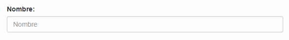
I want to cut the input, which is not so long. According to the bootstrap manual, I have to add a div with the columns I want it to occupy, like this:

<link rel="stylesheet" href="https://maxcdn.bootstrapcdn.com/bootstrap/3.3.7/css/bootstrap.min.css" integrity="sha384-BVYiiSIFeK1dGmJRAkycuHAHRg32OmUcww7on3RYdg4Va+PmSTsz/K68vbdEjh4u" crossorigin="anonymous">
    <div class="form-group">
          <label for="nombre">Nombre:</label>
          <div class="col-sm-4">
          <input class="form-control" id="nombre" name="nombre" type="text" placeholder="Nombre"></input>
          </div>
     </div>

But everything is disarmed

How would it be done and what is the problem?

Edit: According to what I have downloaded, the bootstap version is: Bootstrap v3.3.6

Thank you very much.

    
asked by Vidal 21.03.2018 в 15:47
source

2 answers

6

this is not right:

 <div class="form-group">
   <label for="nombre">Nombre:</label>
   <div class="col-sm-4">
     <input class="form-control" id="nombre" name="nombre" type="text" placeholder="Nombre"/>
   </div>
 </div>

since you should not apply it to the entire form-group container and not just the input, for what you are looking for:

<div class="row">
 <div class="col-sm-4">
    <div class="form-group">
      <label for="nombre">Nombre:</label>
      <input class="form-control" id="nombre" name="nombre" type="text" placeholder="Nombre"/>
    </div>
 </div>
</div>
    
answered by 21.03.2018 / 15:53
source
4

You must put your label e input in a class row , in order to use the columns correctly, then I leave you a snipeed with an example.

<link rel="stylesheet" href="//maxcdn.bootstrapcdn.com/bootstrap/3.3.6/css/bootstrap.min.css">

<div class="form-group row">
      <label class="col-xs-2" for="nombre">Nombre:</label>
      <div class="col-xs-4">
      <input class="form-control" id="nombre" name="nombre" type="text" placeholder="Nombre">
      </div>
 </div>
  

You can determine which column size occupies label or input , changing   the .col-xs- between 1 and 12, having 12 as the maximum size of a row. (the elements if they add more than 12 were placed in two rows)

Additional: Here you can see what sizes each prefix is (xs - sm - md - lg)

    
answered by 21.03.2018 в 15:53