HTML elements are cut

0

I'm doing a main page of a project.

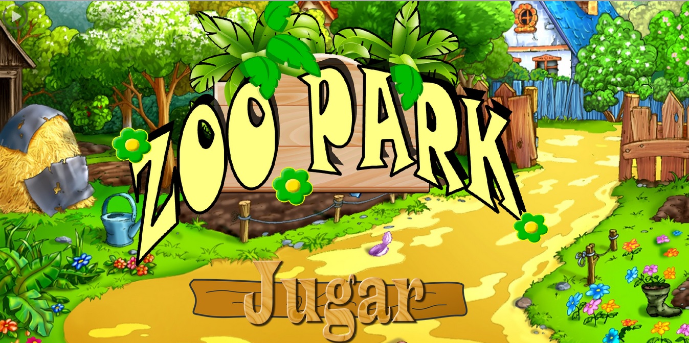
With full resolution its elements look good (logo "zoo park" and play button)

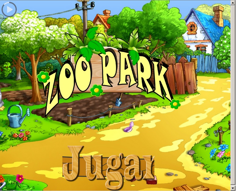
But when I start to decrease the resolution, the elements are cut. Here is how you cut the play button:

Any ideas on how I can solve this problem?

My html + css:

#outPopUp { 
    /* This image will be displayed fullscreen */
	background:url(../images/logo_granja_6.gif) no-repeat center center;
	
	/* The Magic */
	background-size:cover;
    position: absolute;
    left: 15%;
    bottom:20%;
    width: 65%;
    height: 85%;

}

.btn-enter {
   outline: 0;
   -webkit-box-shadow: none;
   box-shadow: none;

    background: url(../images/btn_jugar3.png) no-repeat center center;
    background-size:cover;
    position:absolute;
    top: 70%;
    left: 27%;
    width:40%;
    height: 25%;

   
}
.btn-enter:hover {
    outline: 0;
   -webkit-box-shadow: none;
   box-shadow: none;

    background: url(../images/btn_jugar3.png) no-repeat center center;
    background-size:cover;
    position:absolute;
    top: 70%;
    left: 26%;
    width:41%;
    height: 25%;
}
.btn-enter:active {
    outline: 0;
   -webkit-box-shadow: none;
   box-shadow: none;

    background: url(../images/btn_jugar3.png) no-repeat center center;
    background-size:cover;
    position:absolute;
    top: 70%;
    left: 24%;
    width:43%;
    height: 25%;
}
<div class="preview-item shake shake-slow" id="outPopUp"></div> 

<button type="button" class="btn btn-enter"></button>
    
asked by Oren Diaz 21.09.2017 в 00:17
source

4 answers

2

Greetings Pray , Let's see, you have not included all the HTML where you can find both the background, the logo, and the button. Supposing that the element " #outPopUp " is the window of the bottom of the farm, by means of your CSS you are placing it in absolute position, well, but what you want to put inside the limits of this background element (like the play button) should also include it within the element so that it responds the same as resizing changes.

I think that if instead of giving the button a background, you associate it with an image element, you could control it better:

<button type="button" class="btn btn-enter"><img src="images/btn_jugar3.png" /></button>

Then in the CSS you already try this image properly (for example "width: 100%").

I do not know if I explained myself but I attached the piece of CSS and the HTML that I more or less would put (by the way I have deleted code that I consider redundant):

#outPopUp { 
    /* This image will be displayed fullscreen */
	background:url(images/logo_granja_6.jpg) no-repeat center center;
	/* The Magic */
	background-size:cover;
    position: absolute;
    top: 5%;
    left: 15%;
    bottom:20%;
    width: 65%;
    height: 85%;
}
.btn-enter {
    outline: 0;
    -webkit-box-shadow: none;
    box-shadow: none;
    background:none;
    background-size:cover;
    position:relative;
    display:block;
    margin:auto;
    border:none;
    cursor:pointer;
    top: 70%;
    width:40%;
    height: 25%;

   
}
.btn-enter:hover {
    width:41%;
}
.btn-enter:active {
    width:43%;
}
.btn-enter img{
    width:100%;
}
<div class="preview-item shake shake-slow" id="outPopUp">
    <button type="button" class="btn btn-enter">
        <img src="images/btn_jugar3.png" />
    </button>
</div> 
    
answered by 21.09.2017 / 02:06
source
2

It is cut because the image is bigger than the percentage that you are leaving it for the image of the button to be displayed, in the maximum resolution the result of the percentages is higher, than in a lower resolution. For example the image occupies 50 pixels (the bottom image of the button) and you set it a long width etc with percentages, if the result of the percentage according to the resolution greater than the 50 px that the image occupies will then appear whole, instead if the result of the percentage of space on the screen that you leave for the button is less than those 50 px, the image will not be able to exit whole.

    
answered by 21.09.2017 в 00:57
1

In the btn-enter do not use a background , better use a label img and tell it to have a width: 100% , this will adapt the image to any size that has its parent element and so it will not be cut

    
answered by 21.09.2017 в 00:49
1

Thank you all.

I'm going to try img instead of background.

Another solution that I found is to cover all the resolutions most used by monitors and mobile devices with the css function:

@media (max-width: 'resolution'px)

    
answered by 21.09.2017 в 01:19