Flat Button in Android Material Design

0

By default when a button is created in Android Studio, its appearance inherits the Material Design design, in the Material Design style guide, it talks about buttons Flat, Raised Raised I think is the default

Flat Button

Raised button

Summary of what I'm asking

  • I see that the raised add that effect of glow to raise it, as Is it assigned?
  • How do you specify that it be style like flat button?
asked by Webserveis 23.02.2016 в 11:59
source

2 answers

5

Final result


You must first add the support library.

dependencies {  
    compile 'com.android.support:appcompat-v7:X.X.X'
}

Response for Raised Button.


You define your own style.

<style name="MiRaisedBoton" parent="Theme.AppCompat.Light">  
    <item name="colorControlHighlight">#FF4081</item>
    <item name="colorButtonNormal">#00BCD4</item>
</style>
  

You apply the style.

<Button  
    android:layout_width="wrap_content"
    android:layout_height="wrap_content"
    android:text="RAISED BUTTON"
    android:theme="@style/MiRaisedBoton"/>

Response for Raised Button con elevación (API +19)


Define your own animation.

<selector xmlns:android="http://schemas.android.com/apk/res/android">
<item android:state_pressed="true" android:state_enabled="true">
    <set>
        <objectAnimator android:propertyName="translationZ"
                        android:duration="@integer/button_pressed_animation_duration"
                        android:valueTo="@dimen/button_pressed_z_material"
                        android:valueType="floatType"/>
        <objectAnimator android:propertyName="elevation"
                        android:duration="0"
                        android:valueTo="@dimen/button_elevation_material"
                        android:valueType="floatType"/>
    </set>
</item>
<item android:state_enabled="true">
    <set>
        <objectAnimator android:propertyName="translationZ"
                        android:duration="@integer/button_pressed_animation_duration"
                        android:valueTo="0"
                        android:startDelay="@integer/button_pressed_animation_delay"
                        android:valueType="floatType"/>
        <objectAnimator android:propertyName="elevation"
                        android:duration="0"
                        android:valueTo="@dimen/button_elevation_material"
                        android:valueType="floatType" />
    </set>
</item>


You assign the animation.

<Button
    android:layout_width="wrap_content"
    android:layout_height="wrap_content"
    android:text="RAISED BUTTON ELEVADO"
    android:stateListAnimator="@anim/mi_animacion"/>

Response for Flat Button.


You assign the Borderless style.

<Button  
    android:layout_width="wrap_content"
    android:layout_height="wrap_content"
    android:text="FLAT BUTTON"
    style="@style/Widget.AppCompat.Button.Borderless"/>
  

If you want to define your own style.

<style name="MiFlatBoton" parent="Theme.AppCompat.Light">  
    <!-- tus propios cambios -->
</style> 
  

And after defining your own style of course, indicate it to use it.

<Button  
    android:layout_width="wrap_content"
    android:layout_height="wrap_content"
    android:text="FLAT BUTTON"
    android:theme="@style/MiFlatBoton"
    style="@style/Widget.AppCompat.Button.Borderless"/>

More information: LINK

    
answered by 23.02.2016 / 13:26
source
0

Another solution is to use the styles of the compatibility library, on a Button or AppCompatButton
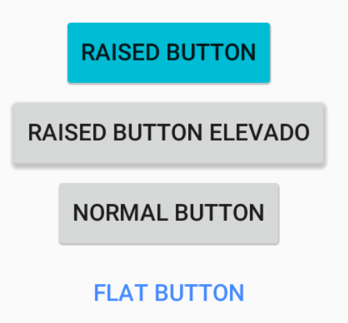
Flat Button

For text only buttons, text button, flat button:

Define the style in: style="@style/Widget.AppCompat.Button.Borderless"

<android.support.v7.widget.AppCompatButton
    android:id="@+id/button1"
    style="@style/Widget.AppCompat.Button.Borderless"
    android:layout_width="wrap_content"
    android:layout_height="wrap_content"
    android:text="Button" />

Colorful The color of the text will be the one defined in colorAccent of the theme.

Define the style in: style="@style/Widget.AppCompat.Button.Borderless.Colored"

<android.support.v7.widget.AppCompatButton
    android:id="@+id/button2"
    style="@style/Widget.AppCompat.Button.Borderless.Colored"
    android:layout_width="wrap_content"
    android:layout_height="wrap_content"
    android:text="Button" />

Personalization

For personalization we can define our own style, to change the color of the text, wave color when we press, only those buttons that we want.

We change the color of the text in <item name="colorAccent"> and the color of the expansive wave in <item name="colorControlHighlight">

PrimaryFlatButton style

<style name="PrimaryFlatButton" parent="Theme.AppCompat.Light">
    <item name="android:buttonStyle">@style/Widget.AppCompat.Button.Borderless.Colored</item>
    <item name="colorControlHighlight">@color/colorAccent</item>
    <item name="colorAccent">@color/colorAccent</item>
</style>

to use it on the button use android:theme="@style/PrimaryFlatButton

<android.support.v7.widget.AppCompatButton
    android:id="@+id/buttonAwesome3"
    android:theme="@style/PrimaryFlatButton"
    android:layout_width="wrap_content"
    android:layout_height="wrap_content"
    android:layout_margin="8dp"
    android:text=" Button" />
    
answered by 22.07.2018 в 13:35