If I understood, the property you're looking for is called object-fit .
That yes before, you have to give the image label a height and a width depending on your need. These are just reference or delimitation, not the final size that the image will choose.
The other thing is that it will be necessary that you can stop the image depending on the height of the title, for this, I suggest using calc to subtract 100% of the height of the container minus the title atura, like that.
.columna img{
  height: calc(100% - XXpx);
}
Once the above is applied, you could use the object-fit property like this:
Object-fit: cover
img.cover{
  object-fit: cover;
}
If you want to always keep its proportions but occupy much or totally the parent container.
Object-fit: contain
img.contain{
  object-fit: contain;
}
If you want to always keep their proportions but also want the image does not exceed the measures and always fit to be within these (ie not deformed).
Here a demo , with the html code as you present it (although I used some reference images that I found on the internet and verify that they are of different sizes):
.contenedor-columnas {
	width: 100%;
	margin: auto;
	text-align: center;
	margin-bottom: 50px;
}

.columx2 {
	width: 50%;
	float: left;
	padding: 20px 20px;
	box-sizing: border-box;
}

.columna {
	height: 200px;
  background-color: red;
  background-image: url('http://picsum.photos/800/600?image=307');
	background-position: center;
	background-size: cover;

}

.columx2 h1 {
	font-size: 20px;
	text-transform: uppercase;
	font-weight: bold;
	color: #4e3224;
}

.columx2 img {
	width: 100%;
	margin: auto;
}

.pleca2 {
	width: 100%;
  height: 20px;
}

.pleca2 img {
  width: 100%;
  height: 100%;
  object-fit: cover;
}

.columna>img{
  width: 100%;
  height: calc(100% - 60px);/*<-- Yo puse 60px porque más o menos es lo que mide la altura del título, pero tú coloca un número de pixeles que se ajuste*/
  object-fit: contain;
}
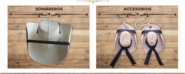
<section class="contenedor-columnas">
            <div class="columx2">
                <div class="columna">
                    <h1>sombreros</h1>
                    <div class="pleca2">
                        <img src="https://dgm.azureedge.net/products/lg/fiora-shelf-bronze.png" alt="">
                    </div>
                    <img src="https://www.almacenesantonioguerrero.es/wp-content/uploads/2017/06/REF-5114-SOMBRERO-CAN%CC%83ERO-PANAMA.png" alt="" >
                </div>
            </div>
            <div class="columx2">
                <div class="columna">
                    <h1>Accesorios</h1>
                    <div class="pleca2">
                        <img src="https://dgm.azureedge.net/products/lg/fiora-shelf-bronze.png" alt="" >
                    </div>
                    <img src="https://ugc-prd.dressinglab.com/media/thumbnails/images/products/sombrero-turquesa9828a.png.450x678_q100_upscale.png" alt="" >
                </div>
            </div>
        </section>
If you can modify the html (which would be the best) apply the properties through classes, as I did in the first examples.
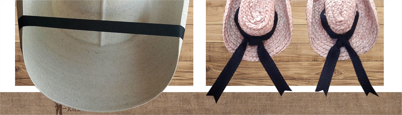
By the way, I think that the image you use for "pleca" should be as background in the CSS and not in an html tag and even better, if you put it as a pseudo-element by after or before of the <h1> tag, because if it's how I think you want to use it, it will never change and it will always be below the title.
Council
You should use flexbox in the parent container so that the image always takes the remaining size of the remaining space, something like this:
.columna{
  display: flex;
  flex-direction: column;
}
Here the same demo, but applying the tips and changes that I tell you.
.contenedor-columnas {
  /*Modifica aquí el tamaño de las columnas y veras que no se deforma la imagen ni se recorta*/
  --col-height: 120px;
	width: 100%;
	margin: auto;
	text-align: center;
	margin-bottom: 50px;
}

.columx2 {
	width: 50%;
	float: left;
	padding: 20px 20px;
	box-sizing: border-box;
}

.columna {
  display: flex;
  flex-wrap: wrap;
  align-items: center;
  align-content: stretch;
  justify-content: center;
  height: var(--col-height);
  background-color: red;
  background-image: url('http://picsum.photos/800/600?image=307');
  background-color: #ece0d5;
  background-blend-mode: color-burn;/*Esta propiedad es innecesaria, ignorala. La uso simplemente para darle un tono distinto y más claro al fondo*/
	background-position: center;
	background-size: cover;
}

.title {
  width: 100%;
  font-size: 20px;
  text-transform: uppercase;
  font-weight: bold;
  color: #4e3224;
  line-height: 1em;
  margin: 0;
  padding: 0.5em;
  position: relative;
}

.pleca{
  background-image: url('https://dgm.azureedge.net/products/lg/fiora-shelf-bronze.png');
  background-position: center calc(100% + 15px);
  background-size: 100% 60px;
  background-repeat: no-repeat;
  padding-bottom: 20px;/*El espacio que ocuparía la pleca*/
}

.columx2 img {
  width: 100%;
  height: calc(100% - 50px);
  object-fit: contain;
}

/*Este estilo de abajo ignoralo, es solo para que puedas jugar con los tamaños de las columnas*/

style{
  background: #444;
  color: lime;
  font-family: monospace;
  position: fixed;
  display: block;
  top: 0;
  left: 0;
  width: 100%;
  z-index: 2;
  padding: 5px;
  text-transform: uppercase;
  text-align: center;
}
<style contenteditable>.columna {--col-height: 150px;}</style>

<section class="contenedor-columnas">
  <div class="columx2">
    <div class="columna">
      <h1 class="title pleca">Sombreros</h1>
      <img src="https://www.almacenesantonioguerrero.es/wp-content/uploads/2017/06/REF-5114-SOMBRERO-CAN%CC%83ERO-PANAMA.png" alt="" >
    </div>
  </div>
  <div class="columx2">
    <div class="columna">
      <h1 class="title pleca">Accesorios</h1>
      <img src="https://ugc-prd.dressinglab.com/media/thumbnails/images/products/sombrero-turquesa9828a.png.450x678_q100_upscale.png" alt="" >
    </div>
  </div>
  <div class="columx2">
    <div class="columna">
      <h1 class="title pleca">Accesorios</h1>
      <img src="https://ugc-prd.dressinglab.com/media/thumbnails/images/products/sombrero-de-verano-con-cinta-negra-y-mono-15759.png.450x678_q100_upscale.png" alt="" >
    </div>
  </div>
  <div class="columx2">
    <div class="columna">
      <h1 class="title pleca">Accesorios</h1>
      <img src="https://agropublicidad.com/wp-content/uploads/2017/03/SOMBRERO-SAFARI-CAMUFLAJE-T-132-AGROPUBLICIDAD.png" alt="" >
    </div>
  </div>
  <div class="columx2">
    <div class="columna">
      <h1 class="title pleca">Accesorios</h1>
      <img src="https://officialpsds.com/imageview/rv/k2/rvk2n4_large.png?1524855863" alt="" >
    </div>
  </div>
</section>
If you have any questions, leave me your comment.