fill spaces of the "Border-Radius" - DIV

0

I am designing a small form that consists of 3 bodies that are "DIV" and I have this. As you can see in the image, when placing border radius with CSS, the spaces take on the color of "BODY".

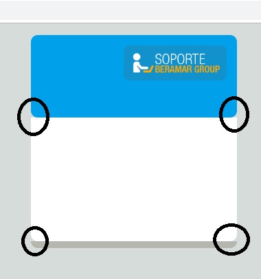
I would like you to take the color of the "DIV" below and leave something like that.

Thanks in advance.

and in case it were necessary to place my css.

//SU CONTENEDOR
.divlogin{
    margin-left : auto;
    margin-right : auto;
    padding : 0px;
    margin-top: 5px;
    width: 300px;
    /*height: 500px;*/
    border-radius: 10px;
}

//DIV AZUL
.loginheader{
    background: #00A1EA;
    height: 130px;
    border-top-left-radius: 10px;
    border-top-right-radius: 10px;
    border-bottom-left-radius: 10px;
    border-bottom-right-radius: 10px;
}

//DIV BLANCO
.logincuerpo{
    overflow-y: auto;
    background: #FFFFFF;
    border-bottom-left-radius: 10px;
    border-bottom-right-radius: 10px;
    height: 180px;
    margin: 0 auto;
}

//DIV PLOMO
.loginfooter{
    border-bottom-left-radius: 10px;
    border-bottom-right-radius: 10px;
    background: #B5B6AE;
    height: 10px;
    display: block;
}

My HTML:

<div class="divlogin" id="divlogin">
    <div class="loginheader">
        <img src="img/soporteberamar.png" alt="error" class="login_logosoporte">
    </div>
    <div class="logincuerpo">
    </div>
    <div class="loginfooter">
    </div>
</div>
    
asked by Angel Cayhualla 16.10.2018 в 22:47
source

2 answers

2

Try setting a background color to your container .divlogin

.divlogin{
   background-color: #fff;
}

Your final css code would look like this:

.divlogin{
    margin-left : auto;
    margin-right : auto;
    padding : 0px;
    margin-top: 5px;
    width: 300px;
    /*height: 500px;*/
    border-radius: 10px;
    background-color: #fff;
}

.loginheader{
    background: #00A1EA;
    height: 130px;
    border-top-left-radius: 10px;
    border-top-right-radius: 10px;
    border-bottom-left-radius: 10px;
    border-bottom-right-radius: 10px;
}

.logincuerpo{
    overflow-y: auto;
    background: #FFFFFF;
    border-bottom-left-radius: 10px;
    border-bottom-right-radius: 10px;
    height: 180px;
    margin: 0 auto;
    position: relative;

    -webkit-box-shadow: 0px 6px 0px #B5B6AE;
    -moz-box-shadow: 0px 6px 0px #B5B6AE;
    box-shadow: 0px 6px 0px #B5B6AE;
}

And your HTML like this:

<div class="divlogin" id="divlogin">
    <div class="loginheader">
        <img src="img/soporteberamar.png" alt="error" class="login_logosoporte">
    </div>
    <div class="logincuerpo">
    </div>

</div>

You did not need a div footer to be able to do the effect you want, with the box-shadow property it's enough.

As an additional comment, I would also add that if all your edges have the same radius, I do not find any sense to format each edge, with border-radius: 10px; would do the job:)

    
answered by 16.10.2018 / 22:57
source
2

It occurs to me that you can use the ::after selector in css to create a background above the lower container. Then you put it behind the top container with z-index and it has the cover effect. This way you do not have to change the position or size of the second container.

I'll give you an example with two containers;

#superior {
  width: 300px;
  height: 100px;
  background: blue;
  border-radius: 20px;
}

#inferior {
  width: 300px;
  height: 100px;
  background: red;
  position: relative;
}

#inferior::after {
  content: "";
  position: absolute;
  top:-20px;
  left:0;
  width: 300px;
  height: 20px;
  background: red;
  z-index: -1;
}
<div id="superior"></div>
<div id="inferior"></div>
    
answered by 16.10.2018 в 22:57