Draw figure with css

0

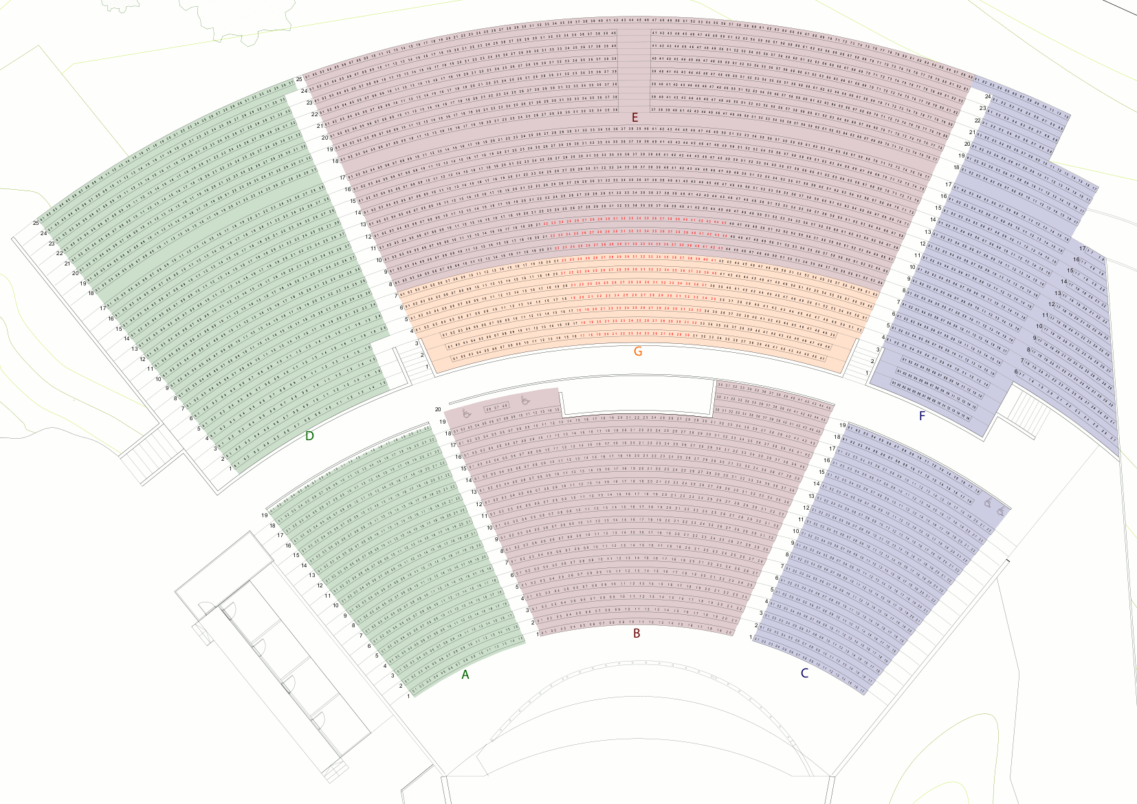
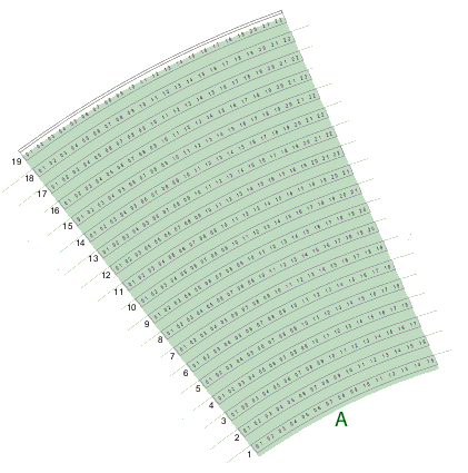
I need to draw this figure with css

How could I do it?

I have this but I can not do it.

Code css:

.seccion
{
    width: 350px;
    height: 200px;
    border-left: 70px solid #fff;
    border-right: 70px solid #fff;
    border-top: 100px solid #ccc;
    border-radius: 50% 50% 0 0;
}

HTML code:

<div class="seccion">
</div>

I need to form this, just the outline of each figure.

    
asked by Jorge Alonso 07.12.2018 в 21:05
source

3 answers

2

If you need only the svg, you can copy it from the inspector. I hope this is what you need.

var SVG_NS = 'http://www.w3.org/2000/svg';
var SVG_XLINK = "http://www.w3.org/1999/xlink"
var svg = document.querySelector("svg");
let c={x:700,y:700}
let a1 = -Math.PI/2 -Math.PI/4; 
let a2 = -Math.PI/2 - Math.PI/10;

for(let r = 300; r < 700; r+=10){
  let x1 = c.x + r*Math.cos(a1);
  let y1 = c.y + r*Math.sin(a1);
  let x2 = c.x + r*Math.cos(a2);
  let y2 = c.y + r*Math.sin(a2);
  let o = {
    d:'M${x1},${y1}A${r},${r} 0 0 1 ${x2},${y2}'
  }
  drawPath(o, svg)
}


function drawPath(o, parent) {
  var path = document.createElementNS(SVG_NS, 'path');
  for (var name in o) {
    if (o.hasOwnProperty(name)) {
      path.setAttributeNS(null, name, o[name]);
    }
  }
  parent.appendChild(path);
  return path;
}
svg{border:1px solid;height:90vh;}
path{fill:none; stroke:black;}
<svg viewBox="100 0 600 600"></svg>

Update:

The OP comments: "It would have been perfect if I drew the outline and not the lines". Next comes the code to draw only the outline.

var SVG_NS = "http://www.w3.org/2000/svg";
var SVG_XLINK = "http://www.w3.org/1999/xlink";
var svg = document.querySelector("svg");
let c = { x: 700, y: 700 };
let a1 = -Math.PI / 2 - Math.PI / 4;
let a2 = -Math.PI / 2 - Math.PI / 10;

// dibujar contorno

let x1 = c.x + 300 * Math.cos(a1);
let y1 = c.y + 300 * Math.sin(a1);
let x2 = c.x + 300 * Math.cos(a2);
let y2 = c.y + 300 * Math.sin(a2);

let x3 = c.x + 690 * Math.cos(a2);
let y3 = c.y + 690 * Math.sin(a2);
let x4 = c.x + 690 * Math.cos(a1);
let y4 = c.y + 690 * Math.sin(a1);

let o = {
  style: "fill:hsla(110, 70% ,40%,.35)",
  d: 'M${x1},${y1}A${300},${300} 0 0 1 ${x2},${y2}L${x3},${y3}A${690},${690} 0 0 0 ${x4},${y4}L${x1},${y1}z'
};
drawPath(o, svg);

function drawPath(o, parent) {
  var path = document.createElementNS(SVG_NS, "path");
  for (var name in o) {
    if (o.hasOwnProperty(name)) {
      path.setAttributeNS(null, name, o[name]);
    }
  }
  parent.appendChild(path);
  return path;
}
svg{border:1px solid;width:90vh;}
path{fill:none; stroke:black;}
<svg viewBox="100 0 600 600"></svg>
    
answered by 07.12.2018 в 21:53
1

This is close to what you are looking for, you could vary this code until it adapts better to your needs:

#figura {
       		border-bottom: 200px solid #9dce98;
      		border-left: 25px solid transparent;
      		border-right: 25px solid transparent;
      		height: 0;
      		width: 100px;
      		transform: rotate(140deg);
      		margin-top: 100px;
      		margin-left: 50px;
    	}
<div id="figura"></div>
    
answered by 07.12.2018 в 21:42
0

This is another answer because the OP says not to know how to work with SVG, so here is an attempt to do it with CSS:

Explanation:

  • In HTML I have a div that has rounded edges at the top.
  • This div has overflow:hidden .
  • It also has a pseudo element before with the top rounded. This element is transparent but has a shadow that fills the div.

  • Next I use clip-path to cut everything in trapezoidal shape, and finally

  • I rotate it with transform:rotate .
  • div{
      width:150px;
      height:200px;
      overflow:hidden;
      position:absolute;
      margin:auto;
      left:0;right:0;top:0;bottom:0;
      border-top-left-radius:  50%  5% ;
      border-top-right-radius: 50%  5%;
      clip-path: polygon(0 0, 100% 0, 75% 100%, 25% 100% );
      transform:rotate(-15deg);
    }
    
    div:before{
      content:"";
      display:block;
      width:100%;
      height:20px;
      border-top-left-radius:     50% ;
      border-top-right-radius:    50%;
      position:absolute;
      bottom:-10px;
      box-shadow: 0 0 0 300px hsla(120,70%,40%,.5);
    }
    <div></div>

    Unlike SVG this works in Chrome and Firefox but not in Edge, IE since I'm using clip-path . In Safari it works with prefix.

        
    answered by 10.12.2018 в 17:45