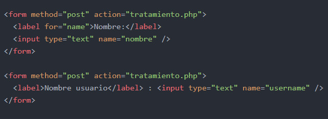
 I think the question is very basic but, I'm learning and I've found the input and label syntax in both ways
I think the question is very basic but, I'm learning and I've found the input and label syntax in both ways
The first form is fine, but I do not recommend the second form in any way, it would even be that way but if there is something that surrounds them, like this:
<div class="input-text-group">
  <label for="foo0">Label</label> :
  <input type="text"/>
</div>
Because the colon (:) could inherit the parent container's default styles and could even be omitted and created using pseudo-elements, but I do not see it as an optimal version, since it is a visual use rather than data structuring, which at the end of the day is html .
There is not much consensus on the subject, you can do it depending on the need, for example my recommended would be:
Allows control to give styles to the label text and input separately, although the input will inherit the styles of the label.
<label for="foo1">
  Label:
  <input type="test" id="foo1"/>
</label>
Allows control to give styles to label text and input separately, but input will not inherit label styles.
<label for="foo2">
  Label:
</label>
<input type="test" id="foo2"/>
Allows you to give advanced input styles, such as pseudo-elements with icons, as well as to accommodate them in a grid of sizes. This is the preferred frameworks most times.
<label for="foo3">
  Label:
</label>
<div class="input-group">
  <input type="test" id="foo3"/>
</div>
This is the one that uses bootstrap to give another example:
<div class="form-group">
  <label for="foo4">Name:</label>
  <input type="text" class="form-control" id="foo4">
</div>
And this is the google with material design :
<div class="mdc-text-field">
  <input type="text" id="foo6">
  <label class="mdc-floating-label" for="foo6">Hint text</label>
  <span class="mdc-line-ripple"></span>
</div>
The last one adds a state line, which can be animated via css with the input states, but I would dispense with it and use pseudos to achieve the same effect.
On many occasions, I have decided to mix them in a version very similar to the two, but with the possibility of being able to control the label through css states of the input, like this.
<div class="grupo-question">
  <input type="text" class="form-control" id="foo7">
  <label for="foo7">Name:</label>
</div>
And I arrange the order of the elements using flexbox and order , like this:
.grupo-question{
  display: flex;
}
.grupo-question .form-label{
  order: 1;
}

.grupo-question .form-label::after{
  content: ':';
  margin-left: -0.2em;
  padding-right: .5em;
}
.grupo-question .form-control{
  order: 2;
}

.grupo-question .form-control:focus ~ .form-label{
  color: blue;
  order: 2;
  padding-left: 0.5em;
}

.grupo-question .form-control:hover ~ .form-label{
  color: red;
}

.grupo-question .form-control:active ~ .form-label{
  color: green;
}
<div class="grupo-question">
<input type="text" class="form-control" id="foo7">
<label for="foo7" class="form-label">Label </label>
</div>According to the W3C Using label elements ...
<label for="nombre">Nombre:</label>
<input id="nombre" name="nombre" type="text" />
The bottom line is that for matches id in practice this is used by assistive systems such as screen readers.
But in case you need to omit label you can use aria-label so that screen readers can read what that input is about
<input type="text" name="nombre" aria-label="Nombre">