how can I modify my display?

0

I'm doing a display for videos but I can not modify it correctly

to make it look like this image:

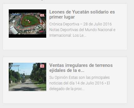
but it only appears to me like this image:

this is the code:

css:

div.polaroid {
  width: 80%;
  background-color: white;
  box-shadow: 0 4px 8px 0 rgba(0, 0, 0, 0.2), 0 6px 20px 0 rgba(0, 0, 0, 0.19);
  margin-bottom: 25px;
}

div.container {
  text-align: center;
  padding: 10px 20px;
}

html:

  <div>
    <div class="polaroid">
      <img src="rock600x400.jpg" alt="Norway" style="width:100%">
      <div class="container">
        <p>The Troll's tongue in Hardanger, Norway</p>
      </div>
    </div>

    <div class="polaroid">
      <img src="lights600x400.jpg" alt="Norway" style="width:100%">
      <div class="container">
        <p>Northern Lights in Norway</p>
      </div>
    </div>
</div>

I will really appreciate if you can help me with this situation.

    
asked by JULIO MACHAN 22.06.2017 в 21:59
source

3 answers

2

Here I leave the code more or less with the organization you want, with the image on one side and the texts on the other. To organize it so you need to use the attribute "position: absolute" in order to place the object in a certain position as it is on the left (in the case of text).

Now you just have to change several things like the size of the tag to suit the style you want.

div.polaroid {
  width: 350px;
  height: 120px;
  background-color: white;
  box-shadow: 0 4px 8px 0 rgba(0, 0, 0, 0.2), 0 6px 20px 0 rgba(0, 0, 0, 0.19);
  margin-bottom: 25px;
 
  position: relative;
}
div.polaroid>img{
 
  width: 50%;
  height: 100%;
  display:inline;
  
}
div.container {
  position: absolute;
  right: 0px;
  width: 50%;
  height: 100%;
  text-align: center;
  vertical-align:middle;
  display:inline;
}
 <div>
    <div class="polaroid">
      <img src="http://www.lowcountryren.com/nestor/Documentation/ionicons-1.4.1/png/512/android-contact.png" alt="Norway">
      <div class="container">
        <p>The Troll's tongue in Hardanger, Norway</p>
      </div>
    </div>

    <div class="polaroid">
      <img src="http://www.lowcountryren.com/nestor/Documentation/ionicons-1.4.1/png/512/android-contact.png" alt="Norway">
      <div class="container">
        <p>Northern Lights in Norway</p>
      </div>
    </div>
</div>
    
answered by 22.06.2017 / 22:50
source
1

You could also do it with a float property The box image and container they are inside the polaroid box, you float the box to the left and the width of 30% to the container box 70%

div.polaroid {
  width: 80%;
  background-color: white;
  box-shadow: 0 4px 8px 0 rgba(0, 0, 0, 0.2), 0 6px 20px 0 rgba(0, 0, 0, 0.19);
  margin-bottom: 25px;
  overflow: hidden;
}

div.container {
  text-align: center;
  padding: 10px 20px;
  width: 70%;
  
}

.imagen {
  width: 30%;
  float: left;
}
.limpiar {
  clear: both;
}
<div>
  <div class="polaroid">
    <div class="imagen">
      <img src="http://lorempixel.com/600/400/" alt="Norway" style="width:100%">
    </div>
    <div class="container">
      <p>The Troll's tongue in Hardanger, Norway1</p>
    </div>
  </div>
<div class="limpiar"></div>
  <div class="polaroid">
    <div class="imagen">
      <img src="http://lorempixel.com/600/400/" alt="Norway" style="width:100%">
    </div>
    <div class="container">
      <p>Northern Lights in Norway2</p>
    </div>
  </div>
</div>
    
answered by 23.06.2017 в 00:51
1

Using Flexbox

It's just enough to give a flex-basis to the image and that the .container occupy the rest.

html {
  box-sizing: border-box;
}

*,
*:before,
*:after {
  box-sizing: inherit;
  margin: 0;
  padding: 0;
}

.grid {
  display: -webkit-box;
  display: -ms-flexbox;
  display: flex;
  -ms-flex-wrap: wrap;
  flex-wrap: wrap;
  padding: 5px;
}

.grid .polaroid {
  -webkit-box-align: center;
  -ms-flex-align: center;
  align-items: center;
  box-shadow: 0 2px 2px 0 rgba(0, 0, 0, .15), 0 -1px 1px 0 rgba(0, 0, 0, .05);
  display: -webkit-box;
  display: -ms-flexbox;
  display: flex;
  height: 150px;
  margin: 5px;
  padding: 0 5px;
  width: 425px;
}

.grid .polaroid img {
  border-radius: 3px;
  height: 90px;
  -webkit-box-flex: 0;
  -ms-flex: 0 0 140px;
  flex: 0 0 140px;
  margin: 0 5px;
}

.grid .polaroid .container {
  -webkit-box-flex: 1;
  -ms-flex: 1;
  flex: 1;
  -webkit-box-orient: vertical;
  -webkit-box-direction: normal;
  -ms-flex-direction: column;
  flex-direction: column;
  display: -webkit-box;
  display: -ms-flexbox;
  display: flex;
  height: 90px;
  margin: 0 5px;
  min-width: 0px;
}

.grid .polaroid .container h4 {
  color: #555;
  display: block;
  -webkit-box-flex: 0;
  -ms-flex: 0 0 25px;
  flex: 0 0 25px;
  font-family: 'Ubuntu', 'Segoe UI', sans-serif;
  font-size: 15px;
  font-weight: 600;
  white-space: nowrap;
  overflow: hidden;
  padding: 5px 0;
  text-overflow: ellipsis;
  width: 100%;
}

.grid .polaroid .container pre,
.grid .polaroid .container p {
  display: -webkit-box;
  -webkit-box-flex: 1;
  -ms-flex: 1;
  flex: 1;
  font-family: 'Ubuntu', 'Segoe UI', sans-serif;
  font-size: 14px;
  line-height: 15px;
  padding-top: 5px;
  white-space: pre-line;
  overflow: hidden;
  -webkit-line-clamp: 4;
  -webkit-box-orient: vertical;
}
<section class="grid">
  <div class="polaroid">
    <img src="https://www.mclanfranconi.com/wp-content/uploads/Consejos-para-tener-buenas-reuniones.jpg" alt="Norway">
    <div class="container">
      <h4>The Troll's tongue in Hardanger, Norway</h4>
      <pre>
          Lorem ipsum dolor sit amet, consectetur adipisicing elit. Voluptates harum porro sed nisi illo reprehenderit, distinctio laboriosam dicta quaerat ipsam amet excepturi, consequatur delectus dolore architecto tempore ipsum. Molestiae, velit.
        </pre>
    </div>
  </div>

  <div class="polaroid">
    <img src="http://www.coffice.do/wp-content/uploads/2016/07/reuniones.jpg" alt="Norway">
    <div class="container">
      <h4>Northern Lights in Norway</h4>
      <pre>
          Lorem ipsum dolor sit amet, consectetur adipisicing elit. Rem at pariatur iusto adipisci corporis, unde, nam dignissimos rerum impedit maiores illo distinctio veritatis quod, modi officia ab vero, reiciendis beatae!
        </pre>
    </div>
  </div>
</section>
    
answered by 26.06.2017 в 20:15