Reduce input text width

0

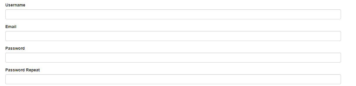
I want to reduce the width of my input text. The input covers the entire width of the page, how can I reduce it?

This is the code with which I show the input text:

<div class="form-group">
 <?= $form->field($model, "username")->input("text") ?>   
</div>

<div class="form-group">
 <?= $form->field($model, "email")->input("email") ?>   
</div>

<div class="form-group">
 <?= $form->field($model, "password")->input("password") ?>   
</div>

<div class="form-group">
 <?= $form->field($model, "password_repeat")->input("password") ?>   
</div>
    
asked by Sebastian Salazar 02.03.2018 в 20:09
source

2 answers

2

Try this:

<div class="form-group">
    <?= $form->field($model, "username")->input("text",['style'=>'width:50%']) ?>   
</div>

<div class="form-group">
    <?= $form->field($model, "email")->input("email",['style'=>'width:50%']) ?>   
</div>

<div class="form-group">
    <?= $form->field($model, "password")->input("password",['style'=>'width:50%']) ?>   
</div>

<div class="form-group">
    <?= $form->field($model, "password_repeat")->input("password",['style'=>'width:50%']) ?>   
</div>
    
answered by 02.03.2018 / 20:45
source
0

If you are using bootstrap I do not recommend changing the styles unless it is really necessary. this can be solved with the values of the bootstrap columns that in fact make it responsive

example

<div class="col-md-4">
  <div class="form-group">
    <input type="text" class="form-control"/>
  </div>
</div>

the values of the sizes can be adapted to the different screens with the use of the prefixes col-xs- col-md- col-lg etc,

here you have the documentation

    
answered by 02.03.2018 в 21:00