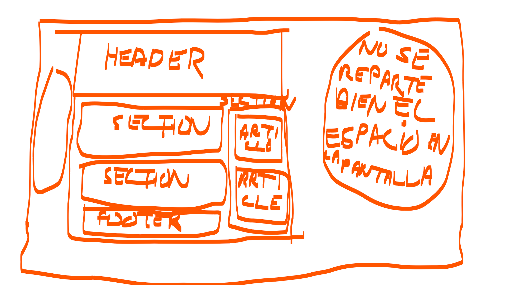
I tried to center what the page is but I always have space left to occupy almost always as in the sketch above, what happens? leaves some words aligned horizontally.
Index.html
<!DOCTYPE html>
<html lang="es">
<head>
<title>Miletra</title>
<meta charset="ISO-8859-1">
<meta name="keywords" content="HTML,CSS">
<link rel="stylesheet" href="css/main.css">
</head>
<body>
<ul class="contacto">
<li>T99</li>
<li><a href="mailto:[email protected]">email:[email protected]</a></li>
</ul>
<header id="banner">
<img src="img/x.jpg">
<div class="continente">
<h1><div class="a">M</div> <div class="b">i</div> <div class="c">C</div> <div class="d">o</div> <div class="e">c</div> <div class="f">i</div> <div class="g">n</div> <div class="h">a</div>...... 1º DAM</h1>
</div>
<nav class="menu">
<a href="#">Incio</a>
<a href="#">meu</a>
<a href="#">sericio a domicilio</a>
<a href="#">aceca de nosotros</a>
<a href="formulario.html">rero</a>
</nav>
</header>
<main class="group">
<section id="blog">
<div class="contenedor">
<article class="tamanio1">
<img src="img/x.jpg">
<h2>Roesa</h2>
</article>
<article class="tamanio2">
<h2>Hola queulo<h2>
<h3>Hola titulo<h3>
<p>Lorem ipsum dolor sit amet, consectetur adipiscing
elit. Quisque l libero ac molestie. In eu nisi
at elit maximus lobortis. </p>
</article>
</div>
<div class="contenedor">
<article class="tamanio1">
<img src="img/x.jpg">
<h2>Sushi</h2>
</article>
<article class="tamanio2">
<h2>Hola que titulo<h2>
<h3>Hola que l titulo<h3>
<p>Lorem ipsum dolor sibero ac molestie.</p>
</article>
</div>
</section>
<aside id="aside">
<article class="hola">
<h4>Recetas populares</h4>
<a href="#">Yaoune</a>
<a href="#">Okoomiyaki</a>
<a href="#">Mizutaki</a>
</article>
<article class="adios">
<a href="#">j</a>
<a href="#">Cona </a>
<a href="#">Pa/a>
</article>
</aside>
</main>
<div class="clear"></div>
<footer>
<p>© fghdfgh</p>
</footer>
</body>
</html>
main.css
@import url('../css/menu.css');
@import url('../css/banner.css');
{
    margin: 0;
    padding: 0;
    font-size:16px;
}

.contacto{
    position:fixed;
    background:white;
    height:40px;
    z-index:100;
    right:0;
    width: 100%;
    margin: auto;
}

.contacto ul{
    clear: both;
    width:70%;
}

.contacto li{
    margin:10px 50px 10px 50px;
    float:left;
    position:relative;
    left:25%;
    list-style-type: none;

}
.contacto li a{
text-decoration:none;
}

 body{
    font-family: myFuente;
    background-image: url("../img/x.jpg");
    max-width:1024px;
    margin-left:165px;
    margin-right:100px;
}

header{
    max-width:1024px;
    position: fixed;
    top: 0;
    left: 0;
}

@font-face {
    font-family: myFuente;
    src: url(../fonts/Orbitron-Bold.ttf);
}

.continente {
 width: 90%;
 margin: auto;/*para alinear*/
}

.group {
    position: relative;
    background:white;
}

.group:before,
.group:after {
  content: "";
  display: table;
}
.group:after {
  clear: both;
}
.group {
  clear: both;
}
section {
  float: left;
  margin: 0 1%;
  width: 70%;
}
aside {
  float: right;
  margin: 0 1%;
  width: 25%;
}

header .continente {
    display:table;
}

footer {
    clear: both;
    background:RGB(192,192,192);
    width:100%;
    color:white;
    height:50px;
    margin-top:-5px;
}

footer p {
    padding-top:15px;
    text-align:left;
    margin-left:10px;
}
menu.css
 .continente {
  overflow: hidden;
}

#banner .menu {
    width:100%;
    position: absolute;
    top:90%;
    left:55%;
    transform: translateX(-50%) translateY(-50%);

    display:flex;
    width:100%;
    padding:10px;
}
#banner .menu a {
    width:20%;
    margin-top:1px;
    margin-right:1px;
    margin-bottom:1px;
    margin-left:1px;
    text-decoration:none;
    color: white;
}

#banner .menu a:hover {
    color:black;
}
banner.css
h1 {
    display:flex;
    letter-spacing: 0.3em;
}

#banner {
    position: relative;
    width: 100%;
    right:200px;/*--aqui*/
    margin-bottom:0;
}

#banner img {
    width: 100%;
    height: 100%;
}

#banner .continente{
    position: absolute;
    top:50%;
    left:50%;
    transform: translateX(-50%) translateY(-50%);
}

#banner h1 {
    font-size: 1.750em;
    color: white;
}

#banner {
        /*overflow: hidden;*/
        height: 300px;
    }

#banner img {
        height: auto;
    }