keep the content centered on a defined layout?

0

LAYOUT ACTUAL

I have an already defined layout which consists of a container (.container) that centers all the content of the page, of the rows (.row) which help to create horizontal divisions inside the container and the columns that help create the vertical divisions (.col) within the rows. here the layout:

//utilizado para centrar todo el contenido de la pagina
.container() {
    margin-left:   auto;
    margin-right:  auto;
    width:         90%;
    max-width:     $container-max-width;
}

//Wrap de las subdivisiones del layout
.row{
    display:      flex;
    flex-wrap:    wrap;
    margin-right: -1rem;
    margin-left:  -1rem;
}

//divisiones del layout
.col{
    padding-left:  1rem;
    padding-right: 1rem; 
    flex:          none; // 0 0 auto
    width:         100%; //original del framework
}

//las divisiones van de 5 en 5 hasta 100 eje. col-5 col-10 etc
.col-15{
    flex-basis: 15%;
    max-width:  15%;
}

THE PROBLEM

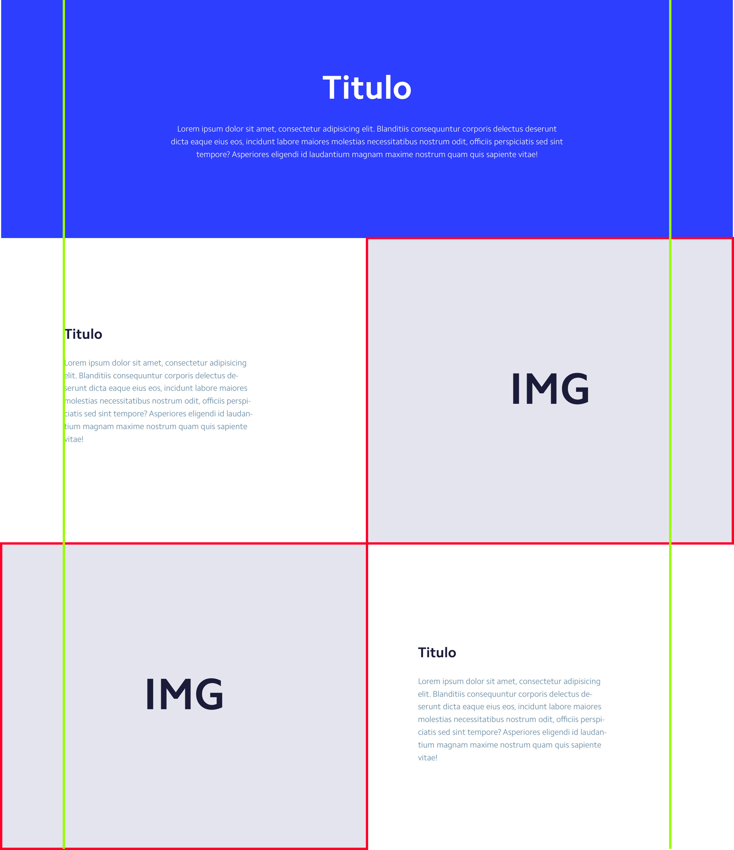
I am creating a site which has some sections which are subdivided into two, each of the subdivisions occupies 50% of the viewport. one of the subdivisions has a background image and the other has content which should be aligned with the rest of the page.

The question is how to align a content without the container (.container) with the rest of the content of the page that does have it.

an image to illustrate the problem, the yellow line represents the container (.container) for the alignment of the page and the red border of the images indicate that these elements go out of the normal layout of the page.

    
asked by Cristian Camilo Flórez 06.02.2018 в 03:01
source

2 answers

2

Once, I had to do this same exercise, the way I solved it at that time was combining units vw , calc , custom properties (optional) and margin , something like this:

.container{
  /* o la medida que se vaya a dejar de margen lateral*/
  --margenes: 10vw; 
  padding-left: var(--margenes);
  padding-right: var(--margenes);
}
  /*también se puede hacer si se desea que haya un ancho estandar*/
@media (min-width: 1024px){
  .container{
    --margenes: calc( (100vw - 1024px ) / 2); 
  }
}

.imagen{
  /*La imagen mide la mitad del contenedor más el margen lateral*/
  width: calc(50% + var(--margenes)); 
}

/*Se resta con el margen lateral correspondiente*/

.imagen.izquierda{
  margin-left: calc(var(--margenes) * -1);
}

.imagen.derecha{
  margin-right: calc(var(--margenes) * -1);
}

Look at this demo:

*{ box-sizing: border-box; margin: 0; padding: 0; }

body{
  background-color: whitesmoke;
  font-family: arial;
  text-align: left;
}

.contenedor{
  --margenes: 10vw;
  padding-left: var(--margenes);
  padding-right: var(--margenes);
}

.banner{
  background-color: blue; 
  min-height: 80vh;
  color: white;
  display: flex;
  justify-content: left;
  align-content: center;
  align-items: center;
}

.row{
  background-color: white;
  min-height: 50vh;
  display: flex;
  align-items: stretch;
}

.informacion{
  width: 50%;
  display: flex;
  justify-content: flex-start;
  align-content: center;
  align-items: center;
}

.imagen{
  width: calc(50% + var(--margenes));
  background: lightblue;
  background-size: cover;
  background-position: center;
}

.imagen.izquierda{
  margin-left: calc(var(--margenes) * -1);
  background-image: url(http://picsum.photos/1200/1200);
}

.imagen.derecha{
  margin-right: calc(var(--margenes) * -1);
  background-image: url(http://picsum.photos/1800/1200);
}
<body>
  <div class="contenedor-principal">
    <div class="contenedor banner">
       <h3>Título</h3>
    </div>
    <main class="contenedor contenido">
       <article class="row">
         <figure class="imagen izquierda"></figure>
         <div class="informacion">
           lorem ipsum
         </div>
       </article>
       <article class="row">
         <div class="informacion">
           lorem ipsum
         </div>
         <figure class="imagen derecha"></figure>
       </article>
    </main>
  </div>
</body>

I hope that it applies equally to your project, but I remain attentive in the comments to see what changes we could apply or if we can find another solution.

    
answered by 06.02.2018 / 18:33
source
0

Try putting the header and content in "containers", that is, the header in one that occupies 100% and the text with the logo you put the% you want, the same for the body of the web, you I leave the code that looks clearer what I mean

I have put the border dashed so you can check the margins and play with them

Greetings

body{
  color: white;
  text-align: center;
  font-family: verdana;
} 
header{
  width: 100%;  
  background-color: blue;
}
header .logo {
  max-width: 770px;
  margin: 0 auto;
  height: 200px;
  padding: 0 100px;
  border: 1px dashed red;
}
.container{
  width: 970px;
  background-color: white;
  margin: 0 auto;
}
.container .table{
  color: gray;
  display: table;
  width: 100%
};

.container .table section {
  display: table-row;
}

.container .table section article {
  display: table-cell;
  padding: 35px;
  width: 50%;
  border: 1px dashed red;
}

.container .table section article:first-child {
  text-align: left
}
<!DOCTYPE html>
<html>
<head>
  <meta charset="utf-8">
  <meta name="viewport" content="width=device-width">
  <title>JS Bin</title>
</head>
<body>
  <header>
    <div class="logo">
      <h1>titulo</h1>
      <small>Lorem ipsum dolor sit amet, consectetur adipisicing elit. Voluptatum soluta non obcaecati, odit iure necessitatibus est culpa aliquam aut cupiditate autem, aperiam sint velit animi, pariatur repellat a id officia.</small>
    </div>  
  </header>
  <div class="container">
    <div class="table">      
    
      <section>
        <article>Lorem ipsum dolor sit amet, consectetur adipisicing elit. Cum, aliquam, ullam. Eum mollitia commodi asperiores recusandae nihil repudiandae debitis corrupti quis architecto quae assumenda nam quibusdam maxime, maiores repellat. Ad.</article>
        <article>img</article>
      </section>
      
    </div>
  </div>
</body>
</html>
    
answered by 06.02.2018 в 10:31