Text always same position on img and with proportion to the image in html and CSS

0

I'm doing tests with text positioning on an image. I have this:

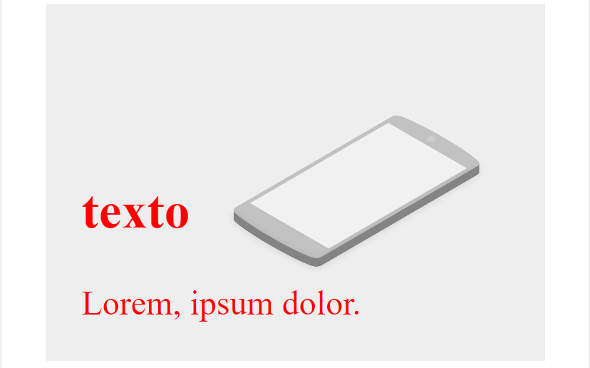
This I get with this code. In html:

<main>
    <div class="caja">
        <img src="smartphones.png" alt="" >
        <div class="texto">
            <h2>texto</h2>
            <p>Lorem, ipsum dolor.</p>
        </div>
    </div>
</main>

In the CSS:

  .caja{
    position: relative;
}
img{
    width: 100%;
}
.texto{
    color: red;
    position: absolute;
    bottom: 10px;
    left: 50px;
    font-size: 3rem;

}

Good. With this if I resize the screen the image is resized. Being something like this (depending on the screen size, the text will obviously have a different position):

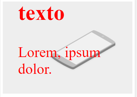
The question is: Is there any way that the text always stays in the same position and has a size according to the size of the image? I have the solution of putting half queries and positions and text size chords. But could it be done automatically? Any bookstore to put text on images?

I've tried to put the font-size as vw and something fixes ... but even so it's not what I want.

Greetings and thanks.

    
asked by Carlos Rayón Álvarez 13.11.2018 в 23:16
source

2 answers

1

Do not use percentages or pixels, use vw for all measures, including the size of the accounts.

And remember to set a limit media query max-width that leaves the widths in pixels from a certain size of the browser if necessary (if you had all this in a div with limited width).

   .caja{
position: relative;
}
img{
width: 100%;
}
.texto{
color: red;
position: absolute;
bottom: 1vw;
left: 0.5vw;
font-size: 5vw;

}
<main>
<div class="caja">
    <img src="https://picsum.photos/200/100" alt="" >
    <div class="texto">
        <h2>texto</h2>
        <p>Lorem, ipsum dolor.</p>
    </div>
</div>
</main>
    
answered by 14.11.2018 в 12:03
0

Try to use span and use% in bottom and left, here is an example

.caja{
    position: relative;
}
img{
    width: 100%;
}
.title{
    color: red;
    position: absolute;
    bottom: 20%;
    left: 4%;
    font-size: 5em;
}
.contain{
    color: red;
    position: absolute;
    bottom: 10%;
    left: 4%;
    font-size: 2.5em;
}
<main>
    <div class="caja">
        <img src="smartphones.png" alt="" >
        <div class="texto">
            <span class="title">texto</span>
            <span class="contain">Lorem, ipsum dolor.</span>
        </div>
    </div>
</main>
    
answered by 14.11.2018 в 09:58