Can a table be made responsively?

0

I have a small form of clients in which I have to accommodate the data of a normal client (name, phone number, address, email, residence), and I have not been able to make my form 100% responsive and at the same time have a good order of design, is there a method to have a responsive table?

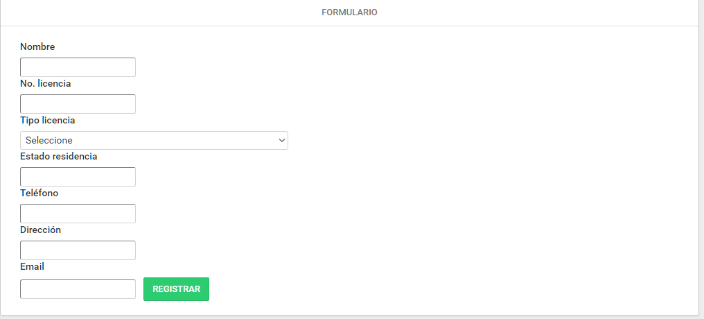
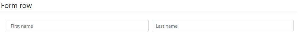
Currently the form (it could be said that it is the base form) looks like this, but my assignment is that I want to arrange them in a table of two columns, in which the "name" and its text box have to one side to the label "no.licencia" and also its corresponding text box, it could be said that each one with his "partner" and leaving alone to the email, some idea? I am open to suggestions. Thanks

    
asked by Cesar Reyna 04.11.2018 в 06:47
source

1 answer

1

Yes it is possible using the Boostrap 4 library in html, I recommend you watch this video in which they explain it pretty well: link

And the official documentation: link

Here is an example code of a responsive form, using the class column and row that what they do is accommodate those 2 elements in a single row with 2 columns.

<form>
    <div class="row">
        <div class="col">
            <input type="text" class="form-control" placeholder="First name">
        </div>
        <div class="col">
            <input type="text" class="form-control" placeholder="Last name">
        </div>
    </div>
</form>

And remember to add the Boostrap library before the <head> tag.

Either through the following code:

<link rel="stylesheet" href="https://stackpath.bootstrapcdn.com/bootstrap/4.1.3/css/bootstrap.min.css" integrity="sha384-MCw98/SFnGE8fJT3GXwEOngsV7Zt27NXFoaoApmYm81iuXoPkFOJwJ8ERdknLPMO" crossorigin="anonymous">
<script src="https://stackpath.bootstrapcdn.com/bootstrap/4.1.3/js/bootstrap.min.js" integrity="sha384-ChfqqxuZUCnJSK3+MXmPNIyE6ZbWh2IMqE241rYiqJxyMiZ6OW/JmZQ5stwEULTy" crossorigin="anonymous"></script>

Or by unloading it from the following link:

link

    
answered by 04.11.2018 / 07:25
source