I need to position text around an image. example
This is how I position each text, but it gives me problems to be responsive. At the moment it looks good on my screen but when I review it in a bigger one it gets out of hand. Any idea how to do it correctly?
.benefits1 {
    margin-top: -95%;
    width: 26%;
    margin-left: 13%;
    @include breakpoint(desktop) {
        margin-top: -452px;
        width: 26%;
        margin-left: 8%;
    }
}

.benefits2 {
    margin-left: 80%;
    margin-top: -10%;
    width: 22%;
    @include breakpoint(desktop) {
        margin-left: 60%;
        margin-top: 42px;
        width: 24%;
    }
}

.benefits3 {
    margin-top: 69%;
    margin-left: 60%;
    width: 40%;
    @include breakpoint(desktop) {
        margin-top: 219px;
    margin-left: 44%;
    width: 2%;
    }
}

.benefits4 {
    margin-top: -37%;
    margin-left: 1%;
    width: 21%;
    @include breakpoint(desktop) {
        margin-top: -139px;
        margin-left: -4%;
        width: 2%;
    }
}
HTML:
<div class="col-sm-6">
<div class="list-benefits">
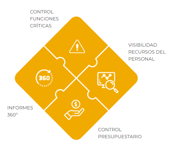
<img src="assets/images/beneficios.png" alt="Beneficios">
<p class="benefits1">CONTROL FUNCIONES CRÍTICAS</p>
<p class="benefits2">VISIBILIDAD RECURSOS DEL PERSONAL</p>
<p class="benefits3">CONTROL PRESUPUESTARIO</p>
<p class="benefits4">INFORMES 360º</p>
</div>
</div>