How to paint half screen and responsive in css boostrap 4?

0

Hello, I would like you to help me. I am making a form. I would like half of my screen to be painted yellow and with that logo in the middle. and the other half like this, and I would like to perform responsive. I'm doing with boostrap 4 and css, html

I attach my HTML.

<!DOCTYPE html>

<html xmlns="http://www.w3.org/1999/xhtml">
<head runat="server">
<meta http-equiv="Content-Type" content="text/html; charset=utf-8"/>
<meta name="viewport" content="width=device-width, initial-scale=1, shrink-to-fit=no"/>
<link rel="stylesheet" href="https://stackpath.bootstrapcdn.com/bootstrap/4.1.3/css/bootstrap.min.css" integrity="sha384-MCw98/SFnGE8fJT3GXwEOngsV7Zt27NXFoaoApmYm81iuXoPkFOJwJ8ERdknLPMO" crossorigin="anonymous"/>
<link href="../Css/Login.css" rel="stylesheet" />
<script src="https://code.jquery.com/jquery-3.3.1.slim.min.js" integrity="sha384-q8i/X+965DzO0rT7abK41JStQIAqVgRVzpbzo5smXKp4YfRvH+8abtTE1Pi6jizo" crossorigin="anonymous"></script>
<script src="https://cdnjs.cloudflare.com/ajax/libs/popper.js/1.14.3/umd/popper.min.js" integrity="sha384-ZMP7rVo3mIykV+2+9J3UJ46jBk0WLaUAdn689aCwoqbBJiSnjAK/l8WvCWPIPm49" crossorigin="anonymous"></script>
<script src="https://stackpath.bootstrapcdn.com/bootstrap/4.1.3/js/bootstrap.min.js" integrity="sha384-ChfqqxuZUCnJSK3+MXmPNIyE6ZbWh2IMqE241rYiqJxyMiZ6OW/JmZQ5stwEULTy" crossorigin="anonymous"></script>
<title></title>
</head>
<body>
    <form id="form1" runat="server">
    <div class="container">
          <div class="row">
              <div class="col-6" id="Izquierda">
                  <center>
                       <img src="../img/LOGOOOO.png" width="250px" class="text-center" id="imgen"/>
                  </center>

              </div>
              <div class="col-6" id="Derecha">
                  <h3 class="font-weight-light">Financiera QapaQ S.A</h3> <br />
                  <table class="table">
                      <tr>
                          <th class="font-weight-light">Username :</th>
                          <th>
                              <asp:TextBox ID="txtusername" CssClass="form-control" runat="server"></asp:TextBox></th>
                      </tr>
                      <tr>
                          <th class="font-weight-light">Password :</th>
                          <th>
                              <asp:TextBox ID="txtllave" CssClass="form-control" TextMode="Password" runat="server"></asp:TextBox></th>
                      </tr>
                      <tr>
                          <th>
                              <asp:Button ID="btnIngresar" runat="server" Text="Ingresar" CssClass="alert alert-primary" /></th>
                      </tr>
                  </table>
              </div>
          </div>
    </div>
    </form>

I add my CSS

#Derecha
    {
        margin-top:165px;

    }
    #Izquierda
    {
        padding:25%;
        background:#f7e92f;
        /*background:#085075;*/
        text-align:center;
            padding-left: 150px;
    }

Image that comes out.

[! [enter the description of the image here] [1]] [1]

[! [enter the description of the image here] [2]] [2]

/ ************************ /

<html xmlns="http://www.w3.org/1999/xhtml">
<head runat="server">
<meta http-equiv="Content-Type" content="text/html; charset=utf-8"/>
<meta name="viewport" content="width=device-width, initial-scale=1, shrink-to-fit=no"/>
<link rel="stylesheet" href="https://stackpath.bootstrapcdn.com/bootstrap/4.1.3/css/bootstrap.min.css" integrity="sha384-MCw98/SFnGE8fJT3GXwEOngsV7Zt27NXFoaoApmYm81iuXoPkFOJwJ8ERdknLPMO" crossorigin="anonymous"/>
<link href="../Css/Login.css" rel="stylesheet" />
<script src="https://code.jquery.com/jquery-3.3.1.slim.min.js" integrity="sha384-q8i/X+965DzO0rT7abK41JStQIAqVgRVzpbzo5smXKp4YfRvH+8abtTE1Pi6jizo" crossorigin="anonymous"></script>
<script src="https://cdnjs.cloudflare.com/ajax/libs/popper.js/1.14.3/umd/popper.min.js" integrity="sha384-ZMP7rVo3mIykV+2+9J3UJ46jBk0WLaUAdn689aCwoqbBJiSnjAK/l8WvCWPIPm49" crossorigin="anonymous"></script>
<script src="https://stackpath.bootstrapcdn.com/bootstrap/4.1.3/js/bootstrap.min.js" integrity="sha384-ChfqqxuZUCnJSK3+MXmPNIyE6ZbWh2IMqE241rYiqJxyMiZ6OW/JmZQ5stwEULTy" crossorigin="anonymous"></script>
    <title></title>
    <style>
        .color2{background:#fcc314;}
    </style>
</head>
<body>
    <form id="form1" runat="server">
    <div>

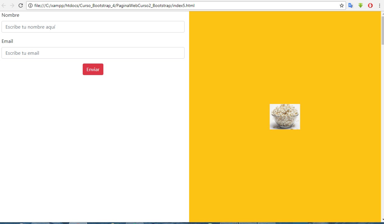
<section class="container-fluid" id="Formulario">
          <h3 class="text-uppercase text-center"> Formulario de contacto</h3>

            <div class="row ">
               <div class="col-6">
                   <form action="" > 
                        <div class="form-group ">
                            <label for="" >Nombre</label>
                            <input type="text"  placeholder="Escribe tu nombre aquí" class="form-control">
                        </div>
                        <div class="form-group">
                                <label for="" >Email</label>
                                <input type="text" placeholder="Escribe tu email" class="form-control">
                            </div>

                            <div class="form-group d-flex flex-row justify-content-center">
                                <button class="btn btn-danger ">Enviar</button>
                            </div>
                    </form>
                </div>
                <div class="col-6 color2  d-flex justify-content-center align-items-center">

                    <img class="img-fluid" src="../img/LOGOOOO.png" id="imgen" alt="">

                 </div>   
            </div>
        </section>
    </div>
    </form>
</body>
    
asked by PieroDev 11.08.2018 в 17:50
source

2 answers

1

Friend you need a course, I recommend this page https://edutin.com/university you can take it from bootstrap 4 hehehe it is easy but you must learn the classes since the trick you need is to control the rows and columns if you are really using bootstrap 4 the trick is here the grid that provides bootstrap is composed of 12 columns class="col-12" that is you can put a row and then the columns you want is how your screen will be divided. Here is an example friend, I hope and this is what you mean: Friend this is what you are looking for ???

<!DOCTYPE html>

    <html xmlns="http://www.w3.org/1999/xhtml">
    <head runat="server">
    <meta http-equiv="Content-Type" content="text/html; charset=utf-8"/>
    <meta name="viewport" content="width=device-width, initial-scale=1, shrink-to-fit=no"/>
    <link rel="stylesheet" href="https://stackpath.bootstrapcdn.com/bootstrap/4.1.3/css/bootstrap.min.css" integrity="sha384-MCw98/SFnGE8fJT3GXwEOngsV7Zt27NXFoaoApmYm81iuXoPkFOJwJ8ERdknLPMO" crossorigin="anonymous"/>
    <link href="../Css/Login.css" rel="stylesheet" />
    <script src="https://code.jquery.com/jquery-3.3.1.slim.min.js" integrity="sha384-q8i/X+965DzO0rT7abK41JStQIAqVgRVzpbzo5smXKp4YfRvH+8abtTE1Pi6jizo" crossorigin="anonymous"></script>
    <script src="https://cdnjs.cloudflare.com/ajax/libs/popper.js/1.14.3/umd/popper.min.js" integrity="sha384-ZMP7rVo3mIykV+2+9J3UJ46jBk0WLaUAdn689aCwoqbBJiSnjAK/l8WvCWPIPm49" crossorigin="anonymous"></script>
    <script src="https://stackpath.bootstrapcdn.com/bootstrap/4.1.3/js/bootstrap.min.js" integrity="sha384-ChfqqxuZUCnJSK3+MXmPNIyE6ZbWh2IMqE241rYiqJxyMiZ6OW/JmZQ5stwEULTy" crossorigin="anonymous"></script>
    <title></title>
    
    <style>
          .color2{background:#fcc314;}
          .slider{
          /* background: url("../img/Chivacola.jpg"); */
          /* Ocupara toda la altura disponible */
          height: 100vh;
          /* La imagen de adapte al tamaño del despoditivo */
          background-size: cover;
          /* La imagen estara centrada */
          background-position: center;
      }
    </style>
    
    </head>
    
    <body>
          <div class="container-fluid">
        
        <div class="row ">
           
            <div class="col-6">
                    <form action="" > 
                         <div class="form-group ">
                             <label for="" >Nombre</label>
                             <input type="text"  placeholder="Escribe tu nombre aquí" class="form-control">
                         </div>
                         <div class="form-group">
                                 <label for="" >Email</label>
                                 <input type="text" placeholder="Escribe tu email" class="form-control">
                             </div>
                            
                             <div class="form-group d-flex flex-row justify-content-center">
                                 <button class="btn btn-danger ">Enviar</button>
                             </div>
                     </form>
                 </div>
                 <div class="col-6 color2 d-flex justify-content-center align-items-center slider">
                     <!-- Imagen fija no crece ni disminuye -->
                     <!-- <img src="../img/palomitas.jpg" width="100px" height="100px" alt=""> -->
                     <!-- Imagen crece y disminuye conforme sea la pantalla de grande -->
                     <img class="img-fluid" src="../img/palomitas.jpg" alt="">
                    
                  </div> 
                
        </div> 
     </div>
    </body>

Capture the entire screen, you can also use it as a background image.

    
answered by 11.08.2018 / 18:41
source
0

to start remove the ones where you have the image, so that you have something like that, second in the row put this ionstruccion: justify-content-around so that you put them online, and if you are using bootstrap then put the measurements with bootstrap instructions, I leave you a video that I saw so you can do it, in that video they explain everything very well: link

I hope it helps you, the first thing you say is how I did it to work for me, but as it does not explain well, that's why I put the video

    
answered by 11.08.2018 в 18:42