Show select with label horizontally in bootstrap

0

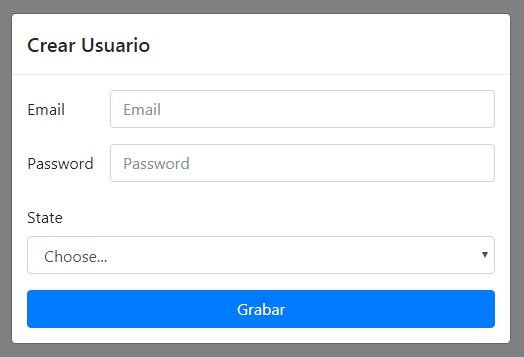
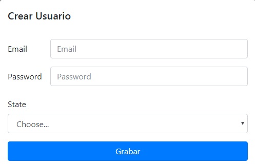
In the bootstrap 4 documentation, there is this example in Forms / Form Row which shows a select with its label one on top of the other. This is my complete form:

<div class="container">

    <div class="modal fade" id="ventana" tabindex="-1" role="dialog" aria-labelledby="exampleModalLabel" aria-hidden="true" data-backdrop="static" data-keyboard="false">
        <div class="modal-dialog" role="document">
            <div class="modal-content">

                <div class="modal-header">
                    <h5 class="modal-title">Crear Usuario</h5>
                </div>

                <div class="modal-body">
                    <form action="index.php" method="POST" enctype="multipart/form-data">

                    <div class="form-group row">
                        <label for="inputEmail3" class="col-sm-2 col-form-label">Email</label>
                        <div class="col-sm-10">
                            <input type="email" class="form-control" id="inputEmail3" placeholder="Email">
                        </div>
                    </div>
                    <div class="form-group row">
                        <label for="inputPassword3" class="col-sm-2 col-form-label">Password</label>
                        <div class="col-sm-10">
                            <input type="password" class="form-control" id="inputPassword3" placeholder="Password">
                        </div>
                    </div>

                    <div class="form-group">
                        <label for="inputState" class="col-xs-2 col-form-label">State</label>
                        <div class="col-xs-10">
                            <select id="inputState" class="form-control">
                                <option selected>Choose...</option>
                                <option>...</option>
                            </select>
                        </div>
                    </div>

                        <input type="submit" value="Grabar" name="grabar" class="btn btn-primary btn-block">
                    </form>
                </div>
            </div>
        </div>
    </div>
</div>

The form is inside a modal window. But the select does not align like the previous fields.

    
asked by Piropeator 24.06.2018 в 08:09
source

1 answer

1

The answer you have in the bootstrap documentation that you have put, there is explained how to put them online, I have put an example with your form, as you will have to put the input element (in your case a select) within a div and put there the space it will occupy in xs or sm so that on small screens it does not look bad.

<link rel="stylesheet" href="https://maxcdn.bootstrapcdn.com/bootstrap/3.3.7/css/bootstrap.min.css" integrity="sha384-BVYiiSIFeK1dGmJRAkycuHAHRg32OmUcww7on3RYdg4Va+PmSTsz/K68vbdEjh4u" crossorigin="anonymous">
<div class="form-group row">
  <label for="inputState" class="col-xs-2 col-form-label">State</label>
  <div class="col-xs-10">
  <select id="inputState" class="form-control">
    <option selected>Choose...</option>
    <option>...</option>
  </select>
  </div>
</div>
    
answered by 24.06.2018 / 13:49
source