How to get a footer to stay in the background without exceeding other elements?

0

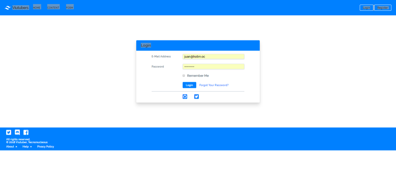
I'm having trouble placing it now with the absolute attribute, the problem is that because of this it works as if it were transparent and the objects go through it.

link

I would like to keep a space so that this does not happen.

I'm using tailwindcss this is the piece of code that belongs to the main div of the footer.

<div style="background-color: #0080ff" class="container bg-grey-lighter absolute pin-b pin-x p-8 pt-3 pb-3">

When used as static, it stays at a fixed point so it does not change depending on the size or resolution of the screen

    
asked by Jhackex MXY 15.06.2018 в 16:50
source

4 answers

0

For the position of the elements depending on the space on the screen or viewport you must use something new from CSS3 which is the units of measure in vh . I leave a link for you to read and you can see Link 1 Link 2

I imagine you have something like this:

<header>
    <!-- TU HEADER -->
</header>
<main style="height: 100vh;">
    <!-- TU FORMULARIO -->
</main>
<footer>
    <!-- TU FOOTER -->
<footer>

Here is where you should play with the height value since as you have a header a main and a footer should not be 100 ai no less. Guide through Internet examples of how to use this new measure of css3

    
answered by 15.06.2018 / 17:47
source
1

you have to put a pocision fixed, bottom 0 and a clear both

example:

  #footer{
    position:fixed;
    bottom:0;
    clear:both;
    width:100%;
    height:100px;

}

Do not put absolute position on it since it will intervene with your other content on the web and another thing use the html5 tags for the footer <footer></footer>

    
answered by 15.06.2018 в 16:57
0

greetings ... the option to use css in this way will serve you this time (REF # 1):

  #footer{
position:fixed;
bottom:0;
clear:both;
width:100%;
height:100px;}

If within a page with content you do this, the footer will be placed on some elements, it will also happen on mobile devices, since position: fixed, keeps the footer fixed and with the rest you keep it down ... I what I do to avoid this is to detect the size of the scroll: reference to the size of the javascript scroll using (REF # 2):

window.pageYOffset;

So I can ask if the scroll is active (REF # 2) it is not necessary to use the CSS above (REF # 1), and if the scroll is not active, I use that css, avoiding causing problems in mobile devices and in other screens .... ALSO LIKE ANOTHER OPTION CREATES A DIV THAT LETS YOUR FORM, AND ADJUST IT TO THE SIZE OF THE SCREEN WITH'window.innerHeight; 'AND YOU REMAIN THE SIZE OF THE FOOTER

    
answered by 15.06.2018 в 18:21
0

In TailWindCSS use the pin class

<div class="relative h-24 w-24 bg-grey-light">
  <div class="pin-x pin-b h-8 bg-grey-darker"></div>
</div>
    
answered by 15.06.2018 в 18:23