How to make a responsive image with css and html

0

What happens is that I have a page where I want that when the page is opened I only see an image and the menu, what happens is that I do it by placing the measurements of my monitor, but obviously not all Monitors are the same, how could I do so that this image covers everything on all monitors in the same way without having to apply it by default pixels?

Example of how I want it:

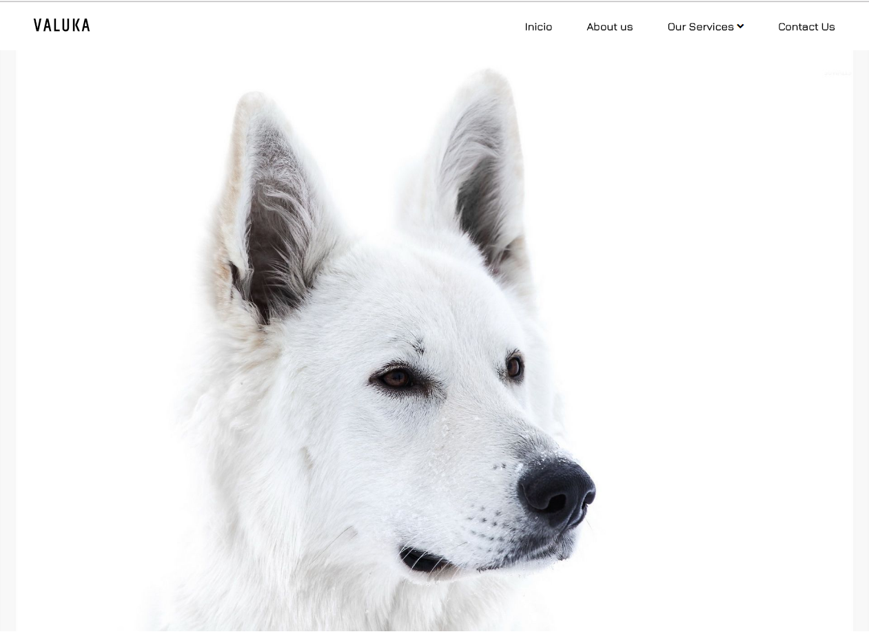
As shown in the image, what I want is that when the page is opened, only that is seen and when it is downloaded, the following content is already there.

Here's the code I have:

@import url('https://fonts.googleapis.com/css?family=Khand');
@import url('https://fonts.googleapis.com/css?family=Jura');
body {
  margin: 0px;
  padding: 0px;
}

nav {
  background: none;
}

header {
  width: auto;
  height: 60px;
  background: transparent;
  position: relative;
}

header ul {
  display: inline-flex;
  list-style: none;
  float: right;
}

header ul li a {
  display: block;
  margin: 10px 0px;
  color: #000;
  text-decoration: none;
  font-family: 'Jura', sans-serif;
  margin-right: 50px;
}

#subcategory {
  color: white;
}

#logo {
  position: absolute;
  margin-top: 15px;
  margin-left: 50px;
  font-family: 'Khand', sans-serif;
  letter-spacing: 3px;
  font-size: 26px;
}


/* Esta es la subcategoria */

header ul ul {
  position: absolute;
  margin-top: 15px;
  display: block;
  /* Esto hace que los ul hijos (las sub catecorias) se pongan debajo del padre (el menu principal) */
  background: #555;
  transform: translateX(60%);
  opacity: 0;
  transition: 0.7s;
  font-family: 'Jura', sans-serif;
}

header ul li:hover ul {
  /* Cuando se pase el mouse, el Ul de la subcategoria pase de tener opacidad 0 a 1 */
  opacity: 1;
  transform: translateX(0%);
}

header ul li:hover #icon {
  opacity: 0;
}


/* Fin de la subcategoria */

.contenido {
  background: url();
}
<link href="https://use.fontawesome.com/releases/v5.0.13/css/all.css" rel="stylesheet" />
<link href="https://fonts.googleapis.com/css?family=Fjalla+One" rel="stylesheet">
<div class="contenido">
  <header>
    <h1 id="logo">VALUKA</h1>
    <ul>
      <li><a href="" title=""><b>Inicio</b></a></li>
      <li><a href="" title=""><b>About us</b></a></li>
      <li><a href="" title=""><b>Our Services</b> <i class="fas fa-angle-down" id="icon"></i></a>
        <!-- SubCategory -->
        <ul>
          <li><a href="" id="subcategory">Lorem1</a></li>
          <li><a href="" id="subcategory">Lorem2</a></li>
          <li><a href="" id="subcategory">Lorem3</a></li>
        </ul>
        <!-- End -->
      </li>
      <li><a href="" title=""><b>Contact Us</b></a></li>
    </ul>
  </header>

  <!--Content  E IMAGEN PRINCIAL-->
  <img src="img/dog.jpg" style="height: 844px;width: 100%;">
</div>
    
asked by Victor Escalona 09.06.2018 в 08:16
source

1 answer

1

I have added a style to it in the header, where it shows an image from the css, I have given it a predetermined height and a width so that it is always 100% from the device from which it is seen:

I do not know if this is what you want to achieve:

<!DOCTYPE html>
<html>
<head>
    <meta charset="utf-8">
    <meta http-equiv="X-UA-Compatible" content="IE=edge">
    <title>Psd to Html</title>
    <link rel="stylesheet" href="css/styles.css">
    <link rel="stylesheet" href="https://use.fontawesome.com/releases/v5.0.13/css/all.css" integrity="sha384-DNOHZ68U8hZfKXOrtjWvjxusGo9WQnrNx2sqG0tfsghAvtVlRW3tvkXWZh58N9jp" crossorigin="anonymous">
    <link href="https://fonts.googleapis.com/css?family=Fjalla+One" rel="stylesheet">

</head>

<style>

#dogbg{background-image:url(img/dog.jpg);background-size: cover; width: 100%; height:700px;box-shadow:0 18px 18px 0 rgba(0,0,0,.2)}

</style>
<body>
<div class="contenido">
    <header>
        <h1 id="logo">VALUKA</h1>
            <ul>
                <li><a href="" title=""><b>Inicio</b></a></li>  
                <li><a href="" title=""><b>About us</b></a></li>
                <li><a href="" title=""><b>Our Services</b> <i class="fas fa-angle-down" id="icon"></i></a>
                <!-- SubCategory -->
                <ul>
                    <li ><a href="" id="subcategory">Lorem1</a></li>
                    <li ><a href="" id="subcategory">Lorem2</a></li>
                    <li ><a href="" id="subcategory">Lorem3</a></li>
                </ul>
                <!-- End -->
                </li>
                <li><a href="" title=""><b>Contact Us</b></a></li>
            </ul>
    </header>

    <div id="dogbg"></div>

</div>

    <h2>Lorem ipsum dolor sit amet, consectetur adipisicing elit. Quo distinctio ducimus repellat cumque a, veniam nulla molestiae repellendus accusamus doloribus hic rem inventore aut doloremque aperiam in necessitatibus, labore dolor alias ipsam nisi fugiat vitae cum. Obcaecati numquam velit officiis temporibus, possimus perferendis dignissimos repellat, provident accusamus quis, quisquam soluta ab porro ut error ducimus quos suscipit rerum praesentium placeat.</h2>

</body>
</html>

Try this code in your index.html and tell me

    
answered by 09.06.2018 в 13:42