How to do this with html and css or what do you recommend

0

Hello for a while I'm trying to do something like this:

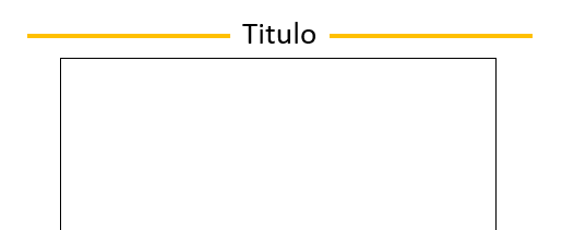
And I would like it not to damage with responsive , that the text stays in the middle and the lines are shrinking according to the screen, every time I do it or it works for me mobile but not desktop or vice versa , I would show you what I had done but it bothered me and I deleted it and I prefer to start fresh with your suggestions

Here what I have if you see well but when you shrink the screen is deformed and the right line is placed over the title (By the way I can not change the color of my hr: C

<!DOCTYPE html> <html lang="en"> <head>
    <meta charset="UTF-8">
    <meta name="viewport" content="width=device-width, initial-scale=1.0">
    <meta http-equiv="X-UA-Compatible" content="ie=edge">
    <link href="https://maxcdn.bootstrapcdn.com/bootstrap/4.0.0-beta.2/css/bootstrap.min.css" rel="stylesheet" integrity="sha384-PsH8R72JQ3SOdhVi3uxftmaW6Vc51MKb0q5P2rRUpPvrszuE4W1povHYgTpBfshb" crossorigin="anonymous">

    <script src="https://maxcdn.bootstrapcdn.com/bootstrap/4.0.0-beta.2/js/bootstrap.min.js" integrity="sha384-alpBpkh1PFOepccYVYDB4do5UnbKysX5WZXm3XxPqe5iKTfUKjNkCk9SaVuEZflJ" crossorigin="anonymous"></script>
    <script src="https://maxcdn.bootstrapcdn.com/bootstrap/4.0.0-beta.2/js/bootstrap.bundle.min.js" integrity="sha384-3ziFidFTgxJXHMDttyPJKDuTlmxJlwbSkojudK/CkRqKDOmeSbN6KLrGdrBQnT2n" crossorigin="anonymous"></script>
    <style>
        #titulo {
            text-align: center;
        }
        hr#linea {
            margin-top: 1rem;
            margin-bottom: 1rem;
            border: 0;
            border-top: 1px solid rgb(60, 9, 9); 
        }
    </style>
    <title>Pruebas</title> </head> <body>

    <div class="container">

        <div class="row" style="background: rgba(128, 128, 128, 0.548); padding: 3rem;">

            <div class="col-5" id="linea">
                <hr>
            </div>

            <div class="col-2" id="titulo">
                <p> TÍTULO</p>
            </div>

            <div class="col-5" id="linea">
                <hr>
            </div>

        </div>

    </div>


</body> </html>
    
asked by Naoto Amari 21.12.2017 в 15:16
source

3 answers

1

Here is a simple example:

I'll explain:

:: before creates a pseudo-element that is the first child of the selected element. It is normally used to add aesthetic content to an element, using the content property. This item is displayed in line with the text by default.

With the title z-index is used to superimpose one on top of the other, if the effect is not used it will be the line crossing all the text

And the rest are only CSS properties.

h2 {
  font: 33px sans-serif;
  margin-top: 30px;
  text-align: center;
}
h2.linea {
  position: relative;
  z-index: 1;
}
h2.linea:before {
  border-top: 2px solid #fff000;
  content: "";
  margin: 0 auto;
  position: absolute;
  top: 50%;
  left: 0;
  right: 0;
  bottom: 0;
  width: 95%;
  z-index: -1;
}
h2.linea span {

  background: #fff;
  padding: 0 15px;
}
<h2 class="linea"><span>Titulo</span></h2>
    
answered by 21.12.2017 / 15:40
source
1

If you know how to do it for both cases, movil and desktop , instead of creating a single style waiting for it to work on both, use @media to make different styles depending on the device:

/* ---- Móviles en horizontal o tablets en vertical ---- */
@media (min-width: 768px) {
    //aqui dentro el estilo para estos dispositivos
}

/* ---- Tablets en horizontal y escritorios normales  ----  / */
@media (min-width: 1024px) {
  ...
}

and so on, define a style responsive for an application responsive

    
answered by 21.12.2017 в 15:23
-1

The idea is to add a bottom line with ::after to the element in this case is a h1 and then the span within the overlay on the line with z-index greater than ::after and ready you already have the desired effect.

I hope you help greetings


NOTE: For the next question please add an example of your code (Do not delete it) because this way we help you better and solve the problem in your same code greetings

:: after (: after)

The pseudo-CSS element :: after matches the last virtual child of the selected element. It is generally used to add aesthetic content to an element, using the CSS content. This item is displayed in line with the text by default.

Syntax

/* CSS3 syntax */
::after

/* CSS2 syntax */
:after
  

The notation :: after (with double symbol :) was introduced in CSS 3 to establish the difference between pseudo-classes and pseudo-elements. The browsers also accept the notation: after introduced in CSS 2.

:: before (: before)

:: before creates a pseudo-element that is the first child of the selected element. It is normally used to add aesthetic content to an element, using the content property. This item is displayed in line with the text by default.

Syntax

/* CSS3 syntax */
::before

/ * CSS2 syntax * /    : before


The :: before notation (with two symbols :) was introduced in CSS3 to establish the difference between pseudo-classes and pseudo-elements. Browsers also accept the : before notation, introduced in CSS 2.

Functional Example

h1 {
  text-align: center;
  position:relative;
}
h1 span {
background:#fff;
z-index:100;
position:relative;
padding:15px;
}
h1::after  {
  content: '';
  position: absolute;
  width:100%;
  height:2px;
  left:0px;
  top:50%;
  background: rgb(217, 232, 49);
  z-index:50;
}

p {
  border:1px solid #000;
  padding:20px;
}
<h1><span>Titulo</span></h1>
  <p>Lorem ipsum dolor sit amet, consectetur adipisicing elit, sed do eiusmod tempor incididunt ut labore et dolore magna aliqua. Ut enim ad minim veniam, quis nostrud exercitation ullamco laboris nisi ut aliquip ex ea commodo consequat. Duis aute irure dolor in reprehenderit in voluptate velit esse cillum dolore eu fugiat nulla pariatur. Excepteur sint occaecat cupidatat non proident, sunt in culpa qui officia deserunt mollit anim id est laborum.</p>
    
answered by 21.12.2017 в 15:53