How to position buttons next to each other?

0

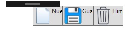
I am working with WPF, Visual Studio 2015, in which I want to place buttons next to each other as well as this image.

I've only been able to achieve this.

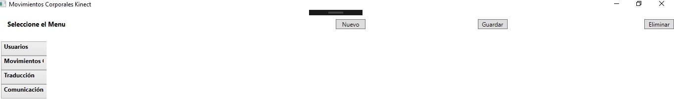
This is the XAML code that I am occupying, what I did was put a Grid with two columns and a row in which in the first I put Select the Menu , and on the other side the buttons .

<Grid>
    <StackPanel Orientation="Vertical">

        <StackPanel>
            <Grid>
                <Grid.ColumnDefinitions>
                    <ColumnDefinition/>
                    <ColumnDefinition/>
                </Grid.ColumnDefinitions>
                <Grid.RowDefinitions>
                    <RowDefinition/>
                </Grid.RowDefinitions>
                <TextBlock Text="Seleccione el Menu" FontWeight="Bold" FontSize="13" Margin="20" Grid.Column="0" Grid.Row="0"/>
                <Button Width="60" Height="20" HorizontalAlignment="Left" Grid.Column="1" Grid.Row="0" Content="Nuevo"/>
                <Button Width="60" Height="20" Grid.Column="1" Grid.Row="0" Content="Guardar" HorizontalAlignment="Center" Margin="-50,0,0,0"/>
                <Button Width="60" Height="20" Grid.Column="1" Grid.Row="0" Content="Eliminar" Margin="-195,0,0,0" HorizontalAlignment="Right"/>
            </Grid>
        </StackPanel>

        <View:MyTabControl x:Name="currentTabControl" Margin="5"/>

    </StackPanel>

</Grid>

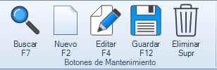
How can I make it look like the buttons on the first image?

I have already managed to put the images and the text on the button, but the text can not be put under the image, I occupy the following code.

<Grid>
    <StackPanel Orientation="Vertical">
        <StackPanel>
            <Grid>
                <Grid.ColumnDefinitions>
                    <ColumnDefinition/>
                    <ColumnDefinition/>
                </Grid.ColumnDefinitions>
                <Grid.RowDefinitions>
                    <RowDefinition/>
                </Grid.RowDefinitions>
                <TextBlock Text="Seleccione el Menu" FontWeight="Bold" FontSize="13" Margin="20" Grid.Column="0" Grid.Row="0"/>
                <StackPanel Orientation="Horizontal" Grid.Column="1" Grid.Row="0">
                    <Button x:Name="btnMNuevo" Width="60" Height="40"  Grid.Column="1" Grid.Row="0">
                        <DockPanel>
                            <Image Source="/Imagenes/New.png"/>
                            <TextBlock Text="Nuevo" TextAlignment="Left"/>
                        </DockPanel>
                    </Button>
                    <Button x:Name="btnMGuardar" Width="60" Height="40" Grid.Column="1" Grid.Row="0">
                        <DockPanel>
                            <Image Source="/Imagenes/save.png"/>
                            <TextBlock Text="Guardar" Margin="0"/>
                        </DockPanel>
                    </Button>
                    <Button x:Name="btnMEliminar" Width="60" Height="40" Grid.Column="1" Grid.Row="0">
                        <DockPanel>
                            <Image Source="/Imagenes/delete.png"/>
                            <TextBlock Text="Eliminar"/>
                        </DockPanel>
                    </Button>
                </StackPanel>
            </Grid>
        </StackPanel>

        <View:MyTabControl x:Name="currentTabControl" Margin="5"/>

    </StackPanel>

</Grid>

    
asked by Pedro Ávila 08.10.2017 в 17:11
source

1 answer

1

As a general issue it is not good to repeat code as well as to use controls within redundant controls.

To avoid what you have done, always try to create a custom control inheriting the one you want to modify, in this case a Button, with this you can inherit all its functionalities.

I hope this can help you.

Control:

This is a CustomControl which you can modify, add functionalities in this case an image.

public class ImageButton : Button
{
    public static readonly DependencyProperty ImageSourceProperty = DependencyProperty.Register(
        "ImageSource", typeof(ImageSource), typeof(ImageButton), new PropertyMetadata(default(ImageSource)));

    public ImageSource ImageSource
    {
        get { return (ImageSource) GetValue(ImageSourceProperty); }
        set { SetValue(ImageSourceProperty, value); }
    }
}

The next case is to create the style for the control created "ImageButton", with this you can change its appearance; This code can be put inside a Dictionary of resources, so that it can be used by all your application and not repeat the Style in each window

<Window.Resources>
    <Style x:Key="WrappingStyle" TargetType="{x:Type TextBlock}" >
            <Setter Property="TextWrapping" Value="Wrap"/>
            <Setter Property="HorizontalAlignment" Value="Center"/>
            <Setter Property="TextAlignment" Value="Center"/>
        </Style>

    <Style x:Key="ButtonFocusVisual">
        <Setter Property="Control.Template">
            <Setter.Value>
                <ControlTemplate>
                    <Rectangle Margin="2" SnapsToDevicePixels="true" Stroke="{DynamicResource {x:Static SystemColors.ControlTextBrushKey}}" StrokeThickness="1" StrokeDashArray="1 2"/>
                </ControlTemplate>
            </Setter.Value>
        </Setter>
    </Style>
    <LinearGradientBrush x:Key="ButtonNormalBackground" EndPoint="0,1" StartPoint="0,0">
        <GradientStop Color="#F3F3F3" Offset="0"/>
        <GradientStop Color="#EBEBEB" Offset="0.5"/>
        <GradientStop Color="#DDDDDD" Offset="0.5"/>
        <GradientStop Color="#CDCDCD" Offset="1"/>
    </LinearGradientBrush>
    <SolidColorBrush x:Key="ButtonNormalBorder" Color="#FF707070"/>
    <Style x:Key="ButtonStyle" TargetType="{x:Type controls:ImageButton}">
        <Setter Property="FocusVisualStyle" Value="{StaticResource ButtonFocusVisual}"/>
        <Setter Property="Background" Value="{StaticResource ButtonNormalBackground}"/>
        <Setter Property="BorderBrush" Value="{StaticResource ButtonNormalBorder}"/>
        <Setter Property="BorderThickness" Value="1"/>
        <Setter Property="Foreground" Value="{DynamicResource {x:Static SystemColors.ControlTextBrushKey}}"/>
        <Setter Property="HorizontalContentAlignment" Value="Center"/>
        <Setter Property="VerticalContentAlignment" Value="Center"/>
        <Setter Property="Padding" Value="1"/>
        <Setter Property="Margin" Value="2,0"/>
        <Setter Property="Template">
            <Setter.Value>
                <ControlTemplate TargetType="{x:Type controls:ImageButton}">
                    <Themes:ButtonChrome x:Name="Chrome" BorderBrush="{TemplateBinding BorderBrush}" Background="{TemplateBinding Background}" RenderMouseOver="{TemplateBinding IsMouseOver}" RenderPressed="{TemplateBinding IsPressed}" RenderDefaulted="{TemplateBinding IsDefaulted}" SnapsToDevicePixels="true">
                        <Grid>
                            <Grid.RowDefinitions>
                                <RowDefinition Height="*"/>
                                <RowDefinition Height="Auto"/>
                            </Grid.RowDefinitions>
                            <Image x:Name="imageBtn" Source="{TemplateBinding ImageSource}" Margin="2" VerticalAlignment="Stretch"/>
                            <ContentPresenter Grid.Row="1" HorizontalAlignment="{TemplateBinding HorizontalContentAlignment}" Margin="{TemplateBinding Padding}" RecognizesAccessKey="True" SnapsToDevicePixels="{TemplateBinding SnapsToDevicePixels}" VerticalAlignment="{TemplateBinding VerticalContentAlignment}" FlowDirection="LeftToRight">
                                <ContentPresenter.Resources>
                                    <Style TargetType="{x:Type TextBlock}" BasedOn="{StaticResource WrappingStyle}"/>
                                </ContentPresenter.Resources>
                            </ContentPresenter>
                        </Grid>
                    </Themes:ButtonChrome>
                    <ControlTemplate.Triggers>
                        <Trigger Property="IsKeyboardFocused" Value="true">
                            <Setter Property="RenderDefaulted" TargetName="Chrome" Value="true"/>
                        </Trigger>
                        <Trigger Property="ToggleButton.IsChecked" Value="true">
                            <Setter Property="RenderPressed" TargetName="Chrome" Value="true"/>
                        </Trigger>
                        <Trigger Property="IsEnabled" Value="false">
                            <Setter Property="Foreground" Value="#ADADAD"/>
                        </Trigger>
                    </ControlTemplate.Triggers>
                </ControlTemplate>
            </Setter.Value>
        </Setter>
    </Style>
</Window.Resources>

<Grid>
    <Grid.ColumnDefinitions>
        <ColumnDefinition Width="Auto"/>
        <ColumnDefinition Width="Auto"/>
        <ColumnDefinition Width="Auto"/>
        <ColumnDefinition Width="Auto"/>
    </Grid.ColumnDefinitions>
    <controls:ImageButton Style="{StaticResource ButtonStyle}" Width="45" Height="60" Content="Buscar F7" 
        ImageSource="Resources/search.png"/>
    <controls:ImageButton Grid.Column="1" Style="{StaticResource ButtonStyle}" Width="45" Height="60" Content="Buscar F7" 
        ImageSource="Resources/search.png"/>
    <controls:ImageButton Grid.Column="2" Style="{StaticResource ButtonStyle}" Width="45" Height="60" Content="Buscar F7" 
        ImageSource="Resources/search.png"/>
    <controls:ImageButton Grid.Column="3" Style="{StaticResource ButtonStyle}" Width="45" Height="60" Content="Buscar F7" 
        ImageSource="Resources/search.png"/>
</Grid>
  • To use the control you just have to call the control from the view where you want to use it, assigning in casd ImageSource, the image which you want to use, remember that when you inherit from a button they have all its functionalities.

Greetings.

    
answered by 24.10.2017 в 12:08