I'm working on a website, I'm not good at design,
I have a section with background of an image, then about 4 images which are reproduced automatically,
The problem is when it comes to testing it on a cell phone the section has a size and the imaegenes other
Thanks
this is the test link:

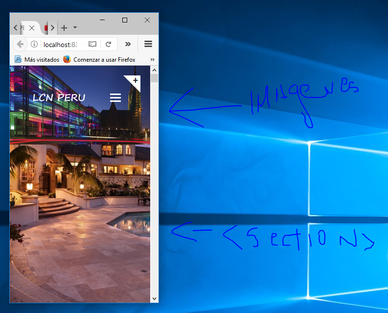
I leave the html code:
<section id="text-carousel-intro-section" class="parallax" data-stellar-background-ratio="0.5" style="background-image: url(img/intro-bg/intro-bg-5.jpg);">

                    <!-- Begin cover
                    <div class="cover"><div class="cover-inner"></div></div>-->
                    <!-- End cover -->
                    <img class="mySlides wow bounceInLeft" src="img/intro-bg/intro-bg-6.jpg" style="width:100%">
                    <img class="mySlides wow bounceInLeft" src="img/intro-bg/intro-bg-5.jpg" style="width:100%">
                    <img class="mySlides wow bounceInLeft" src="img/intro-bg/intro-bg-4.jpg" style="width:100%">
                    <img class="mySlides wow bounceInLeft" src="img/intro-bg/intro-bg-3.jpg" style="width:100%">
                    <img class="mySlides wow bounceInLeft" src="img/intro-bg/intro-bg-2.jpg" style="width:100%">

                    <div class="container">
                        <div class="caption text-center text-white" data-stellar-ratio="0.5">


                        </div> <!-- /.caption -->
                    </div> <!-- /.container -->

                </section>