Navbar Aside Left Height 100%

0

I know that many know SB Admin 2, I'm doing something similar but I have a question about how to put the Navbar on the left that takes 100% of the top of the page as a aside; As it is in the image:

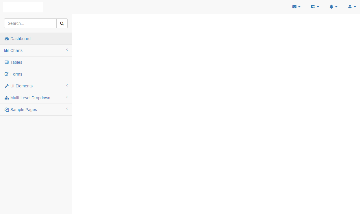
Please keep in mind that I also want the Navbar at the top of the page.

    <!DOCTYPE html>
    <html lang="en">
    <head>
        <meta charset="UTF-8">
        <meta name="viewport" content="width=device-width, initial-scale=1">
        <link rel="stylesheet" href="<?php echo RUTA;?>/css/bootstrap.min.css">
        <link rel="stylesheet" href="<?php echo RUTA;?>/css/style.css">
        <script src="<?php echo RUTA;?>/js/jquery.min.js"></script>
        <script src="<?php echo RUTA;?>/js/bootstrap.min.js"></script>
        <title>Login BoardRoster</title>
    </head>
    <body>


      <nav class="navbar navbar-default">
        <div class="container-fluid">
          <div class="navbar-header">
            <button type="button" class="navbar-toggle collapsed" data-toggle="collapse" data-target="#menu">
              <span class="sr-only">Toggle navigation</span>
              <span class="icon-bar"></span>
              <span class="icon-bar"></span>
              <span class="icon-bar"></span>
            </button>
            <a class="navbar-brand" href="<?php echo RUTA; ?>"><img src="<?php echo RUTA; ?>/img/logo.png" alt="Nomina - OldMutual">
            </a>
          </div>
          <div id="menu" class="navbar-collapse collapse">
            <ul class="nav navbar-nav  navbar-right">
              <li class=""><a href="#">Home</a></li>
              <li><a href="#"><span class="glyphicon glyphicon-envelope"></span></a></li>
              <li><a href="#">Contact</a></li>
              <li class="dropdown">
                <a href="#" class="dropdown-toggle" data-toggle="dropdown" role="button" aria-expanded="false">Dropdown <span class="caret"></span></a>
                <ul class="dropdown-menu" role="menu">
                  <li><a href="#">Action</a></li>
                  <li><a href="#">Another action</a></li>
                  <li><a href="#">Something else here</a></li>
                  <li class="divider"></li>
                  <li class="dropdown-header">Nav header</li>
                  <li><a href="#">Separated link</a></li>
                  <li><a href="#">One more separated link</a></li>
                </ul>
              </li>
            </ul>
          </div>
          <!--/.nav-collapse -->
        </div>
        <!--/.container-fluid -->
      </nav>

      <nav style="width: 20%;" class="navbar navbar-default">
        <div class="container-fluid">
          <div id="menu" class="navbar-collapse collapse">
            <ul class="nav navbar-nav">
              <li class=""><a href="#">Home</a></li>
              <li><a href="#"><span class="glyphicon glyphicon-envelope"></span></a></li>
              <li><a href="#">Contact</a></li>
              <li class="dropdown">
                <a href="#" class="dropdown-toggle" data-toggle="dropdown" role="button" aria-expanded="false">Dropdown <span class="caret"></span></a>
                <ul class="dropdown-menu" role="menu">
                  <li><a href="#">Action</a></li>
                  <li><a href="#">Another action</a></li>
                  <li><a href="#">Something else here</a></li>
                  <li class="divider"></li>
                  <li class="dropdown-header">Nav header</li>
                  <li><a href="#">Separated link</a></li>
                  <li><a href="#">One more separated link</a></li>
                </ul>
              </li>
            </ul>
          </div>
          <!--/.nav-collapse -->
        </div>
        <!--/.container-fluid -->
      </nav>
            <h1>Testing</h1>
</body>
</html>

I want to make it similar or equal to Sb Admin 2, that the menu or navbar located on the left occupies 100% of the top of the page, and that in the center or div.container you can put the content of the web.

    
asked by ByGroxD 27.02.2017 в 16:51
source

3 answers

1

You can use flex box for what you are trying to achieve, taking into account that the aside and the container must have the same height and at least 100%, with the following example it would be useful:

<!DOCTYPE html>
<html lang="en">
<head>
  <meta charset="UTF-8">
  <title>Document</title>
  <style>
     html,body {margin: 0;padding: 0}
    .menu-principal {width: 100%; height: 50px; background: red}
    .caja-flex {display:flex; min-height: calc(100vh - 50px)}
    .aside {width: 20%; background: #ccc}
    .container {width: auto; background: orange}
  </style>
</head>
<body>
  <nav class="menu-principal"></nav>
  <div class="caja-flex">
    <nav class="aside"></nav>
    <div class="container">
      <p>Lorem ipsum dolor sit amet, consectetur adipisicing elit. Incidunt quae nobis voluptatum placeat nisi reiciendis impedit voluptates, minima quam cumque, sit aut dignissimos est et a, ad asperiores repellat ab.</p>
      <p>Lorem ipsum dolor sit amet, consectetur adipisicing elit. Incidunt quae nobis voluptatum placeat nisi reiciendis impedit voluptates, minima quam cumque, sit aut dignissimos est et a, ad asperiores repellat ab.</p>
      <p>Lorem ipsum dolor sit amet, consectetur adipisicing elit. Incidunt quae nobis voluptatum placeat nisi reiciendis impedit voluptates, minima quam cumque, sit aut dignissimos est et a, ad asperiores repellat ab.</p>
      <p>Lorem ipsum dolor sit amet, consectetur adipisicing elit. Incidunt quae nobis voluptatum placeat nisi reiciendis impedit voluptates, minima quam cumque, sit aut dignissimos est et a, ad asperiores repellat ab.</p>
   </div>
  </div>
</body>
</html>

You can see the example running in codepen:

link

    
answered by 28.02.2017 / 11:18
source
0

if you add the following in your stylesheet:

html,body,.side-nav{
  height: 100%;
}
<nav style="width: 20%;" class="side-nav navbar navbar-default">

To the second nav that is the one on the left you add only the class side-nav so it will take the height of the whole page.

    
answered by 27.02.2017 в 17:26
0

Change the percentage unit ℅ to view height. ( vh ) and it will take the size of the window height

.side-nav{ height: 100vh; }

That unit works with the viewport and takes the measurements of the window or device.

Also, what you want is that you do not go through the page, you must add the property position: fixed so that it follows its position during the scroll

    
answered by 28.02.2017 в 09:03