Generate DNA structure with HTML AND CSS

3

How to create a DNA structure using html CSS that at the same time is in motion, like the following image:

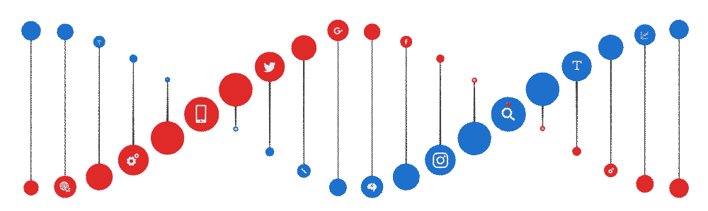
but using HTML CSS and if necessary jQuery and this vertical mind structure?

I have the following código html but it would be a bit more similar to the img

z-border-radius: 0.8em;
  -webkit-border-radius: 0.8em;
  color: #ffffff;
  display: inline-block;
  font-weight: bold;
  line-height: 1.6em;
  margin-right: 15px;
  text-align: center;
  width: 1.6em; 
}

span.grey {
  background: #cccccc;
  border-radius: 0.8em;
  -moz-border-radius: 0.8em;
  -webkit-border-radius: 0.8em;
  color: #fff;
  display: inline-block;
  font-weight: bold;
  line-height: 1.6em;
  margin-right: 15px;
  text-align: center;
  width: 1.6em; 
}

span.green {
  background: #5EA226;
  border-radius: 0.8em;
  -moz-border-radius: 0.8em;
  -webkit-border-radius: 0.8em;
  color: #ffffff;
  display: inline-block;
  font-weight: bold;
  line-height: 1.6em;
  margin-right: 15px;
  text-align: center;
  width: 1.6em; 
}

span.blue {
  background: #5178D0;
  border-radius: 0.8em;
  -moz-border-radius: 0.8em;
  -webkit-border-radius: 0.8em;
  color: #ffffff;
  display: inline-block;
  font-weight: bold;
  line-height: 1.6em;
  margin-right: 15px;
  text-align: center;
  width: 1.6em; 
}

span.pink {
  background: #EF0BD8;
  border-radius: 0.8em;
  -moz-border-radius: 0.8em;
  -webkit-border-radius: 0.8em;
  color: #ffffff;
  display: inline-block;
  font-weight: bold;
  line-height: 1.6em;
  margin-right: 15px;
  text-align: center;
  width: 1.6em; 
}
<body  >	 
	<h1><span class="blue">1</span><span>_____________ </span><span class="pink">1</span></h1>
	 
	<h1><span class="blue">2</span><span>_____________ </span><span class="pink">2</span></h1>
	 
	<h1><span class="blue">3</span><span>_____________ </span><span class="pink">3</span></h1>
	<h1><span class="blue">4</span><span>_____________ </span><span class="pink">4</span></h1>
	 
	<h1><span class="blue">4</span><span>_____________ </span><span class="pink">5</span></h1>
	 
	<h1><span class="blue">6</span><span>_____________ </span><span class="pink">6</span></h1>
	<h1><span class="blue">7</span><span>_____________ </span><span class="pink">7</span></h1>
	 
	<h1><span class="blue">8</span><span>_____________ </span><span class="pink">8</span></h1>
	 
	<h1><span class="blue">9</span><span>_____________ </span><span class="pink">9</span></h1>


</body>
    
asked by Soldier 29.11.2018 в 21:51
source

1 answer

0

You can get something similar in the following way:

  • Use the rotateY property, which receives values from 0 to 360 °, this will allow you to rotate the html component on the vertical axis
  • Turn the div so that it is lying down as in the example
  • Create an animation using a @keyframes block where you modify the property of point 1
  • for each child adds a different delay in a progressive interval by property animation-delay
  •  /* WebKit and Opera browsers */
    
     @-webkit-keyframes spinner {
       from {
         -webkit-transform: rotateY(0deg);
       }
       to {
         -webkit-transform: rotateY(-360deg);
       }
     }
    
     /* all other browsers */
    
     @keyframes spinner {
       from {
         -moz-transform: rotateY(0deg);
         -ms-transform: rotateY(0deg);
         transform: rotateY(0deg);
       }
       to {
         -moz-transform: rotateY(-360deg);
         -ms-transform: rotateY(-360deg);
         transform: rotateY(-360deg);
       }
     }
    
     #stage {
       margin: 1em auto;
       -webkit-perspective: 1400px;
       -moz-perspective: 1400px;
       -ms-perspective: 1400px;
       perspective: 1400px;
       
       /* Safari */
    -webkit-transform: rotate(-90deg);
    
    /* Firefox */
    -moz-transform: rotate(-90deg);
    
    /* IE */
    -ms-transform: rotate(-90deg);
    
    /* Opera */
    -o-transform: rotate(-90deg);
     }
    
     #spinner *{
       -webkit-animation-name: spinner;
       -webkit-animation-timing-function: linear;
       -webkit-animation-iteration-count: infinite;
       -webkit-animation-duration: 6s;
       animation-name: spinner;
       
       animation-timing-function: linear;
       animation-iteration-count: infinite;
       animation-duration: 6s;
       -webkit-transform-style: preserve-3d;
       -moz-transform-style: preserve-3d;
       -ms-transform-style: preserve-3d;
       transform-style: preserve-3d;
     }
    
    #spinner *:nth-child(1) { 
      animation-delay: -1.9s;
    }
    
    #spinner *:nth-child(2) { 
      animation-delay: -2s;
    }
    
    #spinner *:nth-child(3) { 
      animation-delay: -2.3s;
    }
    
    #spinner *:nth-child(4) { 
      animation-delay: -2.4s;
    }
    
    #spinner *:nth-child(5) { 
      animation-delay: -2.6s;
    }
    
    #spinner *:nth-child(6) { 
      animation-delay: -2.8s;
    }
    
    #spinner *:nth-child(7) { 
      animation-delay: -3.0s;
    }
    
    #spinner *:nth-child(8) { 
      animation-delay: -3.2s;
    }
    
    #spinner *:nth-child(9) { 
      animation-delay: -3.4s;
    }
    
     #spinner:hover {
       -webkit-animation-play-state: paused;
       animation-play-state: paused;
     }
    
    span.grey {
      background: #cccccc;
      border-radius: 0.8em;
      -moz-border-radius: 0.8em;
      -webkit-border-radius: 0.8em;
      color: #fff;
      display: inline-block;
      font-weight: bold;
      line-height: 1.6em;
      margin-right: 15px;
      text-align: center;
      width: 1.6em; 
    }
    
    span.green {
      background: #5EA226;
      border-radius: 0.8em;
      -moz-border-radius: 0.8em;
      -webkit-border-radius: 0.8em;
      color: #ffffff;
      display: inline-block;
      font-weight: bold;
      line-height: 1.6em;
      margin-right: 15px;
      text-align: center;
      width: 1.6em; 
    }
    
    span.blue {
      background: #5178D0;
      border-radius: 0.8em;
      -moz-border-radius: 0.8em;
      -webkit-border-radius: 0.8em;
      color: #ffffff;
      display: inline-block;
      font-weight: bold;
      line-height: 1.6em;
      margin-right: 15px;
      text-align: center;
      width: 1.6em; 
    }
    
    span.pink {
      background: #EF0BD8;
      border-radius: 0.8em;
      -moz-border-radius: 0.8em;
      -webkit-border-radius: 0.8em;
      color: #ffffff;
      display: inline-block;
      font-weight: bold;
      line-height: 1.6em;
      margin-right: 15px;
      text-align: center;
      width: 1.6em; 
    }
    <div style="background: rgba(0,0,0,0.9);">
    <div id="stage">
      <div id="spinner" style="text-align: center; color: #fff;">
        <h1><span class="blue">1</span><span>_____________ </span><span class="pink">1</span></h1>
    
        <h1><span class="blue">2</span><span>_____________ </span><span class="pink">2</span></h1>
    
        <h1><span class="blue">3</span><span>_____________ </span><span class="pink">3</span></h1>
        <h1><span class="blue">4</span><span>_____________ </span><span class="pink">4</span></h1>
    
        <h1><span class="blue">4</span><span>_____________ </span><span class="pink">5</span></h1>
    
        <h1><span class="blue">6</span><span>_____________ </span><span class="pink">6</span></h1>
        <h1><span class="blue">7</span><span>_____________ </span><span class="pink">7</span></h1>
    
        <h1><span class="blue">8</span><span>_____________ </span><span class="pink">8</span></h1>
    
        <h1><span class="blue">9</span><span>_____________ </span><span class="pink">9</span></h1>
    
      </div>
    </div>
        
    answered by 30.11.2018 / 03:24
    source