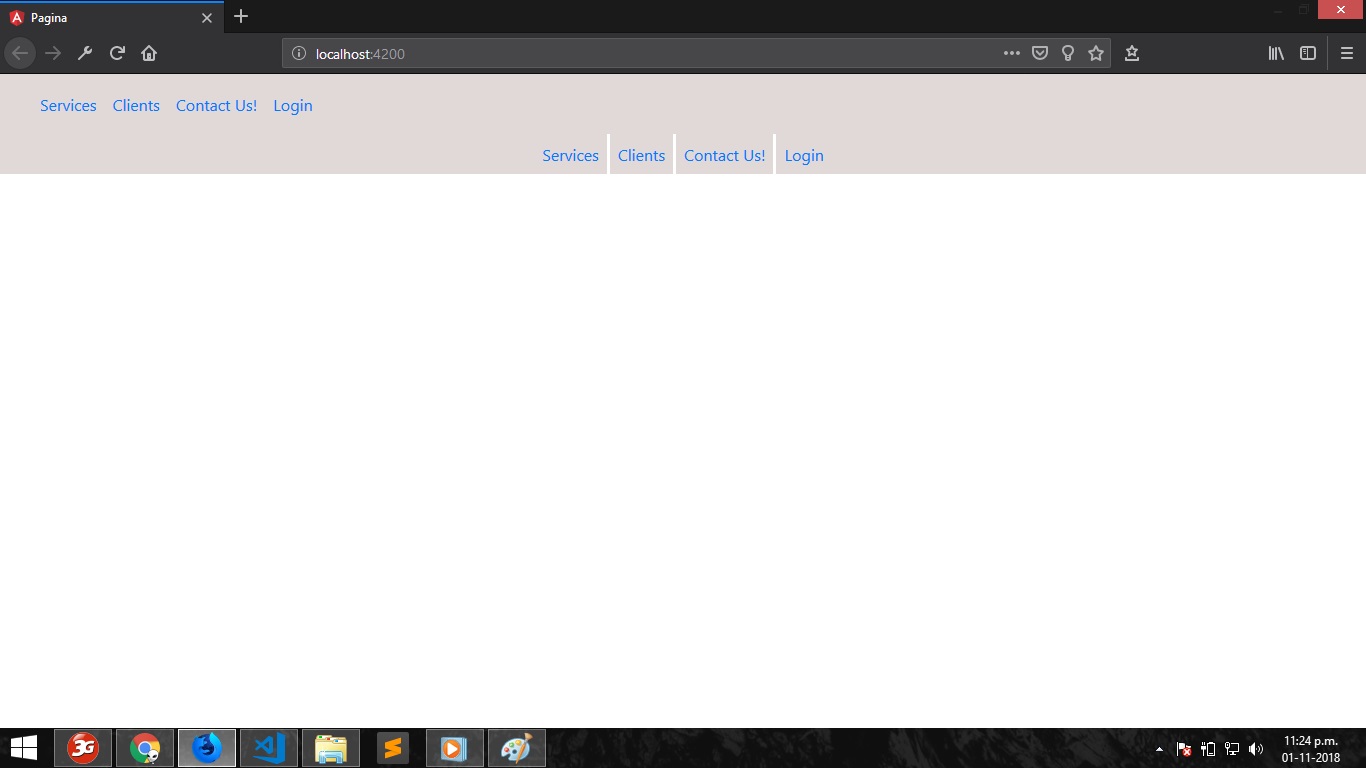
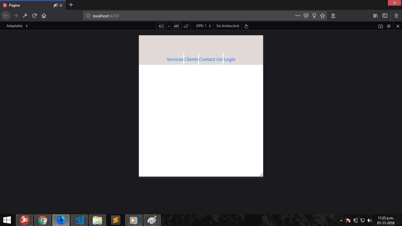
I'm new with Bootstrap, I want to develop a navigation menu similar to the one on the following web page: grab.com , currently I am trying to do the part of the submenus, what I want to achieve is that effect that is activated by clicking on any of the menu links, that is, a submenu appears below the navigation bar. In the documentation of Bootstrap they explain how to make a submenu but it appears with a different style, what I want to achieve is an effect equal to that of the page mentioned above. It is important to note that the effect is already achieved with the Collapse component but the problem is that it is out of the navigation bar and when resizing the screen it does not adapt with the other links in the navigation bar, there is surely a better way to do it but I have not found the solution, I hope someone can help me out. Attached some captures.
Here is my code: '
Services Clients Contact Us! Login
<div class="collapse navbar-expand-lg multi-collapse" id="multiCollapseExample1">
  <div id="barra-secundaria">
    <ul class="navbar-nav mr-auto flex-row justify-content-center">
      <li class="nav-item" id="enlaces">
        <a class="nav-link" data-toggle="collapse" href="#multiCollapseExample1" aria-expanded="false" aria-controls="multiCollapseExample1">Services</a>
      </li>
      <li class="nav-item" id="enlaces">
        <a class="nav-link" href="#">Clients</a>
      </li>
      <li class="nav-item" id="enlaces">
        <a class="nav-link" id="pills-home-tab" data-toggle="pill" href="#pills-home" role="tab" aria-controls="pills-home" aria-selected="true">Contact Us!</a>
      </li>
      <li class="nav-item">
        <a class="nav-link" href="#">Login</a>
      </li>
    </ul>
  </div>
</div>'
Here I leave some views of how it looks in desktop and mobile resolution: