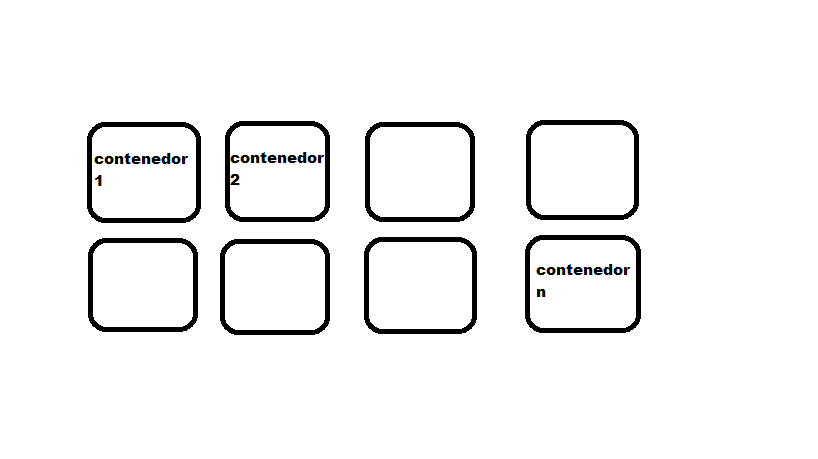
Look, try this, I think that's what you get.
This css style add it to the divs you want
.borde2{
    /*height: 30px;*/
    overflow:auto;
    max-height: 50px;
    word-wrap:break-word;
    -ms-word-break: break-all;
     word-break: break-all;

     // Non standard for webkit
     word-break: break-word;
-webkit-hyphens: auto;
   -moz-hyphens: auto;
    -ms-hyphens: auto;
        hyphens: auto;
    margin-bottom: 2%;
    border: 1px solid #dad8d8;
    padding-top: 10px;
    padding-bottom: 15px;
  }


<div class="content-header">
  <div class="container row">
    <div class="col-lg-3 input-group borde2">
      <label for="nombre9" class="col-form-label col-lg-12">1 CONTENEDOR DE 1 FILA</label>
    </div>
    <div class="col-lg-3 input-group">
      <label for="nombre9" class="col-form-label col-lg-12">2 CONTENEDOR DE 1 FILA</label>
    </div>
    <div class="col-lg-3 input-group borde2">
      <label for="nombre9" class="col-form-label col-lg-12">3 CONTENEDOR DE 1 FILA</label>
    </div>
    <div class="col-lg-3 input-group">
      <label for="nombre9" class="col-form-label col-lg-12">4 CONTENEDOR DE 1 FILA</label>
    </div>
    <div class="col-lg-3 input-group borde2">
      <label for="nombre9" class="col-form-label col-lg-12">1 CONTENEDOR DE 1 FILA</label>
    </div>
  </div>
  <div class="container row">
    <div class="col-lg-3 input-group borde2">
      <label for="nombre9" class="col-form-label col-lg-12">1 CONTENEDOR DE 2 FILA</label>
    </div>
    <div class="col-lg-3 input-group">
      <label for="nombre9" class="col-form-label col-lg-12">2 CONTENEDOR DE 2 FILA</label>
    </div>
    <div class="col-lg-3 input-group borde2">
      <label for="nombre9" class="col-form-label col-lg-12">3 CONTENEDOR DE 2 FILA</label>
    </div>
    <div class="col-lg-3 input-group borde2">
      <label for="nombre9" class="col-form-label col-lg-12">4 CONTENEDOR DE 2 FILA</label>
    </div>
    <div class="col-lg-3 input-group borde2">
      <label for="nombre9" class="col-form-label col-lg-12">1 CONTENEDOR DE 2 FILA</label>
    </div>
  </div>
</div>
Update : Navigating on the web compile this css in which you only change the heigth and it is ready never to leave or for the sides, because it gives you the necessary script, (you must have defined the type of tongue in the html if you want to put the script "-" at the end of the words that do not reach to be complete) and also remains as with scroll so that if you pass the size you defined vertically
I hope it's useful for you, you tell me how it went for you