Adjust CSS text and container

2

Good afternoon,

I had two queries that may be easy to solve.

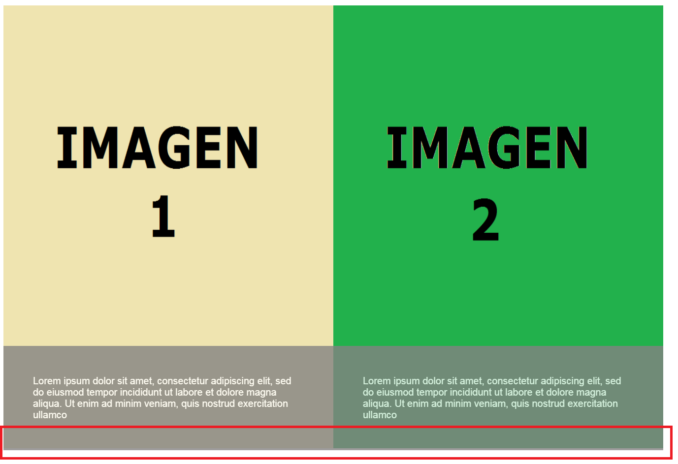
I have placed a gray box at the bottom of two images to show text. Actually at the end it will be a collection of 9 images, but I wanted to see the effect on two images first (attachment capture).

My two questions are the following:

  • In both images the box slides a bit below, how could you make it stay on the edge of the image?

  • When I type more or less text, the gray box is resized. Would there be any possibility of leaving it in fixed size?

Here is the code:

<style>
   .img-texto {
    position: relative;
    float: left;
   }
   .img-texto span {
    position: absolute;
    bottom: 0;
    left: 0;
    right: 0;
    z-index: 999;
    background: #848282;
    padding: 60px;
    color: #fff;
    font-family: sans-serif;
    opacity:0.8;
    font-size: 20px;
    }

</style>

    <div class="img-texto">
    <img src="img/img1.png" alt="" height="900" width="670" />
    <span>Lorem ipsum dolor sit amet, consectetur adipiscing elit, sed do eiusmod tempor incididunt ut labore et dolore magna aliqua. Ut enim ad minim veniam, quis nostrud exercitation ullamco</span>
    </div>
    <div class="img-texto">
    <img src="img/img2.png" alt="" height="900" width="670" />
    <span>Lorem ipsum dolor sit amet, consectetur adipiscing elit, sed do eiusmod tempor incididunt ut labore et dolore magna aliqua. Ut enim ad minim veniam, quis nostrud exercitation ullamco</span>
    </div>

Can you help me out please?

Thank you very much :-)

    
asked by D.R. 22.11.2017 в 13:50
source

6 answers

3

I have several recommendations to make for the solution to your problem:

  • Get used to resetting the values that browsers default to the properties margin and padding , for this you can use the universal selector of css.

    *{
        margin: 0;
        padding: 0;
    }
    
  • You do not control the size of an element by placing the attributes width and height directly on the label, for that CSS exists and you can do it from there.

  • The size must have the container .img-texto and not the label <img>

  • You must be organized in the structure of your node flow, if you are going to have information in text (title and description) why do not you place a <div class="informacion"></div> to be more organized and easier to apply styles ?

  • So that the height of div.informacion is not altered depending on its content you can use the property max-height which prevents the height from exceeding the value that you place and so that the content can still be seen you can use the property overflow with which you can add a scroll in case the content exceeds max-height

  • (Execute the snippet in full screen)

    If you have any other concern, I will gladly resolve it.

    *{
        margin: 0;
        padding: 0;
    }
    
    .img-texto{
        position: relative;
        float: left;
        width: 50%;
        height: 900px;
        overflow: hidden;
    }
    
    .img-texto img{
        width: 100%;
    }
    
    .img-texto .informacion{
        position: absolute;
        bottom: 0;
        left: 0;
        width: 100%;
        z-index: 999;
        background: #848282;
        opacity:0.8;
        padding: 20px 50px 50px 50px;
        font-family: sans-serif;
        max-height: 112px;
        overflow: auto;
    }
    
    .img-texto .informacion h2{
        font-size: 20px;
        text-transform: uppercase;
        color: green;
        margin-bottom: 20px;
    }
    
    .img-texto .informacion p {
        color: #fff;
        font-size: 20px;
        width: calc(100% - 100px);
        text-align: justify;
    }
    <div class="img-texto">
        <img src="http://2.bp.blogspot.com/-y1OVOafP3v0/UfBVoq9N-1I/AAAAAAAAAR4/rykjxIaxh9Q/s1600/picture15.jpg" alt=""/>
    
        <div class="informacion">
            <h2>Titulo imagen 1</h2>
            <p>Lorem ipsum dolor sit amet, consectetur adipiscing elit, sed do eiusmod tempor incididunt ut labore et dolore magna aliqua. Ut enim ad minim veniam, quis nostrud exercitation ullamco</p>
        </div>
    </div>
    <div class="img-texto">
        <img src="http://2.bp.blogspot.com/-y1OVOafP3v0/UfBVoq9N-1I/AAAAAAAAAR4/rykjxIaxh9Q/s1600/picture15.jpg" alt=""/>
    
        <div class="informacion">
            <h2>Titulo imagen 2</h2>
            <p>Lorem ipsum dolor sit amet, consectetur adipiscing elit, sed do eiusmod tempor incididunt ut labore et dolore magna aliqua. Ut enim ad minim veniam, quis nostrud exercitation ullamcoLorem ipsum dolor sit amet, consectetur adipiscing elit, sed do eiusmod tempor incididunt ut labore et dolore magna aliqua. Ut enim ad minim veniam, quis nostrud exercitation ullamcoLorem ipsum dolor sit amet, consectetur adipiscing elit, sed do eiusmod tempor incididunt ut labore et dolore magna aliqua. Ut enim ad minim veniam, quis nostrud exercitation ullamcoLorem ipsum dolor sit amet, consectetur adipiscing elit, sed do eiusmod tempor incididunt ut labore et dolore magna aliqua. Ut enim ad minim veniam, quis nostrud exercitation ullamcoLorem ipsum dolor sit amet, consectetur adipiscing elit, sed do eiusmod tempor incididunt ut labore et dolore magna aliqua. Ut enim ad minim veniam, quis nostrud exercitation ullamcoLorem ipsum dolor sit amet, consectetur adipiscing elit, sed do eiusmod tempor incididunt ut labore et dolore magna aliqua. Ut enim ad minim veniam, quis nostrud exercitation ullamcoLorem ipsum dolor sit amet, consectetur adipiscing elit, sed do eiusmod tempor incididunt ut labore et dolore magna aliqua. Ut enim ad minim veniam, quis nostrud exercitation ullamco</p>
        </div>
    </div>
        
    answered by 22.11.2017 в 17:58
    3

    I hope this is more or less what you want to achieve greetings

    .img-texto {
        position: relative;
        float: left;
       }
       .img-texto span {
        position: absolute;
        bottom: 0;
        left: 0;
        right: 0;
        z-index: 999;
        background: #848282;
        padding: 20px;
        color: #fff;
        font-family: sans-serif;
        opacity:0.8;
        font-size: 15px;
        height: 20%;
            overflow: auto;
        }
        
       *{
        margin:0px;
        padding:0px;
       } 
        
        .con-imagenes {
            width: 100%;
            height: 100vh;
            position: relative;
            background: rgb(55, 181, 144)
        }
        .img-texto{
             width: 50%;
             height: 100%;
             position: relative;
             background: rgb(113, 64, 252)
           }
       .img-texto img {
        height: 100%;
        width: 100%;
        background: rgb(55, 181, 144);
       }
    <section class="con-imagenes">
        <div class="img-texto">
        <img src="https://i.imgur.com/LX3Ax38.jpg" alt="" height="900" width="670" />
        <span>Lorem ipsum dolor sit amet, consectetur adipiscing elit, sed do eiusmod tempor incididunt ut labore et dolore magna aliqua. Ut enim ad minim veniam, quis nostrud exercitation ullamco</span>
        </div>
        <div class="img-texto">
        <img src="https://i.imgur.com/IslWmbg.png" alt="" height="900" width="670" />
        <span>Lorem ipsum dolor sit amet, consectetur adipiscing elit, sed do eiusmod tempor incididunt ut labore et dolore magna aliqua. Ut enim ad minim veniam, quis nostrud exercitation ullamco</span>
        </div>
          </section>

    for the space in blaco below is for the browser that adds a margin

    if you want a height of 100% of the screen you use in .img-texto

    height:100vh;
    

    and for the second question put the% span display:block and height: 300px; and overflow:auto;

    .img-texto {
     position: relative;
     float: left;
    }
    .img-texto span {
    position: absolute;
    bottom: 0;
    left: 0;
    right: 0;
    z-index: 999;
    background: #848282;
    padding: 60px;
    color: #fff;
    font-family: sans-serif;
    opacity:0.8;
    font-size: 20px;
    /* nuevos attr */
    display:block;
    height: 300px;
    overflow:auto
    }
    
        
    answered by 23.11.2017 в 01:36
    1

    It seems that there is some kind of bug (it's my guess, I could not find any reference) when you use the attributes height and width of HTML.

    As an alternative so that the box does not come out below, I propose to do it only with CSS, that is, to set the width and height to div containing both the image and the span , and assign it a width and height to the 100% image.

    In this way, the image fits completely into the container and does not "fall short".

    On the other hand, if you wanted the gray box not to be resized you could assign it a height and a width using CSS.

    Your modified example:

    .img-texto {
        position: relative;
        float: left;
        height: 900px;
        width: 670px;
    }
    
    .img-texto span {
        position: absolute;
        bottom: 0;
        left: 0;
        right: 0;
        z-index: 999;
        background: #848282;
        padding: 60px;
        color: #fff;
        font-family: sans-serif;
        opacity:0.8;
        font-size: 20px;
    }
    
    .img-texto img{
      height: 100%;
      width: 100%;
    }
    <div class="img-texto">
       <img src="https://media.licdn.com/mpr/mpr/shrinknp_800_800/AAEAAQAAAAAAAARpAAAAJDMzZGRhNGMwLTU4YmMtNDdmZi1hMjU5LWIwYTViMjdlNWJmOQ.png" alt="" />
       <span>Lorem ipsum dolor sit amet, consectetur adipiscing elit, sed do eiusmod tempor incididunt ut labore et dolore magna aliqua. Ut enim ad minim veniam, quis nostrud exercitation ullamco</span>
    </div>
        
    answered by 22.11.2017 в 14:57
    1

    Try removing the line height for the image ...

    <style>
    .img-texto {
        position: relative;
        float: left;
        line-height: 0;
    }
    .img-texto span {
        position: absolute;
        bottom: 0;
        left: 0;
        right: 0;
        z-index: 999;
        background: #848282;
        padding: 60px;
        color: #fff;
        font-family: sans-serif;
        opacity:0.8;
        font-size: 20px;
        line-height: initial;
    }


    answered by 23.11.2017 в 02:07
    1

    Thank you very much for your help: -)

    Following your recommendations I have built the code that I show you below. Even so, I still have a couple of doubts.

  • I would like the two boxes where the text has a fixed height, that are not resized with the text, and that the text has no scroll effect (the bar is already hidden, but when the text is long, like image 2, you can go up and down with the mouse roulette).

  • I would also like the box where the texts are to be automatically adjusted to the main container. In principle these images will be stuck in a table, but when we have everything mastered maybe we will reconstruct it in css.

  • Thank you very much again: -)

    *{
    margin: 0;
    padding: 0;
    }
    
    .img-texto {
    position: relative;
    float: left;
    height: 900px;
    width: 670px;
    overflow: hidden;
    }
    
    .img-texto img{
    width: 100%;
    }
    
    .img-texto .informacion{
    position: absolute;
    bottom: 0;
    left: 0;
    width: 100%;
    z-index: 999;
    background: #848282;
    opacity:0.8;
    padding: 60px;
    font-family: sans-serif;
    max-height: 112px;
    overflow: auto;
    }
    
    .img-texto .informacion h2{
    font-size: 26px;
    text-transform: uppercase;
    color: #acc454;
    margin-bottom: 10px;
    }
    
    .img-texto .informacion p {
    color: #fff;
    font-size: 20px;
    width: calc(100% - 100px);
    text-align: justify;
    }
    <div class="img-texto">
    <img src="https://media.licdn.com/mpr/mpr/shrinknp_800_800/AAEAAQAAAAAAAARpAAAAJDMzZGRhNGMwLTU4YmMtNDdmZi1hMjU5LWIwYTViMjdlNWJmOQ.png" alt="" /></a>
    <div class="informacion">
        <h2>IMAGEN 1</h2>
        <p>Lorem ipsum dolor sit amet, consectetur adipiscing elit, sed do eiusmod tempor incididunt ut labore et dolore magna aliqua. Ut enim ad minim veniam.</p>
    </div>
    </div>
    
    <div class="img-texto">
    <img src="https://media.licdn.com/mpr/mpr/shrinknp_800_800/AAEAAQAAAAAAAARpAAAAJDMzZGRhNGMwLTU4YmMtNDdmZi1hMjU5LWIwYTViMjdlNWJmOQ.png.jpg" alt="" /></a>
    <div class="informacion">
        <h2>IMAGEN 2</h2>
        <p>Lorem ipsum dolor sit amet, consectetur adipiscing elit, sed do eiusmod tempor incididunt ut labore et dolore magna aliqua. Ut enim ad minim veniam, quis nostrud exercitation ullamco laboris nisi ut aliquip ex ea commodo consequat. Duis aute irure dolor in reprehenderit in voluptate velit esse cillum dolore eu fugiat nulla pariatur. </p>
    </div>
    </div>
        
    answered by 24.11.2017 в 10:02
    -1

    1- Look at the boxes you are saying position: absolute, from that moment they are governed by the coordinates top, left, bottom, right that you give and take off from the div, and if you you set bottom: 0 stick to the bottom edge, apparently the images (img) have a margin-bottom that takes them off the bottom edge and that's why you notice that the gray box is lower than the images, also check that if .img-text that has the image inside has a padding-bottom, it could also be the one that takes off the background image

    2- Put the width and height you want to the box, then in the properties, you will overflow: auto, and when the text is very large, the size will be maintained and what it will be will show a scroll to see the following content

        
    answered by 22.11.2017 в 14:21