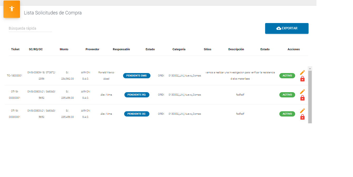
I have this HTML and CSS code and I need the header to be fixed. Everything works fine, but titles do not align with the body.
This is the code:
<table class="table header_fijo">
    <thead>
        <tr id="cabecera">
            <th>Ticket</th>
            <th><a>SC/RQ/OC</a></th>
            <th>Monto</th>
            <th>Proveedor</th>
            <th>Responsable</th>
            <th>Estado Solicitud</th>
            <th>Categoría</th>
            <th>Sitios</th>
            <th>Descripción</th>
            <th>Estado</th>
            <th>Acciones</th>
        </tr>
    </thead>
    <tbody *ngIf="compras.length != 0">
        <tr id="cabecera" *ngFor="let compra of compras |
             filtercompras: search | paginate: { itemsPerPage:
             10, currentPage:p}">
            <td>{{compra.codigo_ticket}}</td>
            <td>
                <a href="#">{{compra.numero_sc}}/</a>
                <a>{{compra.numero_rq}}/</a>
                <a>{{compra.numero_oc}}</a>
            </td>
            <td>{{compra.moneda_descripcion}}
                {{compra.costo | thousandsPipe}}</td>
            <td>{{compra.proveedor_descripcion}}</td>
            <td>{{compra.usuario_nombre}}</td>
            <td>{{compra.estado_descripcion}}</td>
            <td>{{compra.categoria_descripcion}}</td>
            <td>{{compra.sitios_descripcion}}</td>
            <td>{{compra.descripcion}}</td>
            <td class="text-center">
                <span *ngIf="compra.activo==1"  class="badge badge-pill badge-success">Activo</span>
                <span *ngIf="compra.activo==0"  class="badge badge-pill badge-danger">Inactivo</span>
            </td>
            <td class="text-center">
                <a href="javascript:void(0)" (click)="editarSolicitud(compra.id)"  data-toggle="tooltip" title="Editar">
                  <i class="material-icons text-warning">mode_edit</i>
                </a>
                <a *ngIf="compra.activo==1" href="javascript:void(0)" (click)="desactivarSolicitudPage(compra.id)" data-toggle="tooltip" title="Deshabilitar">
                  <i class="material-icons  text-danger">lock</i>
                </a>
                <a *ngIf="compra.activo==0" href="javascript:void(0)" (click)="activarSolicitudPage(compra.id)" data-toggle="tooltip" title="Habilitar">
                  <i class="material-icons text-success">lock_open</i>
                </a>
            </td>
        </tr>
    </tbody>
...
CSS Styles
.header_fijo {
   width: 100%;
   table-layout: fixed;
   border-collapse: collapse;
}

.header_fijo thead {
   background-color: white;
   color: black;
}

.header_fijo th {
   padding: $table-cell-padding;
}

.header_fijo thead tr {
   display: block;

   //padding: $table-cell-padding;
   border-top: $table-border-width solid $table-border-color;
   border-bottom: (2 * $table-border-width) solid $table- border-color;
}

.header_fijo tbody {
   display: block;
   overflow: auto;
   width: 100%;
   height: 400px;
}

.table {
   width: 100%;
   max-width: 100%;
   margin-bottom: $spacer;
   background-color: $table-bg; // Reset for nesting within

   parents with 'background-color'. th,
   td {
       padding: $table-cell-padding;
       vertical-align: top;
       border-top: $table-border-width solid $table-border- color;

   }

   thead th {
       vertical-align: bottom;
       border-bottom: (2 * $table-border-width) solid $table- border-color;

   }

   tbody+tbody {
       overflow-y: auto;
       border-top: (2 * $table-border-width) solid $table- border-color;
   }

   .table {
       background-color: $body-bg;
   }
}

// // Condensed table w/ half padding //

.table-sm {

   th,
   td {
       padding: $table-cell-padding-sm;
   }
}


#cabecera th,
td {
   font-size: 80%;
   text-align: center;
}

// Bordered version
//
// Add borders all around the table and between all the
columns. .table-bordered {
   border: $table-border-width solid $table-border-color;

   th,
   td {
       border: $table-border-width solid $table-border-color;
   }

   thead {

       th,
       td {
           border-bottom-width: (2 * $table-border-width);
       }
   }
}


// Zebra-striping
//
// Default zebra-stripe styles (alternating gray and transparent
backgrounds) .table-striped {
   tbody tr:nth-of-type(odd) {
       background-color: $table-accent-bg;
   }
}

// Hover effect
//
// Placed here since it has to come after the potential zebra striping

.table-hover {
   tbody tr {
       @include hover {
           background-color: $table-hover-bg;
       }
   }
}

// Table backgrounds
//
// Exact selectors below required to override '.table-striped' and
prevent // inheritance to nested tables.

@each $color,
$value in $theme-colors {
   @include table-row-variant($color,
   theme-color-level($color, -9));
}

@include table-row-variant(active,
$table-active-bg);


// Dark styles
//
// Same table markup, but inverted color scheme: dark
background and light text. // stylelint-disable-next-line no-duplicate-selectors

.table {
   .thead-dark {
       th {
           color: $table-dark-color;
           background-color: $table-dark-bg;
           border-color: $table-dark-border-color;
       }
   }

   .thead-light {
       th {
           color: $table-head-color;
           background-color: $table-head-bg;
           border-color: $table-border-color;
       }
   }
}

.table-dark {
   color: $table-dark-color;
   background-color: $table-dark-bg;

   th,
   td,
   thead th {
       border-color: $table-dark-border-color;
   }

   &.table-bordered {
       border: 0;
   }

   &.table-striped {
       tbody tr:nth-of-type(odd) {
           background-color: $table-dark-accent-bg;
       }
   }

   &.table-hover {
       tbody tr {
           @include hover {
               background-color: $table-dark-hover-bg;
           }
       }
   }
}


// Responsive tables
//
// Generate series of '.table-responsive-*' classes for
configuring the screen // size of where your table will overflow.

.navbar {
   height: 50px;
   padding: 0 15px;
   width: 100%;
   position: fixed;
   top: 0;
   z-index: 1;
}

table.responsive-table th {
   background: #eee;
}

table.responsive-table td {
   line-height: 2em;
}

.table-responsive {
   @each $breakpoint in map-keys($grid-breakpoints) {
       $next: breakpoint-next($breakpoint, $grid-breakpoints);
       $infix: breakpoint-infix($next, $grid-breakpoints);

       &#{$infix} {
           [ ![introducir la descripción de la imagen aquí][1]][1] @include media-breakpoint-down($breakpoint) {
               display: block;
               width: 100%;
               overflow-x: auto;
               overflow-y: auto;
               -webkit-overflow-scrolling: touch;
               -ms-overflow-style: -ms-autohiding-scrollbar; // See https://github.com/twbs/bootstrap/pull/10057

               // Prevent double border on horizontal scroll due to use of 'display: block;'
               >.table-bordered {
                   border: 0;
               }
           }
       }
   }
}
Result: