The bootstrap grid system divides the width of the screen into 12 columns, to solve what you do not you need to implement nothing in javascript / jQuery other than to use the bootstrap css and js and the correct column class assignments.
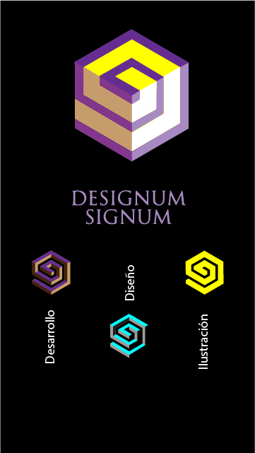
Case 1:
I want it to be displayed in large size all in the same row ,
but by varying the size the last three images move towards
below
If what you want is to be displayed as in your first image but when you reach a certain size change to the 2nd, what you have to do is:
- Define for the first image 6 columns and for the other three images use 2 columns, so that you occupy the 12 columns
-
Define for other sizes, such as sm for example, that the first image takes 12 columns (so that the rest of the content goes to a second column) and that the others take 1/3 of each row, ie col-sm-4
NOTES:
-
To see the behavior, click  when executing the fiddle
-
Remove the background color so that you can better appreciate the behavior
- In this case when moving to
sm they are accommodated below taking 1/3 of the width c / u
   <html>
    <head>
    	<title></title>
    	<link rel="stylesheet" href="https://maxcdn.bootstrapcdn.com/bootstrap/3.3.7/css/bootstrap.min.css" integrity="sha384-BVYiiSIFeK1dGmJRAkycuHAHRg32OmUcww7on3RYdg4Va+PmSTsz/K68vbdEjh4u" crossorigin="anonymous">
      <script
      src="https://code.jquery.com/jquery-3.2.1.js"
      integrity="sha256-DZAnKJ/6XZ9si04Hgrsxu/8s717jcIzLy3oi35EouyE="
      crossorigin="anonymous"></script>
      <script src="https://maxcdn.bootstrapcdn.com/bootstrap/3.3.7/js/bootstrap.min.js" integrity="sha384-Tc5IQib027qvyjSMfHjOMaLkfuWVxZxUPnCJA7l2mCWNIpG9mGCD8wGNIcPD7Txa" crossorigin="anonymous"></script>

 </head>
<body>
   <div class="container" >
      <div class="row" style="margin-top:30px">
           <div class="col-lg-6 col-s-12" >
               <img style="margin-left:50px" src="https://i.gyazo.com/f3770b006e68da04b61b3670274dc954.png">
            </div>
            <div class="col-lg-2 col-sm-4" >
                 <img  src="https://i.gyazo.com/a934f6d402b4916556935d97b2421baa.png">
            </div>
            <div class="col-lg-2 col-sm-4" >
                 <img  src="https://i.gyazo.com/56ac9e837a731c1fff558e425efeb624.pngg">
            </div>
            <div class="col-lg-2 col-sm-4"  >
                 <img src="https://i.gyazo.com/b96dce0ae524db8374b6f9b49d3a413f.png">
            </div>
         </div>
    </body>
   </html>
Case 2: I want the first image to occupy the full width and the other three to fit underneath
-
In this case, what you want is for the first image to occupy the total of the container , that is, assign it col-lg-12
-
When you assign the total of 12 columns you do not need to add another <div class="row"> since the next thing you put will move to the next row.
-
The other 3 images should each occupy 1/3 of the container, therefore they would be col-lg-4
-
I think it's easier for your images to have the text included when you want to place it vertical.
Starting from this basic skeleton you can add how much you want to occupy for the md, sm y xs . For example, I let it occupy 4 columns when the size is xs so you can see the result in the fiddle.
<html>
<head>
	<title></title>
	<link rel="stylesheet" href="https://maxcdn.bootstrapcdn.com/bootstrap/3.3.7/css/bootstrap.min.css" integrity="sha384-BVYiiSIFeK1dGmJRAkycuHAHRg32OmUcww7on3RYdg4Va+PmSTsz/K68vbdEjh4u" crossorigin="anonymous">
  <script
  src="https://code.jquery.com/jquery-3.2.1.js"
  integrity="sha256-DZAnKJ/6XZ9si04Hgrsxu/8s717jcIzLy3oi35EouyE="
  crossorigin="anonymous"></script>
  <script src="https://maxcdn.bootstrapcdn.com/bootstrap/3.3.7/js/bootstrap.min.js" integrity="sha384-Tc5IQib027qvyjSMfHjOMaLkfuWVxZxUPnCJA7l2mCWNIpG9mGCD8wGNIcPD7Txa" crossorigin="anonymous"></script>
</head>
<body>
	<div class="container" style="background-color: #000000; width:500px;">
        <div class="row" style="margin-top:30px">
            <div class="col-lg-12 col-xs-6" >
                <img style="margin-left:50px" src="https://i.gyazo.com/f3770b006e68da04b61b3670274dc954.png">
            </div>
        </div>
        <div class="col-lg-4 col-xs-4" >
          <img src="https://i.gyazo.com/a934f6d402b4916556935d97b2421baa.png">
        </div>
        <div class="col-lg-4 col-xs-4" >
           <img  src="https://i.gyazo.com/56ac9e837a731c1fff558e425efeb624.pngg">
        </div>
        <div class="col-lg-4 col-xs-4"  >
           <img  src="https://i.gyazo.com/b96dce0ae524db8374b6f9b49d3a413f.png">
        </div>
  </body>
</html>