Implement an image - text in block with html and css

0

Good morning I hope you find yourself very well, What I need from your knowledge is to be able to implement this structure with html and css.

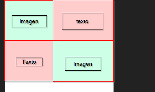
The image occupies half screen and goes to the corner (left, right). And the text goes in the other column centered.

Please could you tell me with what code I could achieve it. I am very grateful. Have a happy day!

I enclose the code that I could not fix (use bootstrap):

#about {
  padding: 60px 0;
  overflow: hidden;
}
			
#about .about-img {
  height: 510px;
  overflow: hidden;
}
			
#about .about-img img {
  margin-left: -15px;
  max-width: 100%;
}
			
@media (max-width: 768px) {
  #about .about-img {
     height: auto;
  }
   #about .about-img img {
     margin-left: 0;
     padding-bottom: 30px;
  }
}
			
#about .content .h2 {
  color: #333;
  font-weight: 300;
  font-size: 24px;
}
			
#about .content h3 {
  color: #777;
  font-weight: 300;
  font-size: 18px;
  line-height: 26px;
  font-style: italic;
}
			
#about .content p {
  line-height: 26px;
}
			
#about .content p:last-child {
  margin-bottom: 0;
}
			
#about .content i {
 font-size: 20px;
 padding-right: 4px;
 color: #1dc8cd;
}
			
#about .content ul {
  list-style: none;
  padding: 0;
}
			
#about .content ul li {
  padding-bottom: 10px;
}
    	<section id="about" >
            <div class="container">
              <div class="row">
                <div class="col-lg-6 about-img wow fadeInLeft"  data-wow-delay="0s"  data-wow-duration="1.9s">                  
                  <img src="img/img_showcase_1.jpg" alt="">
                </div>      
                <div class="col-lg-6 content wow fadeInRight"  data-wow-delay="0s"  data-wow-duration="1.9s">                
                  <h2>Lorem ipsum dolor sit amet, consectetur adipiscing</h2>
                  <h3>Excepteur sint occaecat cupidatat non proident, sunt in culpa qui officia deserunt mollit anim id est laborum.</h3>                 
                </div>
              </div>      
            </div>
            <!-- Fila 2-->
            <div class="container">
                    <div class="row">
                        <div class="col-lg-6  about-img order-lg-2 wow fadeInRight"  data-wow-delay="0s"  data-wow-duration="1.9s">                         
                            <img src="img/img_showcase_1.jpg" alt="">           
                      </div>
                      <div class="col-lg-6 content order-lg-1 wow fadeInLeft"  data-wow-delay="0s"  data-wow-duration="1.9s">                     
                            <h2>Lorem ipsum dolor sit amet, consectetur adipiscing</h2>
                            <h3>Excepteur sint occaecat cupidatat non proident, sunt in culpa qui officia deserunt mollit anim id est laborum.</h3>                          
                      </div>                                       
                    </div>
                  </div>
	</section>
    
asked by Ana P. 11.06.2018 в 08:04
source

2 answers

0
.fadeInRight, .fadeInLeft{
display: inline-block;

}

.container {     clear: both; }

Add these lines to your css file, and remove the height from

about .about-img

    
answered by 13.06.2018 в 05:41
0

The code you have is fine but maybe you have a different resolution than the one you indicated.

The column classes have resolution measures that are the following:

In your case you have a col-lg, that although on certain screens it will look like you want and others will not.

You can choose a resolution or add more as I did:

#about {
  padding: 60px 0;
  overflow: hidden;
}
			
#about .about-img {
  height: 510px;
  overflow: hidden;
}
			
#about .about-img img {
  margin-left: -15px;
  max-width: 100%;
}
			
@media (max-width: 768px) {
  #about .about-img {
     height: auto;
  }
   #about .about-img img {
     margin-left: 0;
     padding-bottom: 30px;
  }
}
			
#about .content .h2 {
  color: #333;
  font-weight: 300;
  font-size: 24px;
}
			
#about .content h3 {
  color: #777;
  font-weight: 300;
  font-size: 18px;
  line-height: 26px;
  font-style: italic;
}
			
#about .content p {
  line-height: 26px;
}
			
#about .content p:last-child {
  margin-bottom: 0;
}
			
#about .content i {
 font-size: 20px;
 padding-right: 4px;
 color: #1dc8cd;
}
			
#about .content ul {
  list-style: none;
  padding: 0;
}
			
#about .content ul li {
  padding-bottom: 10px;
}
<link rel="stylesheet" href="https://stackpath.bootstrapcdn.com/bootstrap/4.1.3/css/bootstrap.min.css">
<script src="https://code.jquery.com/jquery-3.3.1.slim.min.js"></script>
<script src="https://cdnjs.cloudflare.com/ajax/libs/popper.js/1.14.3/umd/popper.min.js"></script>
<script src="https://stackpath.bootstrapcdn.com/bootstrap/4.1.3/js/bootstrap.min.js"></script>
    	<section id="about" >
            <div class="container">
              <div class="row">
                <div class="col-sm-6 col-md-6 col-lg-6 about-img wow fadeInLeft"  data-wow-delay="0s"  data-wow-duration="1.9s">                  
                  <img src="img/img_showcase_1.jpg" alt="">
                </div>      
                <div class="col-sm-6 col-md-6 col-lg-6 content wow fadeInRight"  data-wow-delay="0s"  data-wow-duration="1.9s">                
                  <h2>Lorem ipsum dolor sit amet, consectetur adipiscing</h2>
                  <h3>Excepteur sint occaecat cupidatat non proident, sunt in culpa qui officia deserunt mollit anim id est laborum.</h3>                 
                </div>
              </div>      
            <!-- Fila 2-->
                    <div class="row">
                        <div class="col-sm-6 col-md-6 col-lg-6 about-img order-lg-2 wow fadeInRight"  data-wow-delay="0s"  data-wow-duration="1.9s">                         
                            <img src="img/img_showcase_1.jpg" alt="">           
                      </div>
                      <div class="col-sm-6 col-md-6 col-lg-6 content order-lg-1 wow fadeInLeft"  data-wow-delay="0s"  data-wow-duration="1.9s">                     
                            <h2>Lorem ipsum dolor sit amet, consectetur adipiscing</h2>
                            <h3>Excepteur sint occaecat cupidatat non proident, sunt in culpa qui officia deserunt mollit anim id est laborum.</h3>                          
                      </div>                                       
                    </div>
                  </div>
	</section>

Another thing to comment is the following:


When you start a div.container you can use the div.row in your   interior you want, you do not need to close the container to create another   row. Since it is designed bootstrap and its grid, they are lines   ( .row ) and columns ( .col ).

    
answered by 22.12.2018 в 21:19