Move underline in the middle of the word

2

Currently I have 2 underline that I want to join in the middle of the word

how to move the underline in the middle of the word? when I try it goes down + the word

.err {
  border-top: 2px dotted red;
  display: inline-block;
  position: relative;
  top: 5px;
  z-index: 2;
}

.err:after {
  content: '';
  width: 100%;
  border-top: 2px dotted red;
  position: absolute;
  font-size: 16px;
  top: 5px;
  left: -2px;
  display: block;
  height: 4px;
}
<div>hola
  <div class="err">mundo</div> informatico</div>

The underline should simulate an Error line, but in the middle of the word

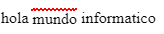
I have the underline located above that simulates being an ERROR line, but I want to center it in the middle

.err {
  border-top: 2px dotted red;
  display: inline-block;
  position: relative;
  top: -1px;
  z-index: 2;
}

.err:after {
  content: '';
  width: 100%;
  border-bottom: 2px dotted red;
  position: absolute;
  font-size: 16px;
  top: -5px;
  left: -2px;
  display: block;
  height: 4px;
}
<div>hola
  <div class="err">mundo</div> informatico</div>
    
asked by x-rw 20.03.2018 в 23:31
source

3 answers

2

Do not add the second line of "error" in the element, but in another pseudo element, like this:

.err {
  display: inline-block;
  position: relative;
  color: rgba(0,0,0,.5);
}

.err:after,
.err:before{
  content: '';
  width: 100%;
  z-index: 2;
  border-bottom: 2px dotted red;
  position: absolute;
  font-size: 16px;
  display: block;
  height: 4px;
  top: 50%;
  transform: translateY(-50%);
}

.err:before{
  left: 2px;
  top: calc(50% - 1px);
}
<div>hola
  <div class="err">mundo</div> informatico</div>

To place it in the middle, assign the top to 50% of the word and upload it a little with transform: translateY(-50%) .

For the second line, position it as you want using calc and left , example:

top: calc(50% - 1px);
left: 2px;

Was this what I needed? Place the word in low opacity, so that it would make better contrast, with black, the red lines are hardly seen.

    
answered by 20.03.2018 / 23:57
source
2

I know you already have solutions using pseudo-elements, I'll give you a solution without using them. You can decorate the text directly so that it has a line over the text (with the value "line-through" for text-decoration-line ), and that line is wavy (with the value" wavy "for text-decoration-style ).

Here you can see it:

.err {
  display: inline-block;
  position: relative;
  z-index: 2;
  text-decoration-line: line-through;
  text-decoration-style: wavy;
  text-decoration-color: red;
}
<div>hola <div class="err">mundo</div> informatico</div>

But this solution has a couple of problems (at least for now):

answered by 21.03.2018 в 03:32
1

Just as you are using the pseudo-element after, you can use the pseudo-element before, you could even use calc () to give it a more appropriate location according to what you want to achieve.

.err {
  display: inline-block;
  position: relative;
  z-index: 2;
}

.err::before,
.err::after {
  content: '';
  width: 100%;
  border-top: 2px dotted red;
  position: absolute;
  font-size: 16px;
  top: 53%;
  left: -2px;
  display: block;
  height: 4px;
}

.err::before {
  left: 0;
  top: 47%;
}
<div>hola
  <div class="err">mundo</div> informatico</div>
    
answered by 20.03.2018 в 23:37