Divide the width of the screen into two containers

3

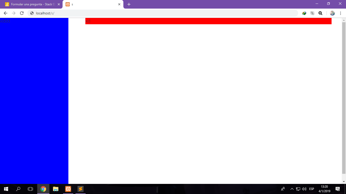
I have two divs, one is a sidebar and the other a container. I want to divide the entire width in these two (.sidebar 20%, .container 80%), but I do not know what is failing because they do not occupy the width at 100%.

I'm using the Simple Grid Framework.

This is my code:

/**
    *** SIMPLE GRID
    *** (C) ZACH COLE 2016
    **/

@import url('https://fonts.googleapis.com/css?family=Raleway:300,300i,400,400i,700,700i');

/* UNIVERSAL */

html,
body {
  height: 100%;
  width: 100%;
  margin: 0;
  padding: 0;
  left: 0;
  top: 0;
  font-size: 100%;
}


/* ROOT FONT STYLES */

* {
  font-family: 'Raleway', sans-serif;
  color: #333447;
  line-height: 1.5;
  box-sizing: border-box;
}


/* TYPOGRAPHY */

h1 {
  font-size: 2.5rem;
}

h2 {
  font-size: 2rem;
}

h3 {
  font-size: 1.375rem;
}

h4 {
  font-size: 1.125rem;
}

h5 {
  font-size: 1rem;
}

h6 {
  font-size: 0.875rem;
}

p {
  font-size: 1.125rem;
  font-weight: 200;
  line-height: 1.8;
}

.font-light {
  font-weight: 300;
}

.font-regular {
  font-weight: 400;
}

.font-heavy {
  font-weight: 700;
}


/* POSITIONING */

.left {
  text-align: left;
}

.right {
  text-align: right;
}

.center {
  text-align: center;
  margin-left: auto;
  margin-right: auto;
}

.justify {
  text-align: justify;
}


/* ==== GRID SYSTEM ==== */

.container {
  width: 80%;
  float: right;
}

.row {
  position: relative;
  width: 100%;
}

.row [class^="col"] {
  float: left;
  margin: 0.5rem 2%;
  min-height: 0.125rem;
}

.col-1,
.col-2,
.col-3,
.col-4,
.col-5,
.col-6,
.col-7,
.col-8,
.col-9,
.col-10,
.col-11,
.col-12 {
  width: 96%;
}

.col-1-sm {
  width: 4.33%;
}

.col-2-sm {
  width: 12.66%;
}

.col-3-sm {
  width: 21%;
}

.col-4-sm {
  width: 29.33%;
}

.col-5-sm {
  width: 37.66%;
}

.col-6-sm {
  width: 46%;
}

.col-7-sm {
  width: 54.33%;
}

.col-8-sm {
  width: 62.66%;
}

.col-9-sm {
  width: 71%;
}

.col-10-sm {
  width: 79.33%;
}

.col-11-sm {
  width: 87.66%;
}

.col-12-sm {
  width: 96%;
}

.row::after {
  content: "";
  display: table;
  clear: both;
}

.hidden-sm {
  display: none;
}

@media only screen and (min-width: 33.75em) {
  /* 540px */
  .container {
    width: 80%;
  }
}

@media only screen and (min-width: 45em) {
  /* 720px */
  .col-1 {
    width: 4.33%;
  }
  .col-2 {
    width: 12.66%;
  }
  .col-3 {
    width: 21%;
  }
  .col-4 {
    width: 29.33%;
  }
  .col-5 {
    width: 37.66%;
  }
  .col-6 {
    width: 46%;
  }
  .col-7 {
    width: 54.33%;
  }
  .col-8 {
    width: 62.66%;
  }
  .col-9 {
    width: 71%;
  }
  .col-10 {
    width: 79.33%;
  }
  .col-11 {
    width: 87.66%;
  }
  .col-12 {
    width: 96%;
  }
  .hidden-sm {
    display: block;
  }
}

@media only screen and (min-width: 60em) {
  /* 960px */
  .container {
    width: 75%;
    max-width: 60rem;
  }
}

**
/**
    *** custom.css
    **/

.sidebar {
  width: 20%;
  background-color: blue;
  height: 100%;
  position: sticky;
  top: 0;
  display: inline-block
}

.container {
  background-color: red;
  width: 80%;
  display: inline-block;
}
<!-- index.html -->

<div class="sidebar">
  xddd
</div>
<div class="container">
  <div class="col-12" style="background-color: blue">xd</div>
  <div class="row">
    <code>xDDD hola
    		</div>
    	</div>

This is the result:

    
asked by Esteban Fernández 04.01.2019 в 17:24
source

2 answers

3

The inconvenience you have in large resolutions is given by a media query that puts this condition in a class equal to the one you have:

@media only screen and (min-width: 60em) { /* 960px */
  .container {
    width: 75%;
    max-width: 60rem;
  }
}

What you can do is overwrite this condition in your custom code:

@media only screen and (min-width: 60em) {/ * 960px * /   .container {     width: 80%;     max-width: none;   } }

You could also use another class for your container, so that it does not interfere with the framework's own style.

@import url('https://fonts.googleapis.com/css?family=Raleway:300,300i,400,400i,700,700i');

/* UNIVERSAL */

html,
body {
  height: 100%;
  width: 100%;
  margin: 0;
  padding: 0;
  left: 0;
  top: 0;
  font-size: 100%;
}

/* ROOT FONT STYLES */

* {
  font-family: 'Raleway', sans-serif;
  color: #333447;
  line-height: 1.5;
  box-sizing: border-box;
}

/* TYPOGRAPHY */

h1 {
  font-size: 2.5rem;
}

h2 {
  font-size: 2rem;
}

h3 {
  font-size: 1.375rem;
}

h4 {
  font-size: 1.125rem;
}

h5 {
  font-size: 1rem;
}

h6 {
  font-size: 0.875rem;
}

p {
  font-size: 1.125rem;
  font-weight: 200;
  line-height: 1.8;
}

.font-light {
  font-weight: 300;
}

.font-regular {
  font-weight: 400;
}

.font-heavy {
  font-weight: 700;
}

/* POSITIONING */

.left {
  text-align: left;
}

.right {
  text-align: right;
}

.center {
  text-align: center;
  margin-left: auto;
  margin-right: auto;
}

.justify {
  text-align: justify;
}

/* ==== GRID SYSTEM ==== */

.container {
  width: 80%;
  float: right;
}

.row {
  position: relative;
  width: 100%;
}

.row [class^="col"] {
  float: left;
  margin: 0.5rem 2%;
  min-height: 0.125rem;
}

.col-1,
.col-2,
.col-3,
.col-4,
.col-5,
.col-6,
.col-7,
.col-8,
.col-9,
.col-10,
.col-11,
.col-12 {
  width: 96%;
}

.col-1-sm {
  width: 4.33%;
}

.col-2-sm {
  width: 12.66%;
}

.col-3-sm {
  width: 21%;
}

.col-4-sm {
  width: 29.33%;
}

.col-5-sm {
  width: 37.66%;
}

.col-6-sm {
  width: 46%;
}

.col-7-sm {
  width: 54.33%;
}

.col-8-sm {
  width: 62.66%;
}

.col-9-sm {
  width: 71%;
}

.col-10-sm {
  width: 79.33%;
}

.col-11-sm {
  width: 87.66%;
}

.col-12-sm {
  width: 96%;
}

.row::after {
	content: "";
	display: table;
	clear: both;
}

.hidden-sm {
  display: none;
}

@media only screen and (min-width: 33.75em) {  /* 540px */
  .container {
    width: 80%;
  }
}

@media only screen and (min-width: 45em) {  /* 720px */
  .col-1 {
    width: 4.33%;
  }

  .col-2 {
    width: 12.66%;
  }

  .col-3 {
    width: 21%;
  }

  .col-4 {
    width: 29.33%;
  }

  .col-5 {
    width: 37.66%;
  }

  .col-6 {
    width: 46%;
  }

  .col-7 {
    width: 54.33%;
  }

  .col-8 {
    width: 62.66%;
  }

  .col-9 {
    width: 71%;
  }

  .col-10 {
    width: 79.33%;
  }

  .col-11 {
    width: 87.66%;
  }

  .col-12 {
    width: 96%;
  }

  .hidden-sm {
    display: block;
  }
}

@media only screen and (min-width: 60em) { /* 960px */
  .container {
    width: 75%;
    max-width: 60rem;
  }
}

.sidebar{
	width: 20%;
	background-color: blue;
	height: 100%;
	position: sticky;
	top: 0;
	display: inline-block
}
.container{
	background-color: red;
	width: 80%;
	display: inline-block;
}

@media only screen and (min-width: 60em) { /* 960px */
  .container {
width: 80%;
max-width: none;
  }
}
<div class="sidebar">
		izquierda
</div>
<div class="container">
    derecha  
</div>
    
answered by 04.01.2019 / 18:07
source
0

This is one way you can solve the problem of the two columns:

@import url('https://fonts.googleapis.com/css?family=Raleway:300,300i,400,400i,700,700i');

body, html {

  margin: 0;
  padding: 0;
  font-family: "Raleway", sans-serif, arial;
  font-size: 1rem;
  color: white;
}
* {

  box-sizing: border-box;
}

/* Esta es una manera de hacerlo */
.container {
  display: grid;
  grid-template-columns: 0.2fr 0.8fr;
  height: 100vh;
  
  /* Puedes limitar la anchura */
  max-width: 1500px;
}

.container__item--sidebar {
  background-color: #0080d4;
  
}
.container__item--content {

  background-color: blue;
}
.container__item--sidebar,
.container__item--content {
  display: flex;
  justify-content: center;
  align-items: center;
 }
<!DOCTYPE html>
<html lang="es">
<head>
    <meta charset="UTF-8">
    <title>Ejemplo</title>
</head>
<body>
    <main class="container">
      <aside class="container__item--sidebar">
        20%
      </aside>
      
      <div class="container__item--content">
        80%
      </div>
    </main>
</body>
</html>
    
answered by 05.01.2019 в 12:07