The detail is that you do not give specific measures to .bg-registro . If it is understood that you want it to occupy 100% stop (although as you set it is not going to give you the result you expect), but what? mmm, I do not know, it could be from another previous element or from the window or the body, etc. You do not specify Nor are you giving it a width ... and you have disabled background-size: cover; , enough to not work for you.
Well, since you are not giving width and height measurements to the container that has the image as a background, this element will only cover the same space occupied by the inherent elements (such as the form), and since the form does not have any defined measures, simply everything is reduced to the space that is occupying the text (...contiene un formulario...) .
So, for whatever the case and / or measures, the ideal is to use background-size: cover; and specify the width and height you want to cover in particular (for 100% of high use "viewport height", that is, height: 100vh; ), so the image will be adjusted to 100% of the width or height according to the dimensions of the window or device being readjusted, with the longest side of the container always remaining 100%, the other side will be exceeded, with the hidden surplus (this will ensure that the background image always remains in the entire area of the container). It should not be adjusted to 100% of width and height (with respect to the measurements of the image) at the same time, because if the device does not have the same proportion as the image, it will be deformed, leaving it with a "squashed" effect or " elongated "that looks very, very bad and little (or nothing) professional.
NOTE: Keep in mind that if the height or width ratio of the container, window or device is very large (for example 1000px wide by 400px high, or 500px wide by 1200px high) and your image is 1200px wide by 800px high (to mention an example), it will never be possible to appreciate the complete image or exactly in its proportion.
Also consider that if you have a background image in the entire window, your form should have a white background, so that the texts are clear and legible, all this for use and functionality (ie for a good UI / UX ), since the design must be thinking about the user, and he will thank you. So never put regular text blocks on background images.
body {
margin: 0;
padding: 0;
}
.bg-registro {
background-image: url("https://www.w3schools.com/css/paris.jpg");
height: 100vh;
width: 100%;
background-size: cover;
display: block;
}
.farciment-formulari {
width: 80%;
margin: 50px 10%;
height: 100px;
display: inline-block;
background-color: #fff;
border-radius: 3px;
padding: 15px;
box-sizing: border-box;
}
<section class="bg-registro">
<div class="col-sm-offset-1 col-md-offset-1 col-lg-offset-1 col-xs-12 col-sm-10 col-md-10 col-lg-10 registrat">
<section>
<form action='' method="POST">
<div class="farciment-formulari">
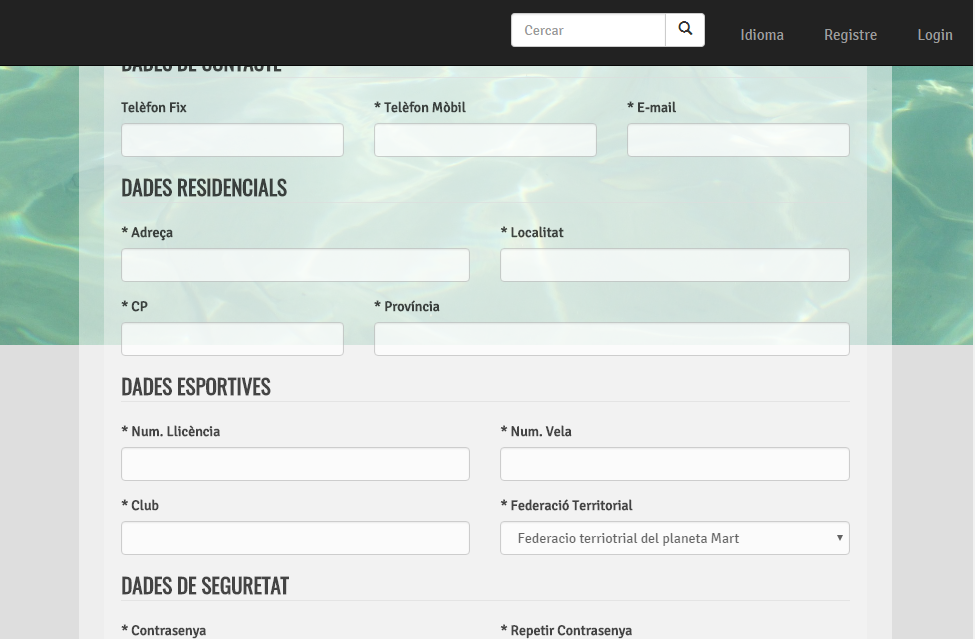
(....Contiene un formulario....)
</div>
</form>
</section>
</div>
</section>
I hope it serves you. Greetings.