How to position html elements with bootstrap

2

I have a page to add products to an invoice:

  • You have a part to filter by name or code.
  • Other part for sorting by category or price.
  • Finally a edit not editable where the product name is put when clicking on one row, and that, along with the amount entered in another edit, process when you click add. All this within a form for that purpose.

The fact is that I can not locate the elements and I wanted to know a correct technique to do it.

<form>
<p>FILTRO</p>
  <script src="includes/js/busqProducto.js"></script>
<script src="https://ajax.googleapis.com/ajax/libs/jquery/3.3.1/jquery.min.js"></script>
 <div class="form-group">
    <label class="col-sm-1 control-label">COD</label>
    <div class="col-sm-2">
      <input type="text" class="form-control" id="cod" placeholder="Codigo Articulo"/>
    </div>


    <label class="col-sm-1 control-label">NOMBRE</label>
    <div class="col-sm-7">
      <input type="text" class="form-control" id="nombre" placeholder="Nombre Articulo"/>
   
  </div>


<p>ORDENAMIENTO</p>
<div class="col-sm-4" style="margin: 20px 0 0 10px;">
    
    
      <input type="checkbox" id="marca"/>
      <label>NOMBRE</label>
      <select id="mySelect" data-show-icon="true">
       <option>  ASC</option>
       <option>  DESC</option>
</select>

    
      <input type="checkbox"id="categoria"/>
      <label>PRECIO</label>
      <select id="mySelect" data-show-icon="true">
       <option>  ASC</option>
       <option>  DESC</option>
</select>
   
  </div>


</form>
<form style="position:relative;width: 100%;">
    <div class="col-sm-8"  >
      <input type="text" disabled="true" class="form-control" id="nombreselec" placeholder="Nombre Articulo"/>
  </div> 

    <div class="col-sm-2">
      <input type="text" class="form-control" id="CANTIDAD" placeholder="CANT"/>

  </div>
   <div class="col-sm-2">
  <button type="button" class="btn btn-default">
    <span class="glyphicon glyphicon-shopping-cart"></span>Agregar
  </button>
</div>
 <div class="col-sm-2">
  <button type="button" class="btn btn-default">
    <span class="glyphicon glyphicon-ok"></span>Terminado
  </button>
</div>
</form>
<table id="resultado">
<thead>
<tr> <th>COD.:</th> <th>DESCRIPCION</th> <th>MARCA</th>
            <th>CATEGORIA</th> <th>P/U</th><th>+</th>
            </tr></thead>
            <tbody>
            
            </tbody>
</table>

Here is a current image:

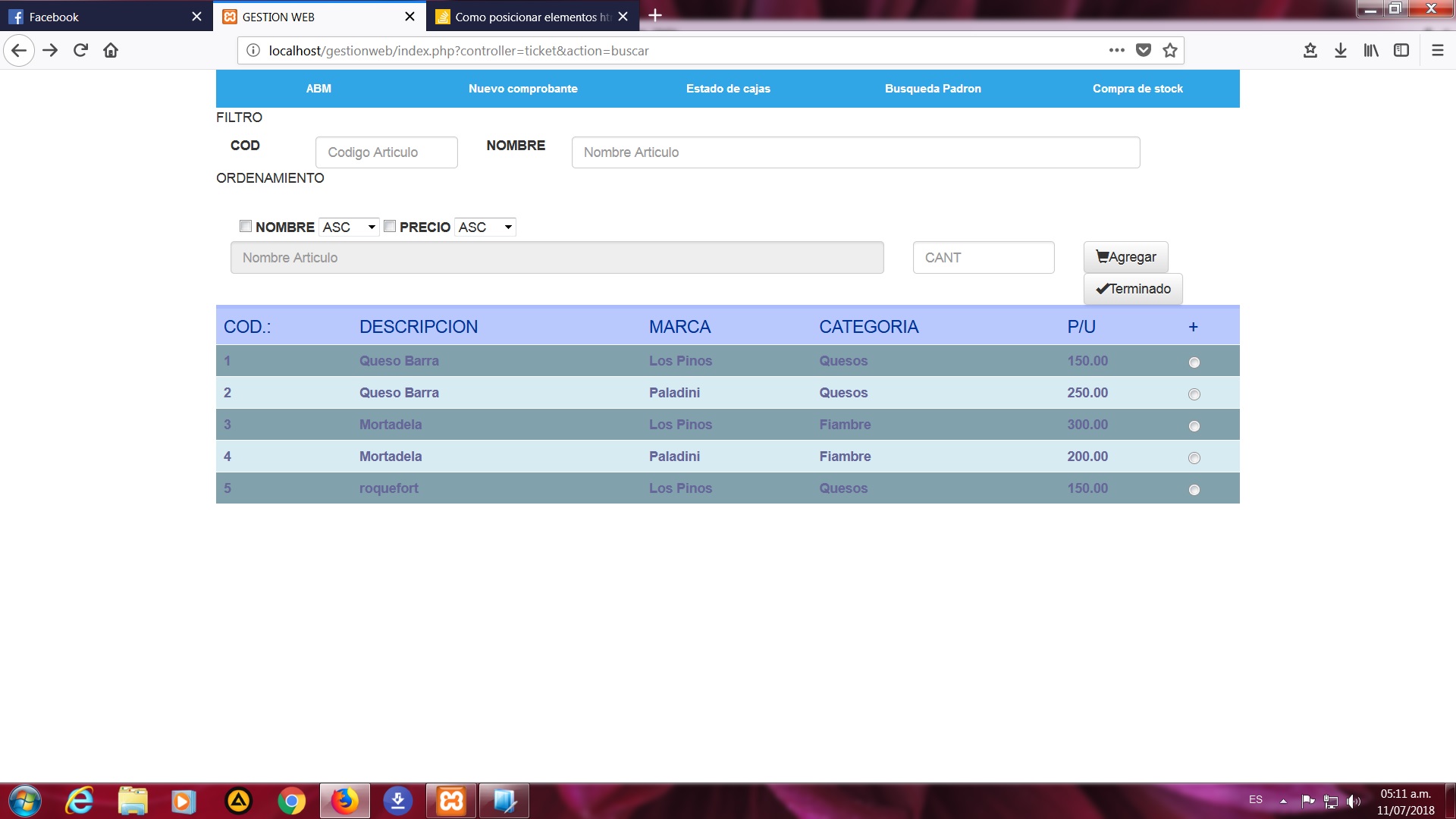
My idea is to align the name and the quantity to the two buttons. I hope your help

    
asked by Caruso 11.07.2018 в 10:14
source

2 answers

3

In this part you have bad grid, in total the sum of its columns has to give 12 and here you have 14 "8 + 2 + 2 + 2 = 14"

<form style="position:relative;width: 100%;">
    <div class="col-sm-8"  >
      <input type="text" disabled="true" class="form-control" id="nombreselec" placeholder="Nombre Articulo"/>
  </div> 

    <div class="col-sm-2">
      <input type="text" class="form-control" id="CANTIDAD" placeholder="CANT"/>

  </div>
   <div class="col-sm-2">
  <button type="button" class="btn btn-default">
    <span class="glyphicon glyphicon-shopping-cart"></span>Agregar
  </button>
</div>
 <div class="col-sm-2">
  <button type="button" class="btn btn-default">
    <span class="glyphicon glyphicon-ok"></span>Terminado
  </button>
</div>
</form>

The correct way would be to decrease the value to a column in your class as well (6 + 2 + 2 + 2 = 12):

<form style="position:relative;width: 100%;">
    <div class="col-sm-6"  >
      <input type="text" disabled="true" class="form-control" id="nombreselec" placeholder="Nombre Articulo"/>
  </div> 

    <div class="col-sm-2">
      <input type="text" class="form-control" id="CANTIDAD" placeholder="CANT"/>

  </div>
   <div class="col-sm-2">
  <button type="button" class="btn btn-default">
    <span class="glyphicon glyphicon-shopping-cart"></span>Agregar
  </button>
</div>
 <div class="col-sm-2">
  <button type="button" class="btn btn-default">
    <span class="glyphicon glyphicon-ok"></span>Terminado
  </button>
</div>
</form>
    
answered by 11.07.2018 в 10:34
0

Besides that the sum of the columns must give 12 you have to create div of row-fluid classes, just as the tables have rows and columns our page also has them, in the case of the columns as previously indicated it is equal to 12 per row, the class that is assigned is col-md-x where the value of in the middle or for this example "me" corresponds to medium, that is, a column of medium size that occupies x columns, the size if not I'm wrong is used to adapt the content to different devices, bootstrap also has responsive classes that are created for that, the content is adjusted to the size of the browser / screen, I recommend you go to the bootstrap page and search the corresponding content, there You will see didactic examples that will help you a lot

    
answered by 11.07.2018 в 11:11