vertically position

2

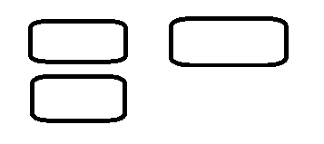
How can I position the first 2 inputs one below the other, but that they are aligned , which does not allow them to be aligned are the words on the left side.

.encima {
  display: flex;
}
<div>
  <div class="encima">
    <div><span>nombre</span><input/></div>
    <div><span>pass</span><input/></div>
  </div>
</div>
<div>
  <div class="encima">
    <div><span>nombre2</span><input/></div>
  </div>
</div>

I want to get this, but I can not get it

    
asked by hubman 15.08.2018 в 00:34
source

2 answers

3

With:

flex-direction: column;

You stack the boxes one on top of the other and with:

display: inline-block;

About the sibling container elements, they are div :

Ex:

div{
  display: inline-block;
}

.encima {
  display: flex;
  flex-direction: column;
  --ancho-del-texto: 5em;
}

.encima span{
  width: 15em;
  display: flex;
  position: relative;
}

.encima input{
  display: inline-flex;
  position: absolute;
  top: 0;
  left: var(--ancho-del-texto);
  width: calc(100% - var(--ancho-del-texto) - 1em);
}
<div>
  <div class="encima">
    <span>nombre<input/></span>
    <span>pass<input/></span>
  </div>
</div>
<div>
  <div class="encima">
    <span>nombre2<input/></span>
  </div>
</div>

Update

Keeping in mind the update in your html . Now it is very simple, simply and complementing the previous information, now it is only necessary to assign a block type to <span> , which can be display: inline-block; or in your case to use flexbox , it would be display: inline-flex;

It would be like this:

div{
  display: inline-block;
}

.encima {
  display: flex;
  flex-direction: column;
  padding: 0.5em; /*Esta no es necesaria, fue solo para separar un poco las columnas*/
}
.encima>div{
  padding: 0.1em; /*Esta tampoco es necesaria, es para separar las filas*/
}

.encima span{
  display: inline-flex;
  min-width: 4em; /*Con esto das un tamaño al span para que se alineen*/
}

.encima input{

}
<div>
  <div class="encima">
    <div>
      <span>nombre</span>
      <input/>
    </div>
    <div>
      <span>pass</span>
      <input/>
    </div>
  </div>
</div>
<div>
  <div class="encima">
    <div>
      <span>nombre2</span>
      <input/>
    </div>
  </div>
</div>
    
answered by 15.08.2018 в 00:38
0

Using flex is easier to structure and have control over your elements and it is not necessary to add unnecessary divs:

.general{
  display:grid;
  grid-template-columns: 1fr 1fr;
  justify-content:stretch;
  grid-gap:5px  20px;
}
.general>div{
  display:grid;
  grid-template-columns: 1fr 2fr;
}
<div class="general">
    <div><span>nombre</span><input/></div>
    <div><span>pass</span><input/></div>
    <div><span>nombre2</span><input/></div>
</div>
grid-template-columns: 1fr 1fr;

Indicate that each element occupies 1 fraction of the available ones:

justify-content:stretch;

You force the elements to fill all the available space

grid-gap:0px  20px;

Vertical margin of 20 px between the elements and 5px horizontal

by indicating:

grid-template-columns: 1fr 2fr;

It means the first element occupies 1 fraction and the second element 2 fractions therefore it is double: 1fr 3fr the triple, 1fr 4fr four times bigger, etc.

    
answered by 15.08.2018 в 20:59