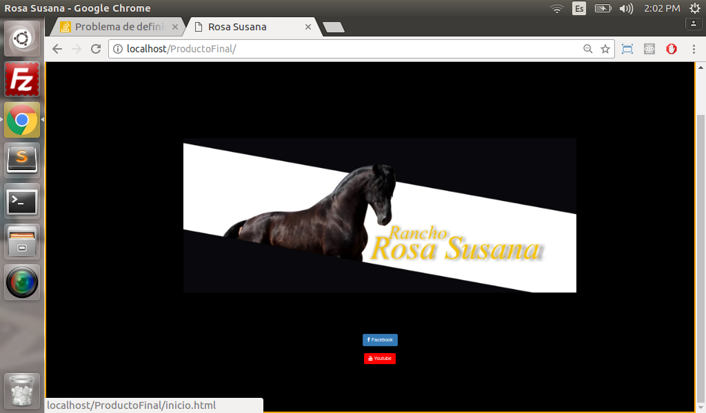
I have the following problem, as you see in the image I have an IMG tag, ok but what I need is that it covers the entire screen and I was adding the following style css and this happened:
my attempts were these:
- WIDTH: 100% - problem: distorted and very long
- display: block - the image stretched a lot and it did not look good.
- Add it in a header and lengthen it but my problem is that I needed that image to send me to another page, I was looking at a code that could do that, but I want to know if there is no other way to position the complete image on the screen without distorting when it reaches mobile version.
My code:
<!DOCTYPE html>
<html>
<head>
	<title>Rosa Susana</title>
	<meta name="viewport" content="width=device-width, initial-scale=1">
<link href="https://fonts.googleapis.com/css?family=Droid+Serif:400,700,700i" rel="stylesheet">
<link href="https://maxcdn.bootstrapcdn.com/font-awesome/4.7.0/css/font-awesome.min.css" rel="stylesheet" >
	  <script src="https://ajax.googleapis.com/ajax/libs/jquery/3.2.0/jquery.min.js"></script>

<link rel="stylesheet" href="https://maxcdn.bootstrapcdn.com/bootstrap/3.3.7/css/bootstrap.min.css">

<script src="https://maxcdn.bootstrapcdn.com/bootstrap/3.3.7/js/bootstrap.min.js"></script>
	<link rel="stylesheet" type="text/css" href="css/estilos.css">
	<link rel="icon" type="image/png" href="Logo para web.svg" />
  <style type="text/css">

  body{
    margin:0;
    padding:0;
    background:#000000;
    background-attachment:fixed;
    background-size:100% 100%;
    border:3px solid orange;
    left:10px;
    padding-top:10%;
    padding-left:3%;
/*border:1px solid #FFFF00;

}

  #iniciar{
    text-decoration:none;
    color:black;
}
  </style>
</head>
<body>
<br><br><br><br>
<br><br><br>
<br><br>
<center>
<div class="container">
    <a href="inicio.html">
<img class="img-responsive" src="inicio.jpg" >

</div>
<br><br><br>
<br><br><br>
<center>
<a href="https://www.facebook.com/Rancho-Rosa-Susana-193044927891849/
" class="btn btn-primary">
    <span class="fa fa-facebook"></span> Facebook
  </a><br><br>
   <a style="background:red;border:none;" href="https://www.youtube.com/channel/UCB41yyo-wrldZQchu_tM3dA" class="btn btn-primary">
    <span class="fa fa-youtube"></span>  Youtube
  </a><br>
</a><br>
<br><br><br><br>
<br><br>

</body>
</html>