Hello on my laptop, the web looks good. And if I resize the web to mobile resolution it looks good too. but when I upload the web to ftp and see it from my phone many things do not work like the menu, the border-radius: 50% of an image or two fontawesome icons do not capture the CSS styles.
I do not know where to look to fix it. the image that must be circular looks normal (square).
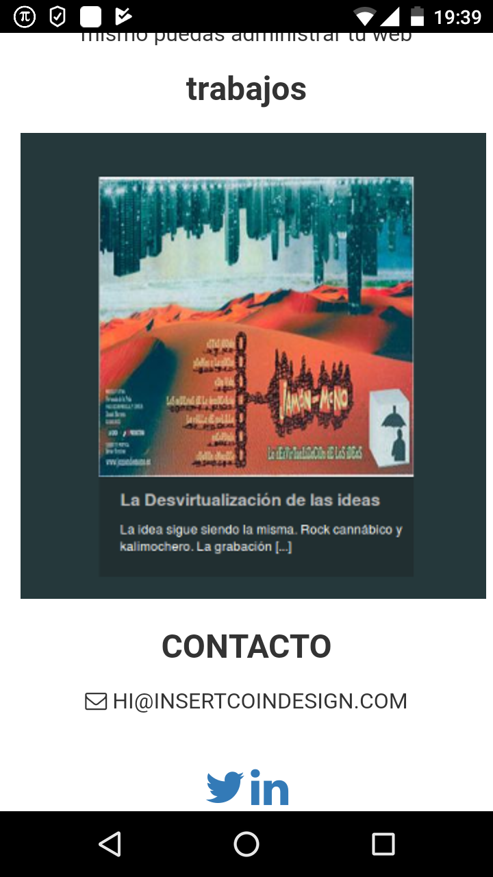
<article id="work">
    <div class="container">

        <h2 class="text-center">trabajos</h2>
            <section class="showcase text-center">
                <ul class="row">
                    <li class="col-sm-6 col-md-4">
                        <a href="#">
                            <img src="images/1.png" alt="work preview">
                        </a>
                    </li>
                </ul>
            </section>

    </div>
</article>

#work .showcase li a {
  border: 10px solid #f2f2f2;
  -moz-border-radius: 50%;
  -webkit-border-radius: 50%;
  border-radius: 50%;
  display: inline-block;
  overflow: hidden;
  -moz-transition: border-color .5s ease;
  -o-transition: border-color .5s ease;
  -webkit-transition: border-color .5s ease;
  transition: border-color .5s ease; }

#work .showcase li a:hover {
  border-color: #fff; }

#work .showcase li a img {
  -moz-border-radius: 50%;
  -webkit-border-radius: 50%;
  border-radius: 50%;
  opacity: 0.5;
  -moz-transition: opacity .5s ease;
  -o-transition: opacity .5s ease;
  -webkit-transition: opacity .5s ease;
  transition: opacity .5s ease; }

#work .showcase li a:hover img {
  opacity: 1; }

#work .showcase li img {
  max-width: 100%; }