The problem I have is sure to be silly, but I have not found anything to solve it.
I have a CSS, which applies the styles according to the screen, that is, my website is Responsive Web Design . I use medias querys , which are defined in my CSS, and well, they work perfectly on all Android devices or on any PC browser or Laptop ( Portable ).
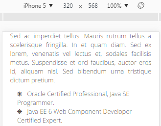
Now, as soon as I happened to iOS, in this case, to iPhone 5. (320 x 568). In the width of 320, it works perfectly:
Simulator view (320):
View on the actual device (320):

As we observed, it is the same, it does not suffer changes. But as soon as I turn the screen, the CSS does not apply correctly to 100%, specifically, the font size. That is:
Simulator view (568):
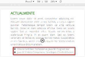
But of course in the real device it changes, and I do not know why it changes ... total the result in the real device is this:
Real device view (568):

Why does this happen? the font size is 100%. If anyone knows anything about this, great! It would help me a lot. I guess it will be something similar to button styles (in iOS it has a CSS that you have to deactivate it so that our CSS is applied, with the attribute: -webkit-appearance: none;) of iOS, but I have not found anything.
The CSS that I have defined, I have this:
@media screen and (max-width: 1023px){
    header{
        font-size: 110%;
    }

    main{/* Contien la parte central de mi web. */
        font-size: 100%;
    }

    footer{
        font-size: 90%;
    }
}
And I change it here, for minor resolution.
@media screen and (max-width: 500px){
    header{
        font-size: 90%;
    }

    main{
        font-size: 80%;
    }

    footer{
        font-size: 70%;
    }
}
Thank you very much for taking the time to read my question.