Website adaptable to different resolutions [closed]

-1

I designed a website on a PC with a resolution of 1600 X 900 and looks like this:

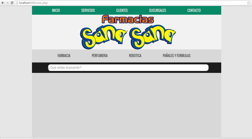
Then I visualized it in different resolutions and it looks very bad. For example, the following image shows 1366x768:

What is the best solution to make it look nice in different resolutions?

    
asked by Guillermo Ricardo Spindola Bri 11.05.2016 в 17:04
source

4 answers

3

Currently the best form of design resposivo is using libraries that facilitate it, there are several options but perhaps the most widespread is

bootstrap

Of course this is going to require a redesign of the site since the idea is to think of the site as mobile first

here

bootstrap 3 youtube

an excellent course that I think is going to introduce you in topic so that you can design in a responsive way and the applications adapt to different resolutions of devices

    
answered by 11.05.2016 / 17:11
source
2

I recommend some framework for this, in the same way you must have basic knowledge, in the same way there is not only Bootstrap , it is also Foundation , likewise I leave this here for you to take a look at

answered by 11.05.2016 в 17:20
1

Bootstrap is an easy way to make responsive designs. Responsive = 'Nice in the different resolutions'. Find it here: link

    
answered by 11.05.2016 в 17:13
1

As you have already been told, bootstrap and foundation are the most popular frameworks when creating "responsive" websites, although they are not the only ones, you can take a look at the more or less current panorama here . However, if you want to "build" your own responsive solution, you'd better take a look at the Media queries

    
answered by 11.05.2016 в 17:27