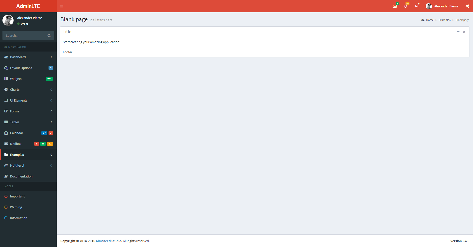
When using AdminLTE what you need is to use a div with the class box as the following code:
<div class="box">
    <div class="box-header with-border">
        <h3 class="box-title">Title</h3>
        <div class="box-tools pull-right">
          <button type="button" class="btn btn-box-tool" data-widget="collapse" data-toggle="tooltip" title="" data-original-title="Collapse">
            <i class="fa fa-minus"></i></button>
          <button type="button" class="btn btn-box-tool" data-widget="remove" data-toggle="tooltip" title="" data-original-title="Remove">
            <i class="fa fa-times"></i></button>
        </div>
   </div>
   <div class="box-body">
       Start creating your amazing application!
   </div>
       <!-- /.box-body -->
   <div class="box-footer">
       Footer
   </div>
        <!-- /.box-footer-->
</div>
It consists of a header , body and footer which will leave you something like the following:
A container in which you are going to distribute the 12 columns and when opening and closing your side menu the content will not be deformed as it happens now.