I think there should be an option using CSS only ... but it has not occurred to me at the moment. An option that you have using JavaScript would be with a MutationObserver to detect the change in size in the div container and calculate the vertical position of the circles. (You could also use ResizeObserver but, at the time of writing this answer, you hardly have support, so you better opt for the more generic MutationObserver ).
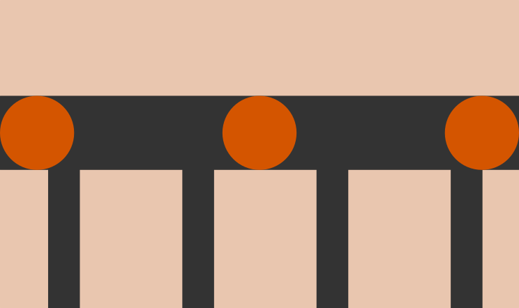
The idea is as simple as indicated above: detect changes in size, calculate the new vertical position (for which you will need to know the size of the image), and apply it to the container of the circles. In this particular case, the background image has a width of 640px, a height of 534px, and the position of the circles is around 50% (or 267px).
Note: Initially I had a more specific example (putting directly width = 640 and height = 534), but to make it look better where each value comes from and not use "magic numbers", I have changed it to load the image and calculate the initial values from the size of the image ... but if you know the values, you can save that part if you want.
Here you can see it working (the changes are mainly JS, keeping the HTML equal to the initial one, and the CSS hardly has minimal changes):
// cargamos la imagen de fondo, esto no es necesario realmente, es para hacerlo más genérico y no usar números mágicos (se ve mejor lo que estoy haciendo si indico que es el ancho de la imagen, en lugar de que es 640).
let img = new Image();
img.src = "https://preview.ibb.co/nMfMkq/fondo.png";
img.onload = function() {
// calculamos su ancho, alto y la posición de la barra horizontal
let ancho = img.width;
let alto = img.height;
let altoBarra = img.height / 2; // la barra comienza alrededor de la mitad de la imagen
// crea un observador e indica la función a ejecutar
let observer = new MutationObserver(function() {
let contenedor = document.querySelector("#contenedor");
let circulos = document.querySelector("#circulos");
let ratio = ancho / alto;
// si ratio es mayor, la parte superior e inferior de la imagen se pierde
if (contenedor.offsetWidth > contenedor.offsetHeight * ratio) {
// calcula cuál sería la nueva posición de los círculos
circulos.style.top = (contenedor.offsetWidth * altoBarra / ancho) + "px";
// si el ratio es menor, la parte izquierda y derecha de la imagen se pierde
} else {
// pero no afecta a los círculos que siguen estando al 50%
circulos.style.top = "50%";
}
});
// comienza la observación del elemento
observer.observe(document.querySelector("#contenedor"), {attributes: true});
}
#contenedor {
width: 320px;
height: 267px;
background: url("https://preview.ibb.co/nMfMkq/fondo.png") no-repeat top center;
background-size: cover;
border: solid 2px #333;
resize: both;
overflow: auto;
}
#circulos {
display: flex;
justify-content: space-between;
position: relative;
top: 133px;
}
#circulos>div {
background-color: #d45500;
border-radius: 50%;
width: 60px;
height: 60px;
}
<div id="contenedor">
  <div id="circulos">
    <div></div>
    <div></div>
    <div></div>
  </div>
</div>
Now that the vertical position of the circles is correct, you can extend the example so that they not only reposition, but also change their size so that they always have the same proportion.